On my train ride in this morning, I saw an article posted on Twitter about Pell Graduation rates at the 80 largest universities in America. If you want to look at a boring table of static data, just click here.
But I wanted to see if there were any patterns, so I copied the table, pasted it into Excel and then opened in Tableau to visualize it. I think it tells an interesting story, although the data set is unfortunately limited, and with no key to merge the data with another set, it loses some potential.
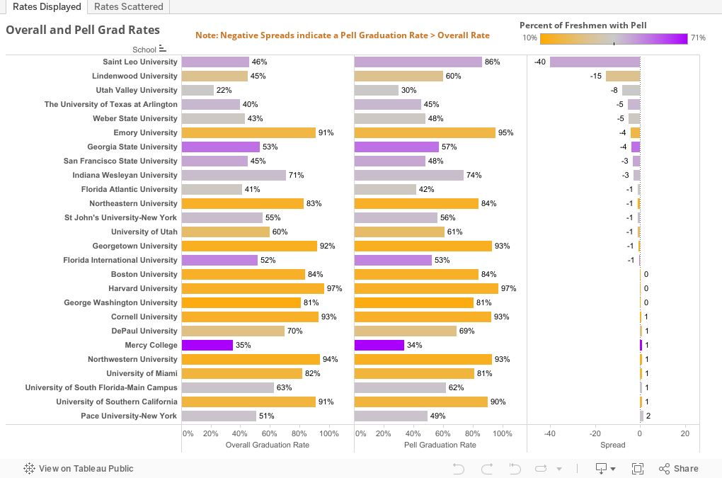
Start by looking at the first view. For each institution, there are three columns: The overall six-year graduation rate; the six-year graduation rate of Pell recipients, and the spread, with the values on spread sorted from low to high. In this instance, a negative number means Pell students graduate at a higher rate than the student body overall, and a positive number means just the opposite. As you scroll down the list from top to bottom, ask yourself what makes the pattern make sense? There are dozens, but all I could see was, "football," but you might see "big public research university." Or something else all together.
If you want to sort by another column, hover over the axis until the little icon pops up and click away. The "reset" at lower left does just what it says it does.
The second view (on the tabs across the top) shows the Pell graduation rate scattered against the percentage of freshmen with Pell. The bubbles are colored and sized by spread (blue and large are good for Pell students; red and small, not so much.) Right away you see the pattern: If you enroll fewer Pell students, your Pell graduation rate is higher. My hypothesis would be that more selective institutions (who have higher graduation rates overall) a) simply select the most capable from among the poor students they admit, and b) have more resources to fund the smaller percentage of low-income students.
What do you see?
But I wanted to see if there were any patterns, so I copied the table, pasted it into Excel and then opened in Tableau to visualize it. I think it tells an interesting story, although the data set is unfortunately limited, and with no key to merge the data with another set, it loses some potential.
Start by looking at the first view. For each institution, there are three columns: The overall six-year graduation rate; the six-year graduation rate of Pell recipients, and the spread, with the values on spread sorted from low to high. In this instance, a negative number means Pell students graduate at a higher rate than the student body overall, and a positive number means just the opposite. As you scroll down the list from top to bottom, ask yourself what makes the pattern make sense? There are dozens, but all I could see was, "football," but you might see "big public research university." Or something else all together.
If you want to sort by another column, hover over the axis until the little icon pops up and click away. The "reset" at lower left does just what it says it does.
The second view (on the tabs across the top) shows the Pell graduation rate scattered against the percentage of freshmen with Pell. The bubbles are colored and sized by spread (blue and large are good for Pell students; red and small, not so much.) Right away you see the pattern: If you enroll fewer Pell students, your Pell graduation rate is higher. My hypothesis would be that more selective institutions (who have higher graduation rates overall) a) simply select the most capable from among the poor students they admit, and b) have more resources to fund the smaller percentage of low-income students.
What do you see?
Comments
Post a Comment