While waiting for 2014 IPEDS data to come out, I've been searching the web for more good educational data to visualize, and came across this site, where I found a nice little data set. It's from 2010, and tracks 9th graders through high school and college.
We typically think of looking at high school graduates and measuring how well they do, which is important, of course. But you can have a high percentage of graduates enrolling in or graduating from college masking a problem of high school dropouts. This data helps look at that.
For all the data here, assume you start with 100 students in 9th grade in the state:
- What percentage of them graduate from high school?
- What percentage of them enter college?
- What percentage make it to the sophomore year of college?
- What percentage graduate from college within 150% of normal time (in other words, within six years)?
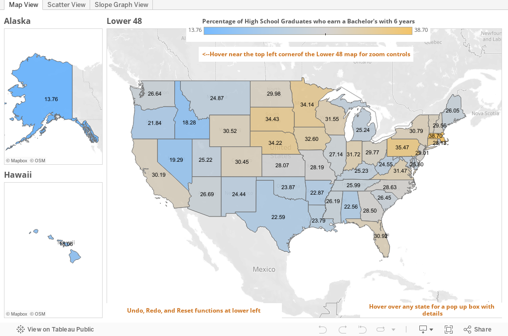
Finally, there is another, more traditional measure included: The percentage of high school graduates who graduate from college.
The data are interesting by themselves, but I also rolled in census data of median family income by state in 2001, presumably the year the 9th grader tracking began. It's by no means perfect: New York City and Elmira in New York, for instance; Dallas and Colorado City in Texas; or Hollywood and Fresno in California share very little except a state capitol. I've made no adjustments for purchasing power of a dollar, either. The high incomes in Alaska mask a much higher cost of living, and the remoteness of the state and relative dearth of post-secondary options make its attainment rating skew low, in all probability.
- On the first view, the map, hover over any state to get a popup chart. Go to the top left corner of the 48 States map to zoom; resets are at the lower left of the visualization. The states are colored by the percentage of high school graduates who earn a college degree.
- One the second view, the scatter gram, the x-axis is always the rank of median family income. Choose any other value to plot on the y-axis. The states are colored by region, and you should note that the axes are reversed, so a rank of 1 is high and to the right.
- And, of the third view, a slope graph, where you can compare any two measures of educational attainment in the states by using the right and left controls. The line connects the two ranks.
What do you see here? I'd love to hear your thoughts.
Comments
Post a Comment