
Tuition Transparency Ratings

The Federal Government released its Tuition Transparency Ratings today, to help students and parents find out how fast colleges are raising tuition and net price.  And as is the case with many well-meaning government programs, the data doesn't always tell you the whole story.

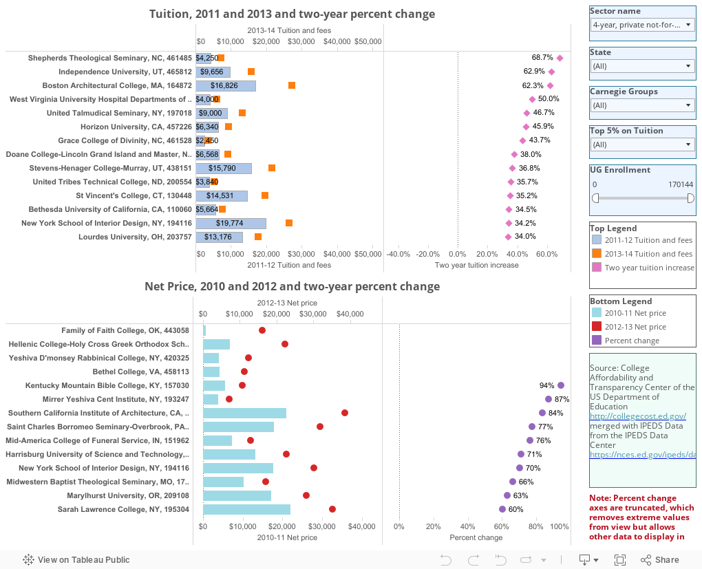
The top chart on this visualization show tuition and fees at about 6,000 colleges and universities; the light blue bar is 2011, and the orange square is 2013.  To the right is the two-year percentage increase.  If you want to limit your selections or sort the colleges differently, take a look at this image, which I've embellished with some instructions.  Click to view larger.


The second chart, at the bottom, shows net price for 2010 and 2011.  Net price is calculated after grant aid, which is only reported at the end of the year, which explains the delay.  It's pretty much the same: 2010 on the aqua bar, 2012 on the red dot, and percent change in the purple circle.  The filters and sorts work the same way on this one.

There are a couple of problems here: One is the data.  I could not find a single program on the New England Culinary Institute website that listed a tuition of $88,000, but that's the data shown here. There are several instances like that in this data; even if they are technically accurate because of the way a program is configured, it doesn't advance our understanding of the issue much.

But more important, net cost is a function of who enrolls and how much aid you can give: If you suddenly stopped enrolling middle-income students, or you have small enrollments, the results can be very volatile. Net cost is a remnant, not a target that can be tightly controlled.  And, it seems in many instances net cost is being calculated by different people in different ways over the two-year period.

Still, there is some good stuff here, I think.  Take a look and let me know.


Comments

Popular posts from this blog

Changes in AP Scores, 2022 to 2024

Used to be, with a little work, you could download very detailed data on AP results from the College Board website: For every state, and for every course, you could see performance by ethnicity.  And, if you wanted to dig really deep, you could break out details by private and public schools, and by grade level.  I used to publish the data every couple of years. Those days are gone.  The transparency The College Board touts as a value seems to have its limits, and I understand this to some extent: Racists loved to twist the data using single-factor analysis, and that's not good for a company who is trying to make business inroads with under-represented communities as they cloak their pursuit of revenue as an altruistic push toward access. They still publish data, but as I wrote about in my last post , it's far less detailed; what's more, what is easily accessible is fairly sterile, and what's more detailed seems to be structured in a way that suggests the company doesn...

The Highly Rejective Colleges

If you're not following Akil Bello on Twitter, you should be.  His timeline is filled with great insights about standardized testing, and he takes great effort to point out racism (both subtle and not-so-subtle) in higher education, all while throwing in references to the Knicks and his daughter Enid, making the experience interesting, compelling, and sometimes, fun. Recently, he created the term " highly rejective colleges " as a more apt description for what are otherwise called "highly selective colleges."  As I've said before, a college that admits 15% of applicants really has a rejections office, not an admissions office.  The term appears to have taken off on Twitter, and I hope it will stick. So I took a look at the highly rejectives (really, that's all I'm going to call them from now on) and found some interesting patterns in the data. Take a look:  The 1,132 four-year, private colleges and universities with admissions data in IPEDS are incl...

Changes in SAT Scores after Test-optional

One of the intended consequences of test-optional admission policies at some institutions prior to the COVID-19 pandemic was to raise test scores reported to US News and World Report.  It's rare that you would see a proponent of test-optional admission like me admit that, but to deny it would be foolish. Because I worked at DePaul, which was an early adopter of the approach (at least among large universities), I fielded a lot of calls from colleagues who were considering it, some of whom were explicit in their reasons for doing so.  One person I spoke to came right out at the start of the call: She was only calling, she said, because her provost wanted to know how much they could raise scores if they went test-optional. If I sensed or heard that motivation, I advised people against it.  In those days, the vast majority of students took standardized admission tests like the SAT or ACT, but the percentage of students applying without tests was still relatively small; the ne...