Note: I got an email from Dean Kilgore at Mount Saint Mary's in California, who indicated I'd downloaded data for the wrong Mount Saint Mary College:In this case, the one in New York. I had to create the list manually, and it was just a slip on my part.
Sorry about that. I've removed them from the analysis, but unfortunately, can't add the correct one at this time without a considerable amount of work.
Sweet Briar College in Virginia recently announced, to the shock of many in higher education, that it would be closing at the end of this spring, 2015 term. As often happens when a college decides to close, those who are or were close to it rally the troops and wage a fierce campaign to try to keep it open. Sometimes it works, other times, it doesn't.
The scene playing out is not unusual: Allegations of secret deals, incompetence, blindness to all that is and was good at Sweet Briar. This is what happens when you decide to close a college. And although I'm not taking sides, I did write before that the closing does seem to be curious in light of what little publicly available financial data there is: If you had to pick a college from this list that was going to close, it probably wouldn't be Sweet Briar. Even the federal rankings of financial responsibility gave Sweet Briar a 3, a score higher than Harvard, which may only point out how absurd those ratings are in the first place.
A while ago, I downloaded a pretty extensive data set, using the members of the Women's College Coalition as my base. Not all colleges have data available in IPEDS, however, so I did the best I could (for instance, the Women's College at Rutgers is not in IPEDS as a separate institution, or if it is, I couldn't find it. And I took out Saint Mary of the Woods, as they just announced they're going co-ed). Also, since there is no IPEDS data field that tells you when a college is a women's college, I couldn't go back and find out how many were labeled as such 20 years ago. That might have been interesting.
Overall, though, the data were pretty uninteresting. So I gave up on visualizing it. There were trends, of course, but nothing dramatic.
So, when I saw this article, by one of the people leading the charge on the Save Sweet Briar campaign, one sentence jumped out at me:
Enrollment: There is no evidence that enrollment is declining, either at Sweet Briar or at women’s or liberal arts colleges. This claim is simply false. Numbers people, please check for yourself: The data are publicly available.
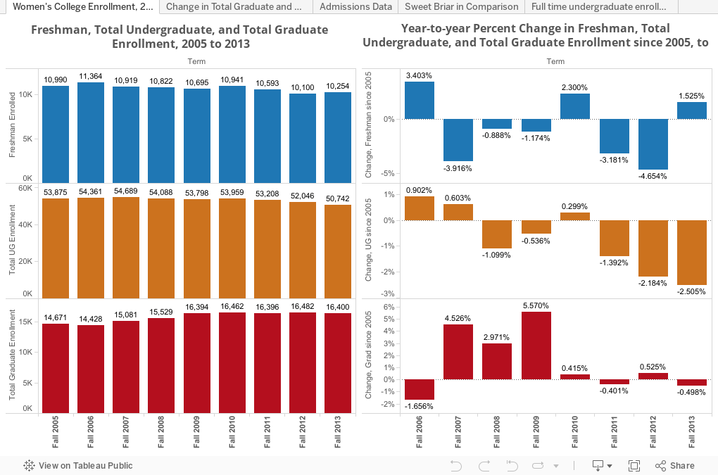
The data are available, and the link goes to the IPEDS site I use all the time. So, take a look here. There are five views of the data, using the tabs across the top. The first shows changes in freshman, total, undergraduate, and graduate enrollment over time. The changes on the right are shown in relation to the prior year. The second shows the same data, but the change is cumulative since 2005: As you can see, total undergraduate enrollment is down almost 6% during a time enrollment increased nationally. The third shows admissions activity; the fourth breaks it out, showing Sweet Briar and all the other women's colleges in aggregate. And the fifth shows total undergraduate enrollment in 2005 and 2013 (on the left) and change (on the right.) As you can see, there are some big winners, big losers and a lot of small changes.
Decide for yourself. And tell me what you see:
Sorry about that. I've removed them from the analysis, but unfortunately, can't add the correct one at this time without a considerable amount of work.
Sweet Briar College in Virginia recently announced, to the shock of many in higher education, that it would be closing at the end of this spring, 2015 term. As often happens when a college decides to close, those who are or were close to it rally the troops and wage a fierce campaign to try to keep it open. Sometimes it works, other times, it doesn't.
The scene playing out is not unusual: Allegations of secret deals, incompetence, blindness to all that is and was good at Sweet Briar. This is what happens when you decide to close a college. And although I'm not taking sides, I did write before that the closing does seem to be curious in light of what little publicly available financial data there is: If you had to pick a college from this list that was going to close, it probably wouldn't be Sweet Briar. Even the federal rankings of financial responsibility gave Sweet Briar a 3, a score higher than Harvard, which may only point out how absurd those ratings are in the first place.
A while ago, I downloaded a pretty extensive data set, using the members of the Women's College Coalition as my base. Not all colleges have data available in IPEDS, however, so I did the best I could (for instance, the Women's College at Rutgers is not in IPEDS as a separate institution, or if it is, I couldn't find it. And I took out Saint Mary of the Woods, as they just announced they're going co-ed). Also, since there is no IPEDS data field that tells you when a college is a women's college, I couldn't go back and find out how many were labeled as such 20 years ago. That might have been interesting.
Overall, though, the data were pretty uninteresting. So I gave up on visualizing it. There were trends, of course, but nothing dramatic.
So, when I saw this article, by one of the people leading the charge on the Save Sweet Briar campaign, one sentence jumped out at me:
Enrollment: There is no evidence that enrollment is declining, either at Sweet Briar or at women’s or liberal arts colleges. This claim is simply false. Numbers people, please check for yourself: The data are publicly available.
The data are available, and the link goes to the IPEDS site I use all the time. So, take a look here. There are five views of the data, using the tabs across the top. The first shows changes in freshman, total, undergraduate, and graduate enrollment over time. The changes on the right are shown in relation to the prior year. The second shows the same data, but the change is cumulative since 2005: As you can see, total undergraduate enrollment is down almost 6% during a time enrollment increased nationally. The third shows admissions activity; the fourth breaks it out, showing Sweet Briar and all the other women's colleges in aggregate. And the fifth shows total undergraduate enrollment in 2005 and 2013 (on the left) and change (on the right.) As you can see, there are some big winners, big losers and a lot of small changes.
Decide for yourself. And tell me what you see:
Comments
Post a Comment