Is it true that the rich get richer, as suggested by a recent Washington Post article discussing college endowments? Probably.
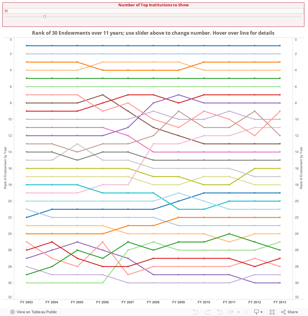
But what's more interesting is the pecking order in the world of endowments, and how it's changed (or not) over the last decade or so. I downloaded trend data from IPEDS showing beginning of year endowment by fiscal year for about 160 four-year private institutions with enrollments of at least 5,000. To be sure, there are some very well endowed colleges who have smaller enrollments (Williams, Pomona, Grinnell, etc.) but this chart could get messy pretty fast.
I pulled the data into Tableau and created a bump chart, showing not the value over time (because everyone does that) but rather the rank of all the endowments shown. So, for instance, if a line slopes down, it might mean a college has gone from 10th to 20; a slope up might show the opposite.
But what we see here are lines that are essentially flat. There are a couple anomalies, of course, and as with IPEDS always, a warning about human errors in data entry, incompetence, or other agendas at work is in order. When data was missing for a year, I simply put the prior year's data in its place for continuity.
I started with 30, but you can show more or fewer using the slider at the top. Just pull it to whatever number of colleges to display.
See anything interesting?
Comments
Post a Comment