The answer to the headline, of course, is "no." Race is not determinant of where you go to college, but race--or more probably the factors that vary with race and ethnicity--may influence your college choice set, which can, of course, influence where you go to college.
I've written before about how all these variables are at play with each other: In America, race, income, parental attainment, and presumably, opportunity, all cluster together.
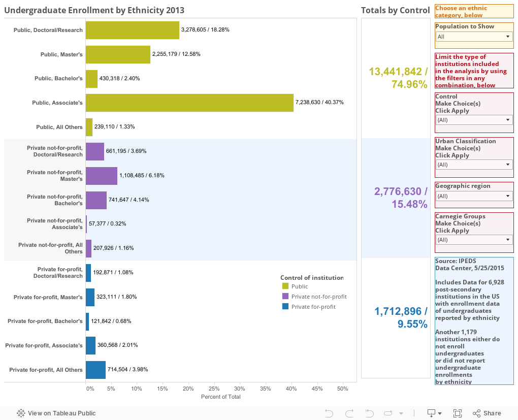
And, after you look at this, you'll see how opportunity gets distributed by race, provided you're willing to click a button or two. The visualization starts off showing all undergraduate enrollment in almost 7,000 post-secondary institutions who report to IPEDS. (And before you object, I've believe strongly that the college you attend is not your destiny, and that education is what you make of it, as I've written before on my other blog. But it's also clear that many people believe talent congregates at the "best" colleges, and the way this plays out in hiring and graduation school admissions can be troublesome.)
As you can see, almost 75% of all undergraduates go to a public institution; the majority of them go to Associate's granting institutions (almost all community colleges.)
But use the control at the top right to see how the distribution changes: Try Black or Hispanic or Asian or White to watch the bars move. What you see is a change: Hispanic and African-American students go to community colleges and for-profits at much higher rates than their White and Asian peers. White students go to private, not-for-profits at higher rates than almost any group, except Non-residents.
International (Non-resident, here) students flock to research universities, but are also far more likely than any group to attend a private university. This is because they avoid for-profits in great numbers.
What else do you notice?
If you want to limit the population, feel free to use any of the filters, but beware that the percent of totals are taken on the base of the sub-population you've chosen, not the entire population. You'll notice there are further differences by geography and campus urbanization among other things. I'd love to hear what you turn up that's intriguing.
I've written before about how all these variables are at play with each other: In America, race, income, parental attainment, and presumably, opportunity, all cluster together.
And, after you look at this, you'll see how opportunity gets distributed by race, provided you're willing to click a button or two. The visualization starts off showing all undergraduate enrollment in almost 7,000 post-secondary institutions who report to IPEDS. (And before you object, I've believe strongly that the college you attend is not your destiny, and that education is what you make of it, as I've written before on my other blog. But it's also clear that many people believe talent congregates at the "best" colleges, and the way this plays out in hiring and graduation school admissions can be troublesome.)
As you can see, almost 75% of all undergraduates go to a public institution; the majority of them go to Associate's granting institutions (almost all community colleges.)
But use the control at the top right to see how the distribution changes: Try Black or Hispanic or Asian or White to watch the bars move. What you see is a change: Hispanic and African-American students go to community colleges and for-profits at much higher rates than their White and Asian peers. White students go to private, not-for-profits at higher rates than almost any group, except Non-residents.
International (Non-resident, here) students flock to research universities, but are also far more likely than any group to attend a private university. This is because they avoid for-profits in great numbers.
What else do you notice?
If you want to limit the population, feel free to use any of the filters, but beware that the percent of totals are taken on the base of the sub-population you've chosen, not the entire population. You'll notice there are further differences by geography and campus urbanization among other things. I'd love to hear what you turn up that's intriguing.
Comments
Post a Comment