If you follow media following higher education, you know that for a while, many have been (somewhat gleefully) predicting the demise of the whole industry. High costs, MOOCs, a weak job market, and shrinking confidence in the value of a college degree are all conspiring, they would say, to create a perfect storm that will be the end of us all.
I'm not saying these people are wrong; you can get in trouble arguing with self-proclaimed prophets, and until something either comes to fruition or it doesn't, all you have is a lot of heated discussion. Personally, I take exception to the smugness of some who seem to revel in their predictions.
But that is, as they say, why they make chocolate and vanilla.
The heat (if not the light) increased this week when Sweet Briar College in Virginia announced it was closing. The pundits came out of the woodwork, proclaiming that this was just the first domino to fall, all the time apparently reveling in this presumptive proof of their collective acumen in predicting such things.
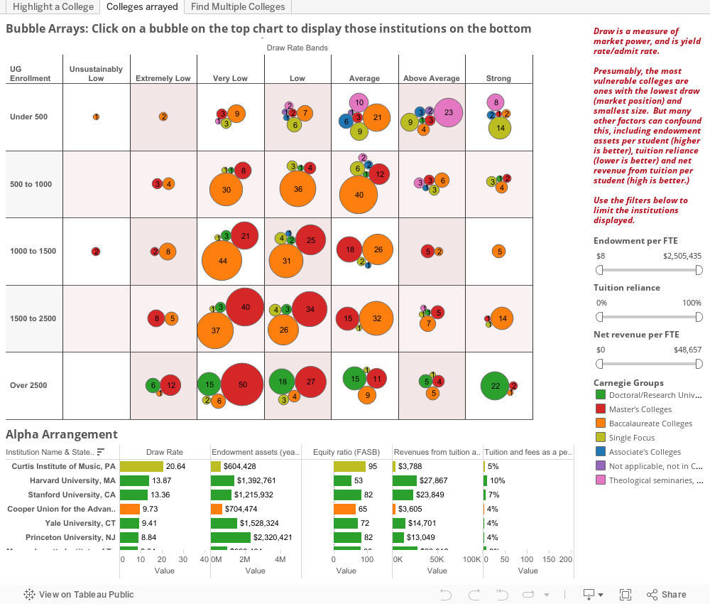
But a look at publicly available data makes it hard to predict such things; many colleges soldier on despite numbers that make them look vulnerable, while a college like Sweet Briar, which occupied a pretty good position on the second chart, below, found itself a victim of the most obvious college problem, namely enrollment that was not large enough to support itself.
You might think that Sweet Briar is the first of many. You could say the industry is collapsing. And you might be right.
But it seems there is nothing a prophet likes to point at more than evidence he might be right. There is no one saying (yet) some of the other possible reasons things might have gone south, even though there is much more attention paid to this college than the one per month that has closed since 1969. If it later turns out (and I have no reason to believe it will) that this was a board with no vision, or a horrible case of mismanagement, or one of dozens of other possible reasons we can point to, the pundits are unlikely to correct what they're suggesting today.
So take a look at this. On the first chart, you can see the array of colleges and universities, and with a click of a bubble, find out who's where. On the second, you can put any college in context with a couple of clicks. Have fun. Don't get too worked up over what you see. It's not destiny.
As for me, I'll tell you what Mark Twain once said: “I was gratified to be able to answer promptly, and I did. I said I didn’t know.” And I'm sticking to it.
Note: It's important to remember that IPEDS data that this is built with contains errors on occasion; don't make any bar bets on what you see here, and if your institution is incorrectly listed, take it up with your IR office.
I'm not saying these people are wrong; you can get in trouble arguing with self-proclaimed prophets, and until something either comes to fruition or it doesn't, all you have is a lot of heated discussion. Personally, I take exception to the smugness of some who seem to revel in their predictions.
But that is, as they say, why they make chocolate and vanilla.
The heat (if not the light) increased this week when Sweet Briar College in Virginia announced it was closing. The pundits came out of the woodwork, proclaiming that this was just the first domino to fall, all the time apparently reveling in this presumptive proof of their collective acumen in predicting such things.
But a look at publicly available data makes it hard to predict such things; many colleges soldier on despite numbers that make them look vulnerable, while a college like Sweet Briar, which occupied a pretty good position on the second chart, below, found itself a victim of the most obvious college problem, namely enrollment that was not large enough to support itself.
You might think that Sweet Briar is the first of many. You could say the industry is collapsing. And you might be right.
But it seems there is nothing a prophet likes to point at more than evidence he might be right. There is no one saying (yet) some of the other possible reasons things might have gone south, even though there is much more attention paid to this college than the one per month that has closed since 1969. If it later turns out (and I have no reason to believe it will) that this was a board with no vision, or a horrible case of mismanagement, or one of dozens of other possible reasons we can point to, the pundits are unlikely to correct what they're suggesting today.
So take a look at this. On the first chart, you can see the array of colleges and universities, and with a click of a bubble, find out who's where. On the second, you can put any college in context with a couple of clicks. Have fun. Don't get too worked up over what you see. It's not destiny.
As for me, I'll tell you what Mark Twain once said: “I was gratified to be able to answer promptly, and I did. I said I didn’t know.” And I'm sticking to it.
Note: It's important to remember that IPEDS data that this is built with contains errors on occasion; don't make any bar bets on what you see here, and if your institution is incorrectly listed, take it up with your IR office.
Comments
Post a Comment