Ever since my first day in admissions, I've had a big problem with the concept of college application fees. They just seem odd to me: You pay some amount of money for the privilege of being considered for admission, often not certain you'll attend if you are. And if you're not admitted, you're out of luck.
I understand those who support the concept, in concept: Students shouldn't apply to a lot of colleges, and they should be somewhat serious about the colleges they apply to. Except we know that doesn't happen. The counselor at my kids' school said a few years ago one student applied to 46, and the Fast Apps, Snap Apps, and VIP apps all encourage students to apply to places just because they can.
I also realize that there are costs associated with processing applications, although those costs have dropped pretty dramatically in the past several years, especially when all the documents come in electronically. But all the costs of doing business are paid for by the students who pay tuition, and, presumably, more applications is good for the college they attend.
There may be other models where this system is used, but I'm not able to come up with any. All I can think about is having to pay $50 just to walk onto the Toyota lot and shop for cars (which is hardly a perfect analogy, either.)
Too often in the discussion about things like "admit to deny," people will point out that app fees from students who have little chance of being admitted are a revenue source for colleges. Technically yes, but actually no. At most institutions, it's about 1/10th of 1% of total revenue.
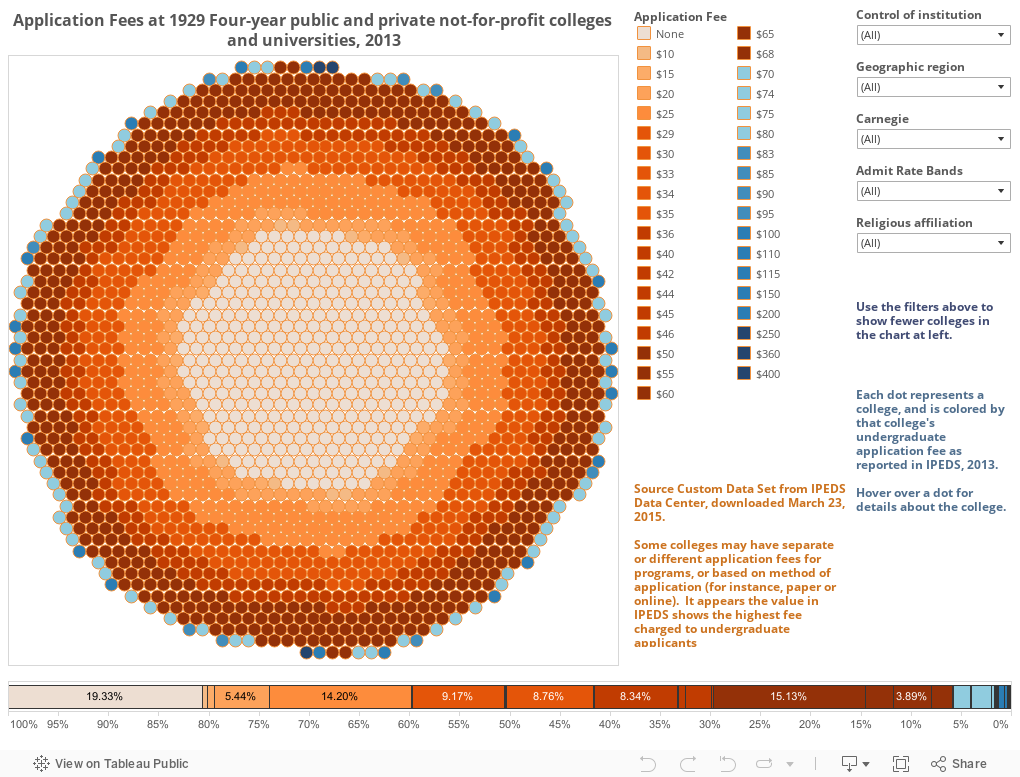
So, take a look at what colleges charge to apply. This visualization starts with just under 2,000 four-year colleges and universities, each represented by a dot. IPEDS apparently list the highest fee a college charges when there are multiple levels.
Hover over the dot for details. The bar chart at the bottom shows the breakouts as a percent of total. Use the filters on the right to show a smaller set of colleges.
What do you notice?
I understand those who support the concept, in concept: Students shouldn't apply to a lot of colleges, and they should be somewhat serious about the colleges they apply to. Except we know that doesn't happen. The counselor at my kids' school said a few years ago one student applied to 46, and the Fast Apps, Snap Apps, and VIP apps all encourage students to apply to places just because they can.
I also realize that there are costs associated with processing applications, although those costs have dropped pretty dramatically in the past several years, especially when all the documents come in electronically. But all the costs of doing business are paid for by the students who pay tuition, and, presumably, more applications is good for the college they attend.
There may be other models where this system is used, but I'm not able to come up with any. All I can think about is having to pay $50 just to walk onto the Toyota lot and shop for cars (which is hardly a perfect analogy, either.)
Too often in the discussion about things like "admit to deny," people will point out that app fees from students who have little chance of being admitted are a revenue source for colleges. Technically yes, but actually no. At most institutions, it's about 1/10th of 1% of total revenue.
So, take a look at what colleges charge to apply. This visualization starts with just under 2,000 four-year colleges and universities, each represented by a dot. IPEDS apparently list the highest fee a college charges when there are multiple levels.
Hover over the dot for details. The bar chart at the bottom shows the breakouts as a percent of total. Use the filters on the right to show a smaller set of colleges.
What do you notice?
Comments
Post a Comment