
When Infographics Fail

There are a lot of bad infographics floating around the Internet.  When they concern things like the difference between cats and dogs, or how many hot dogs and hamburgers Americans eat over the 4th of July, it's no big deal.

But this blog is about higher education data, and when I see bad infographics on that topic, I feel compelled to respond.  This one is so bad it's almost in the "I can't even," category.  It takes very interesting and compelling data--The graduation rates of Black male athletes--and compares it to overall graduation rates at several big football schools in the nation.  Here it is:


For starters, this chart appears to stack bars when they shouldn't be stacked: A graduation rate of 40% for one group and 40% for another group shouldn't add up to 80%.  The effect is that it distorts much of what your brain tries to figure out.  For instance, look at the overall rates (longer bars) for Georgia Tech and Pittsburgh;  Georgia Tech at 79% is shorter than Pittsburgh's at 77%, because they started at different points.

But wait, they can't be stacked; Louisville's 44% + 47% is way longer than Notre Dame's 81%. Stacked bars on dual axes?

These also look at first like they could be two sets of bars, with one (the overall graduation rate, which is always higher) behind the Black male graduation rate.  But that can't be, either.  The effect is that you look at Notre Dame and see very long gap between 81% and 96% (a 15-point spread) that appears to be longer than the 37-point spread at Virginia.

In short, I cannot tell you how this chart was made, or what the assumptions are, let alone what the story really is.

And the image behind the picture is even worse; it makes it hard to see.

Finally, a third element might have been interesting here: The graduation rate of Black males who are not athletes.  It might shed more light on the problem, although if the same designer did it, I'd not be confident.

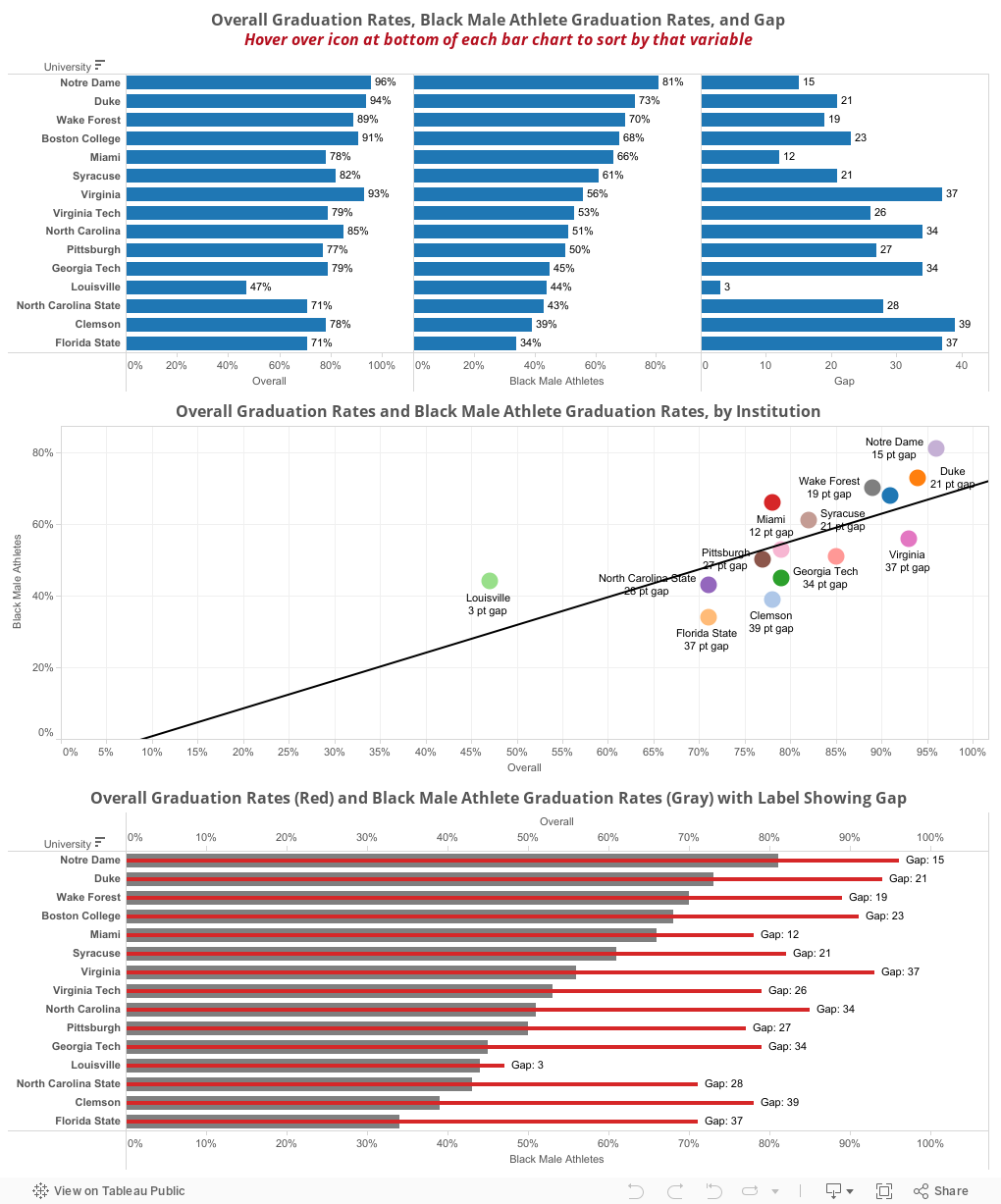
Here's the data presented three ways, each of which tells the story differently, but each better in at least one way. This was literally 15 minutes of work.

What do you think?


Comments

Popular posts from this blog

The Highly Rejective Colleges

If you're not following Akil Bello on Twitter, you should be.  His timeline is filled with great insights about standardized testing, and he takes great effort to point out racism (both subtle and not-so-subtle) in higher education, all while throwing in references to the Knicks and his daughter Enid, making the experience interesting, compelling, and sometimes, fun. Recently, he created the term " highly rejective colleges " as a more apt description for what are otherwise called "highly selective colleges."  As I've said before, a college that admits 15% of applicants really has a rejections office, not an admissions office.  The term appears to have taken off on Twitter, and I hope it will stick. So I took a look at the highly rejectives (really, that's all I'm going to call them from now on) and found some interesting patterns in the data. Take a look:  The 1,132 four-year, private colleges and universities with admissions data in IPEDS are incl

The College Finder

Note: A few people have commented on slow loading with the visualization.  If you have troubles, click here to be taken right to the visualization .  It should open in a new tab and you can follow along from there.    This is always a popular post with high school counselors, IECs, parents, and students who are looking for general information on degrees awarded, or a very specific combination of academic programs, location, and other institutional characteristics. It uses IPEDS data I downloaded as soon as I can when it became available (and before a looming government shutdown), and shows all 1,700 majors recognized by the federal government in the IPEDS system, using CIP codes, and the number of degrees awarded by college in any selected area. For instance, you might have a question about which college awards the most degrees in French Language and Literature: A few clicks, and you find it's the University of Arizona.  If you want a colder climate, choose the Great Lakes region,

Freshman Migration, 1986 to 2020

(Note: I discovered that in IPEDS, Penn State Main Campus now reports with "The Pennsylvania State University" as one system.  So when you'd look at things over time, Penn State would have data until 2018, and then The Penn....etc would show up in 2020.  I found out Penn State main campus still reports its own data on the website, so I went there, and edited the IPEDS data by hand.  So if you noticed that error, it should be corrected now, but I'm not sure what I'll do in years going forward.) Freshman migration to and from the states is always a favorite visualization of mine, both because I find it a compelling and interesting topic, and because I had a few breakthroughs with calculated variables the first time I tried to do it. If you're a loyal reader, you know what this shows: The number of freshman and their movement between the states.  And if you're a loyal viewer and you use this for your work in your business, please consider supporting the costs