Unless you live under a rock, you probably know that colleges are, in general, interested in increasing the number of students who apply for admission. There are a couple reasons for this, but they're all mostly based on the way things used to be: That is, before colleges started trying to intentionally increase applications. The good old days, some might say.
In general, increasing applications used to mean a) you could select better students, who would be easier to teach, and who might reflect well on your college, or b) you as an admissions director could sleep a little better, because you were more certain you could fill the class, or c) your admission rate would go down, which is generally considered a sign of prestige. After all, the best colleges have low admission rates, right?
Well, yes, one does have to admit that the colleges that spring to mind when one says "excellent" all tend to have low admission rates. Lots of people want to go there, and thus, it must be good. The trained eye might be able to spot the forgery, but what about the average person?
This week, we have another journalistic treatise presumably exposing colleges for the ways in which they attempt to increase applications. The tactics listed in this article are nothing new: Reduce the essay, waive the fee, encourage more low-income kids. Barely mentioned was the "Fast App/VIP app/Priority App," many colleges use that allow them to count an "applicant" as anyone who clicks an email link that says "Start your application."
However, application increases only pay off when you generate them from students who have a reasonable propensity to enroll. Prestige can be measured by a little-used variable that punishes you when you increase applications to try to look more selective at the cost of deceasing your yield: It's called the Draw Rate, and it's a powerful indicator of market position. It's a simple calculation: Yield rate/admit rate.
Here's a secret: For some percent of the freshman class, let's say 33%, recruitment doesn't come into play at all. A large chunk of your enrollment is natural; that is, those students are likely to enroll no matter what you do. The next 33% are going to enroll presuming you do everything correctly, make it affordable, and help them understand how they fit. But the last group, that final third, comes from students who have little predisposition to enroll. Your recruitment tactics focus on them, and you spend most of your time trying to find them, get them to apply, and then to enroll. They may make up as much as 75% of your pool. They enter your applicant pool with a lower level of interest.
The problem is that usually, a big increase in applications comes not from the first or second group, and not even the third, but rather a fourth group, the "Ain't no way I'm going to enroll short of a miracle" group. The bigger problem is that you don't always know exactly who these students are. This is one of the reasons demonstrated interest has become a topic of discussion.
When you artificially increase applications, and you have to cover your ass by admitting more, your yield is going to drop. And so will your draw rate.
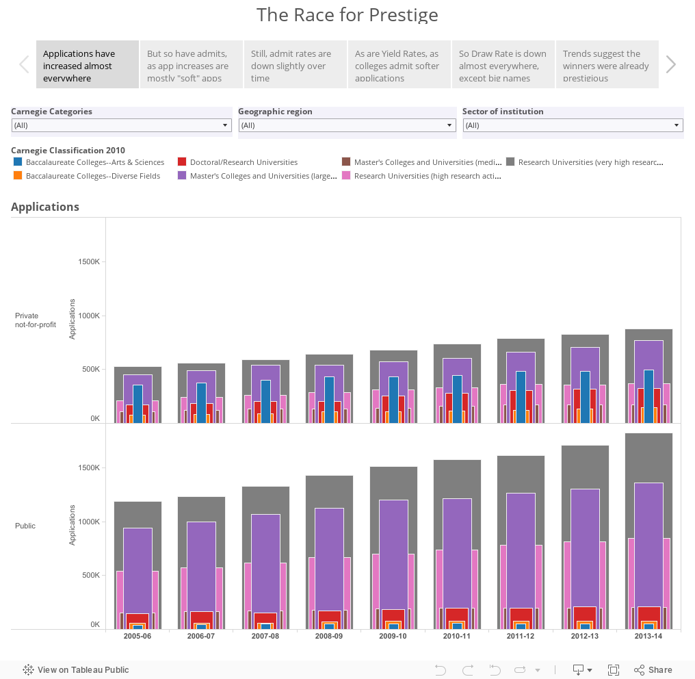
So, let's look at the data. These charts start out very busy, so you should interact by selecting just a region or Carnegie type. But even at their busy mess stage, you can see: a) applications are up, b) admits are up, and c) yield rates are down at almost every type of institution, with the exception of the big, private, research universities. The ones you can rattle off without thinking too much.
But look at the Draw Rates, on the last two charts. Draw rates are down across the board, mostly because capacity is relatively constant, the supply of students is down, and competition is up. The only winners in the battle to increase prestige? The ones who were prestigious in the first place. The money spent trying to join that club, or sometimes even just to look more like them, could have been put to better use.
Use the boxes across the top to see the six points of this Tableau Story Points visualization. Note that the last one exposes some data anomalies which are inherent in IPEDS, often due to typos or new IR staff who count the wrong thing (my alma mater in 2010-2011, for instance.)
What do you see? And what do you think? Is the race for prestige dooming us? Or is it just the latest evolutionary stage in the natural process of competition?
In general, increasing applications used to mean a) you could select better students, who would be easier to teach, and who might reflect well on your college, or b) you as an admissions director could sleep a little better, because you were more certain you could fill the class, or c) your admission rate would go down, which is generally considered a sign of prestige. After all, the best colleges have low admission rates, right?
Well, yes, one does have to admit that the colleges that spring to mind when one says "excellent" all tend to have low admission rates. Lots of people want to go there, and thus, it must be good. The trained eye might be able to spot the forgery, but what about the average person?
This week, we have another journalistic treatise presumably exposing colleges for the ways in which they attempt to increase applications. The tactics listed in this article are nothing new: Reduce the essay, waive the fee, encourage more low-income kids. Barely mentioned was the "Fast App/VIP app/Priority App," many colleges use that allow them to count an "applicant" as anyone who clicks an email link that says "Start your application."
However, application increases only pay off when you generate them from students who have a reasonable propensity to enroll. Prestige can be measured by a little-used variable that punishes you when you increase applications to try to look more selective at the cost of deceasing your yield: It's called the Draw Rate, and it's a powerful indicator of market position. It's a simple calculation: Yield rate/admit rate.
Here's a secret: For some percent of the freshman class, let's say 33%, recruitment doesn't come into play at all. A large chunk of your enrollment is natural; that is, those students are likely to enroll no matter what you do. The next 33% are going to enroll presuming you do everything correctly, make it affordable, and help them understand how they fit. But the last group, that final third, comes from students who have little predisposition to enroll. Your recruitment tactics focus on them, and you spend most of your time trying to find them, get them to apply, and then to enroll. They may make up as much as 75% of your pool. They enter your applicant pool with a lower level of interest.
The problem is that usually, a big increase in applications comes not from the first or second group, and not even the third, but rather a fourth group, the "Ain't no way I'm going to enroll short of a miracle" group. The bigger problem is that you don't always know exactly who these students are. This is one of the reasons demonstrated interest has become a topic of discussion.
When you artificially increase applications, and you have to cover your ass by admitting more, your yield is going to drop. And so will your draw rate.
So, let's look at the data. These charts start out very busy, so you should interact by selecting just a region or Carnegie type. But even at their busy mess stage, you can see: a) applications are up, b) admits are up, and c) yield rates are down at almost every type of institution, with the exception of the big, private, research universities. The ones you can rattle off without thinking too much.
But look at the Draw Rates, on the last two charts. Draw rates are down across the board, mostly because capacity is relatively constant, the supply of students is down, and competition is up. The only winners in the battle to increase prestige? The ones who were prestigious in the first place. The money spent trying to join that club, or sometimes even just to look more like them, could have been put to better use.
Use the boxes across the top to see the six points of this Tableau Story Points visualization. Note that the last one exposes some data anomalies which are inherent in IPEDS, often due to typos or new IR staff who count the wrong thing (my alma mater in 2010-2011, for instance.)
What do you see? And what do you think? Is the race for prestige dooming us? Or is it just the latest evolutionary stage in the natural process of competition?
Comments
Post a Comment