While the endowment of a private university is not a big investment pot from which universities draw income to spend at their discretion (some portion of every endowment is restricted to certain use), it's a very good proxy for institutional wealth. What's always been interesting is the enormous size of the top five or six institutions, always led by Harvard, in comparison to everyone else. And yet Princeton, which enrolls fewer students, has the largest per-FTE endowment.
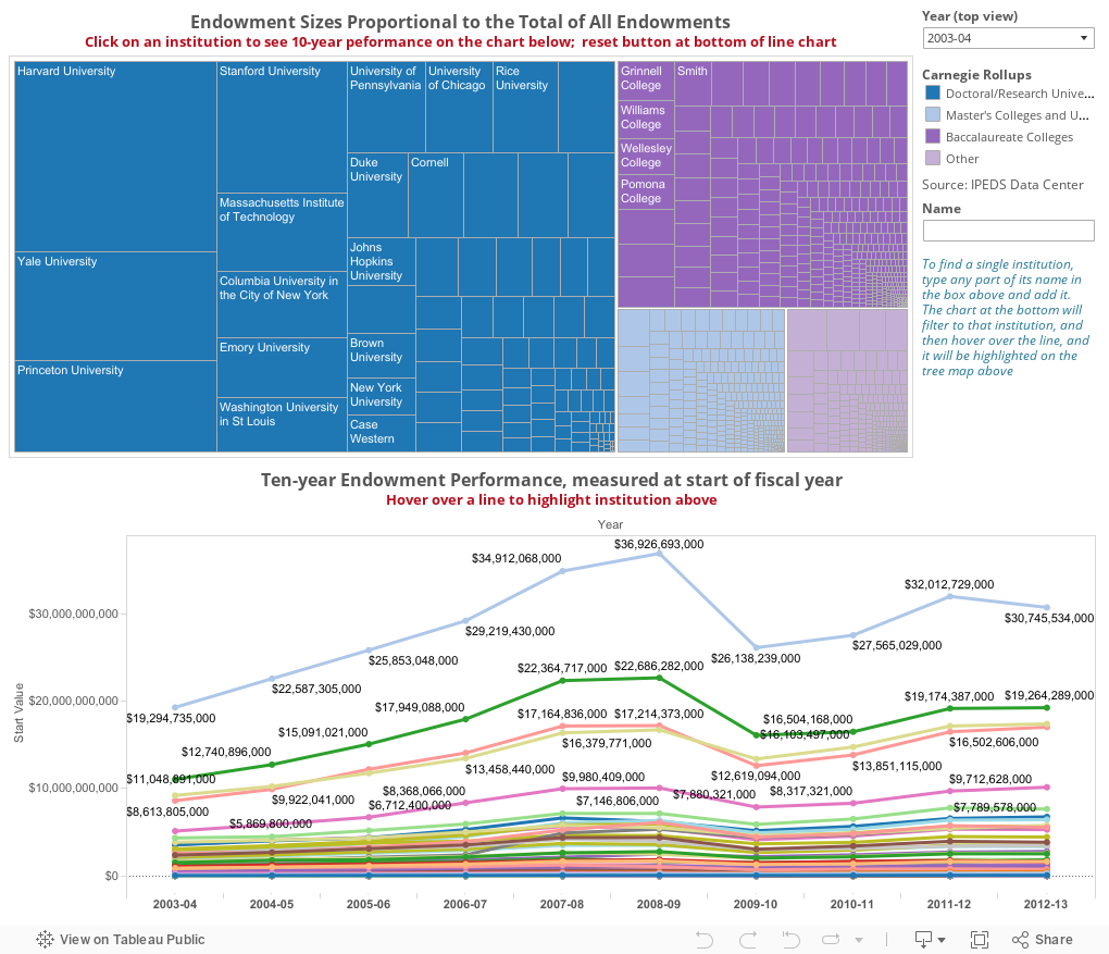
This visualization shows two things. On the top chart, it's a tree map, or what I like to call a sheet cake map. Think of all the money in all the endowments as one big bowl of batter baked into a cake, and then, once baked, sliced up into pieces. The size of the piece is that institution's endowment as a part of the whole.
The bottom chart shows ten years of endowments, measured at the start of the fiscal year shown, so you can see the hits in 2008--2009 and the overall growth over time. Of interest There are only three private universities in US who had a total endowment in 2012 equal to the ten-year growth of Harvard's.
If you click on an institution, the line chart at the bottom will filter to just that college over time. If you hover over a line on the bottom chart, it will highlight the instituion on the top so you can see its place in the endowment universe.
What do you see?
Comments
Post a Comment