I love the Internet. Thirty years ago, I couldn't have imagined being able to look up several years of tax returns for the Ivy League Colleges and Universities (let alone being interested in them.) But Guidestar (a great site you should check out, in case you don't know it) comes to the rescue. The documents are pdf, unfortunately, but you learn a lot by inputting the data manually into a spreadsheet.
For your information: By law, all universities that receive Title IV funding must make tax returns available to the public, so there is nothing clandestine about this.
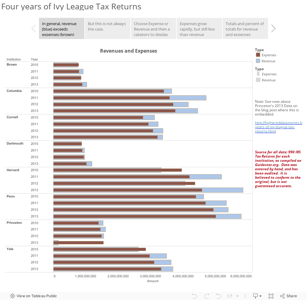
The tax returns can show you, albeit at a very high level, at how the Ivy League Institutions generate revenue, and how they spend it. To no one's surprise, salaries and benefits dominate at almost all colleges and universities, and if you're really curious, the returns list in detail how much the officers and highest paid non-officers make.
But as I once suggested, the most interesting thing is the massive investment return these institutions generate; even the "poorest" of them--Brown University--averaged about $124 million in investment return over these four years. Collectively, the investment return of these eight institutions averaged over $550 million per year, for a grand total of $18 billion over the four years. To put that in some perspective, there are about 1,553 private, not-for-profit, four-year colleges and universities in America with revenue data in IPEDS; 1,506 of them had total revenues of less than $550 million in 2013.
Take a spin around this. It's fairly interesting for the most part, and very interesting for one reason: Princeton's 2013 data (from the 2012 Tax Return, which I've put here in case you want to take a look.) The return shows an operating deficit of almost $1.3 billion, driven by an investment loss of over $800 million. I asked an expert on university finance (not affiliated with my own institution) about this, and here is what he said:
We were doing some analysis using IPEDS finance info and it showed some really weird results, with Princeton being the strangest of all. It caused me to pull their audited financial statements and examine them. Here’s a link to the statements in case you’re curious. Nothing weird showed up in the statements so I attributed the problem to IPEDS and the Department of Education. Now having looked at the 990, I believe Princeton has suffered some turnover among its finance staff and the folks doing their reporting don’t know what they’re doing. As you will see, the financial statements appear to be quite different from what was reported in the tax return.
So, take this, and everything you read from publicly available data, with a grain of salt.
For your information: By law, all universities that receive Title IV funding must make tax returns available to the public, so there is nothing clandestine about this.
The tax returns can show you, albeit at a very high level, at how the Ivy League Institutions generate revenue, and how they spend it. To no one's surprise, salaries and benefits dominate at almost all colleges and universities, and if you're really curious, the returns list in detail how much the officers and highest paid non-officers make.
But as I once suggested, the most interesting thing is the massive investment return these institutions generate; even the "poorest" of them--Brown University--averaged about $124 million in investment return over these four years. Collectively, the investment return of these eight institutions averaged over $550 million per year, for a grand total of $18 billion over the four years. To put that in some perspective, there are about 1,553 private, not-for-profit, four-year colleges and universities in America with revenue data in IPEDS; 1,506 of them had total revenues of less than $550 million in 2013.
Take a spin around this. It's fairly interesting for the most part, and very interesting for one reason: Princeton's 2013 data (from the 2012 Tax Return, which I've put here in case you want to take a look.) The return shows an operating deficit of almost $1.3 billion, driven by an investment loss of over $800 million. I asked an expert on university finance (not affiliated with my own institution) about this, and here is what he said:
We were doing some analysis using IPEDS finance info and it showed some really weird results, with Princeton being the strangest of all. It caused me to pull their audited financial statements and examine them. Here’s a link to the statements in case you’re curious. Nothing weird showed up in the statements so I attributed the problem to IPEDS and the Department of Education. Now having looked at the 990, I believe Princeton has suffered some turnover among its finance staff and the folks doing their reporting don’t know what they’re doing. As you will see, the financial statements appear to be quite different from what was reported in the tax return.
So, take this, and everything you read from publicly available data, with a grain of salt.
Comments
Post a Comment