
A Remake of the Pell Institute Data

I would have written a shorter letter, but I did not have time. --Pascal

And sometimes it's that way with data visualization, too.  What starts out as a simple project--one you think will take a few minutes--gets slightly more complicated.  This morning, I came across this interesting Chronicle of Higher Education story, showing Pell Institute Data on Economic Diversity. If you don't want to look at the article, here is a screen grab of the chart.  Click on it to enlarge.


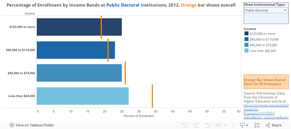
It's not a bad chart, but I found myself taking more time than I thought I should to figure out the story, which is that for-profit institutions enroll far higher percentages of low-income students than public institutions.  (Another problem with this that I can't fix is that the data are not complete; for instance, there is no data on private Baccalaureate or Master's Institutions included in the set.) Additionally, notice the subtle changes in color when you move from the overall category to any of the institutional types. I think that can be confusing.  And finally, as is the case with all stacked bar charts, it's hard to compare middle values.

The biggest problem, though, is that, there are too many things to take in at once. The story can get lost in the chart.

So I did an attempt at a quick visualization, but a small data set (seven columns by five rows) seems to make it harder to get good insight, and I spent a lot more time on this than I thought I would.

This is still not perfect, of course. For instance, it's hard to compare one institutional type to another, unless you have a good memory.  But clicking the drop down box to change the type of institution shown on the bars, and comparing that to the average (orange lines) seems to work pretty well. 

Let me know what you think: Does this make it easier to see the story?


Comments

Popular posts from this blog

The Highly Rejective Colleges

If you're not following Akil Bello on Twitter, you should be.  His timeline is filled with great insights about standardized testing, and he takes great effort to point out racism (both subtle and not-so-subtle) in higher education, all while throwing in references to the Knicks and his daughter Enid, making the experience interesting, compelling, and sometimes, fun. Recently, he created the term " highly rejective colleges " as a more apt description for what are otherwise called "highly selective colleges."  As I've said before, a college that admits 15% of applicants really has a rejections office, not an admissions office.  The term appears to have taken off on Twitter, and I hope it will stick. So I took a look at the highly rejectives (really, that's all I'm going to call them from now on) and found some interesting patterns in the data. Take a look:  The 1,132 four-year, private colleges and universities with admissions data in IPEDS are incl

Freshman Migration, 1986 to 2020

(Note: I discovered that in IPEDS, Penn State Main Campus now reports with "The Pennsylvania State University" as one system.  So when you'd look at things over time, Penn State would have data until 2018, and then The Penn....etc would show up in 2020.  I found out Penn State main campus still reports its own data on the website, so I went there, and edited the IPEDS data by hand.  So if you noticed that error, it should be corrected now, but I'm not sure what I'll do in years going forward.) Freshman migration to and from the states is always a favorite visualization of mine, both because I find it a compelling and interesting topic, and because I had a few breakthroughs with calculated variables the first time I tried to do it. If you're a loyal reader, you know what this shows: The number of freshman and their movement between the states.  And if you're a loyal viewer and you use this for your work in your business, please consider supporting the costs

Doctoral recipients by bachelor's degree-granting institution, 2016-2020

Each time I publish this visualization I get a lot of traffic on the site, and I can see why. It shows all doctoral recipients (in 2016-2020) broken out by where they received their bachelor's degrees.  So, for instance, the top level view shows that UC Berkeley is the alma mater of more doctoral recipients than any other institution, followed by The University of Michigan and Cornell University. That would be interesting, but of course, these are large institutions, and it's natural to think lots of graduates will lead to lots of doctoral degrees.  No surprise there. So the visualization allows you to look at the types of colleges you or your students might want: Select a state, select public or private, select by Carnegie type if you wish.  You can also look at HBCUs if you'd like.  Most important, you can filter by doctoral degree, so if you want to see which institution sends the most students to doctorates in chemistry, you can do so. To head off the questions I get ev