This is a quick and easy little visualization to digest, I hope.
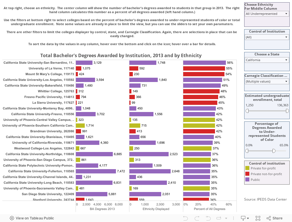
Using IPEDS data, I wanted to look at which colleges graduated the most and the highest percentage students of color. So here it is.
Use the blue control boxes at right to choose a State, Carnegie Classification(s) and Control, whether public, private, and/or for-profit. You can use the sliders if you want to look at schools with a certain size range, or only schools that award a certain percentage of degrees to students of color. The bars are color coded by control.
The left hand column is fixed to show total Bachelor's degrees awarded in 2013. Use the top right box to control what displays in the center and right-hand column, for instance Asian students, or Hispanic Students, or, the default, All Underrepresented Students of Color (Hispanic, African-American, Pacific Islander, Native American, and Two or More Races.) The center column shows the number; the right hand column divides the center by the left to get a percentage. You can also choose White or Asian students, if you wish.
You can sort the institutions by any column just by hovering over the little icon at the bottom near the axis label.
Have fun. Let me know what you find interesting.
Comments
Post a Comment