I've worked at a wide range of colleges and universities in my career: From a tiny little college with lots of adults and transfers and commuters, to a classic liberal arts college, to one of the country's best known and wealthiest colleges, to a place just coming out of financial exigency, to one of the largest private universities in the country. Money, in case you didn't know, makes a difference.
At one of those places, I was docked 18 cents on my first expense report reimbursement, because I had rounded up a tip, making it more than the 15% allowed by college policy. But it was at one of the most heavily endowed colleges in the nation, at least on a per student basis. I remember telling this to my mother, who only remarked, "Well, I guess now you know how they got it."
So today's Chronicle of Higher Education article about the "Huge Explosion of Wealth" and the resultant $37.5 Billion in contributions to colleges and universities last year. And, as you might suspect, the biggest recipient, at an astounding $1.6 Billion, was Harvard.
So, I thought it might be interesting to look at money in higher education to answer my question: Which colleges are raising money on the side, and which investment firms are running colleges on the side?
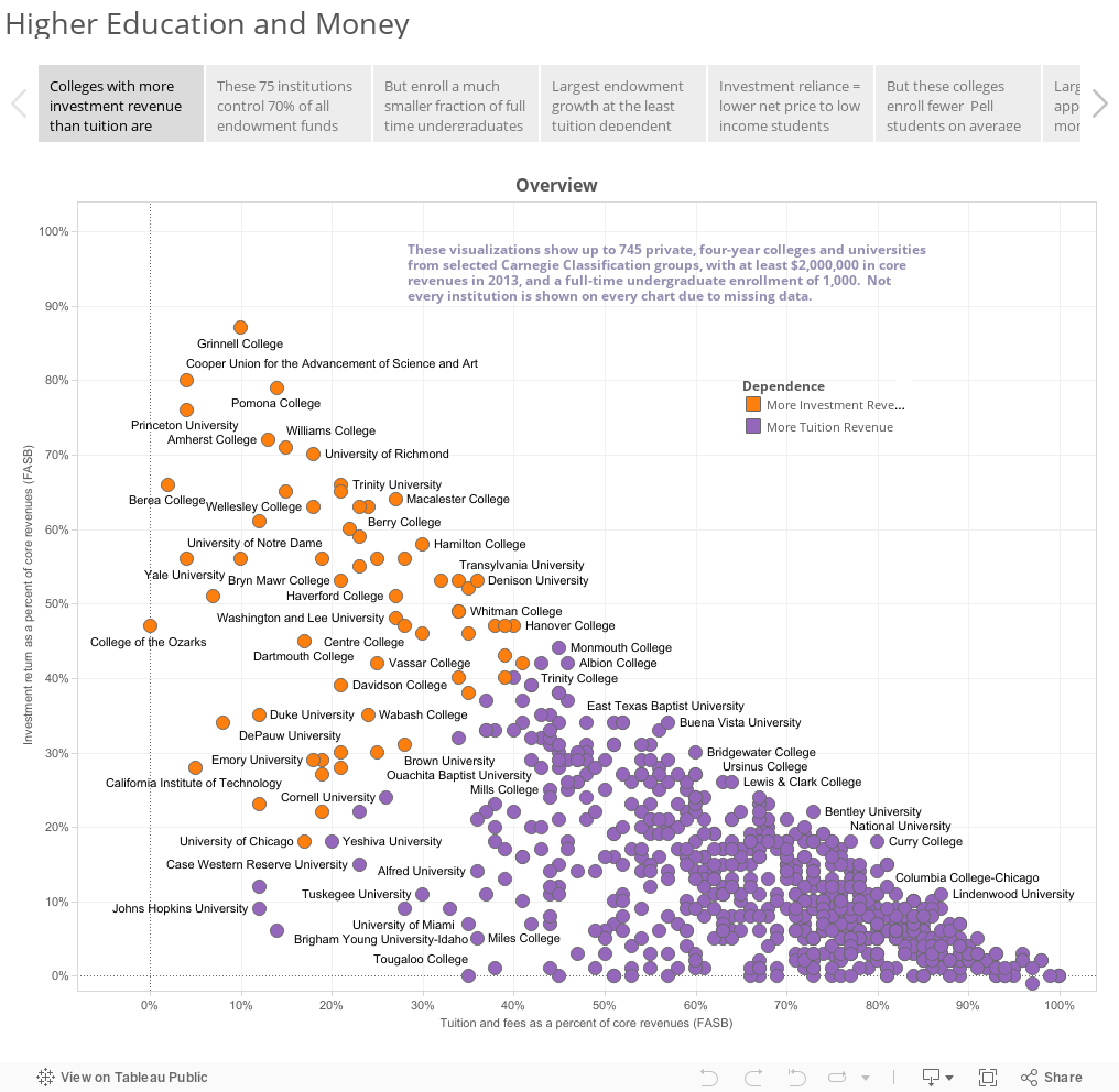
It's below, using Tableau Software's Story Points. Click inside the gray boxes at the top to see a different view of the data set. This starts by breaking these 745 private colleges into two groups: Those who get more revenue from investment return than they get from tuition (orange) and those who get more from tuition than investment return (purple).
This is for a sort of high level flyover; accounting is complicated, and something as simple as growth in endowment can be attributable to a variety of things, such as big gifts or shrewd investment strategies. Not all endowment funds can be spent on financial aid (many of them are restricted) and every university has different missions, and different student bodies (for instance, more graduate students whom you fully fund can get expensive).
But take a look and let me know if you learn anything. And if you tweet this out, I'd appreciate you tagging me @JonBoeckenstedt .
At one of those places, I was docked 18 cents on my first expense report reimbursement, because I had rounded up a tip, making it more than the 15% allowed by college policy. But it was at one of the most heavily endowed colleges in the nation, at least on a per student basis. I remember telling this to my mother, who only remarked, "Well, I guess now you know how they got it."
So today's Chronicle of Higher Education article about the "Huge Explosion of Wealth" and the resultant $37.5 Billion in contributions to colleges and universities last year. And, as you might suspect, the biggest recipient, at an astounding $1.6 Billion, was Harvard.
So, I thought it might be interesting to look at money in higher education to answer my question: Which colleges are raising money on the side, and which investment firms are running colleges on the side?
It's below, using Tableau Software's Story Points. Click inside the gray boxes at the top to see a different view of the data set. This starts by breaking these 745 private colleges into two groups: Those who get more revenue from investment return than they get from tuition (orange) and those who get more from tuition than investment return (purple).
This is for a sort of high level flyover; accounting is complicated, and something as simple as growth in endowment can be attributable to a variety of things, such as big gifts or shrewd investment strategies. Not all endowment funds can be spent on financial aid (many of them are restricted) and every university has different missions, and different student bodies (for instance, more graduate students whom you fully fund can get expensive).
But take a look and let me know if you learn anything. And if you tweet this out, I'd appreciate you tagging me @JonBoeckenstedt .
Comments
Post a Comment