Student Loan defaults make a lot of news, but there is not a lot of understanding about what a default actually is, and there is not good, easily accessible data on default rates, nor a lot of good contextual analysis. But this may help a little.
First, the source of the data is here. You should read it, especially the part about small numbers of students entering payment, or small percentages of students taking loans at a college skewing default rates. You should also know that the definition of a default is being at least 270 days behind on a payment.
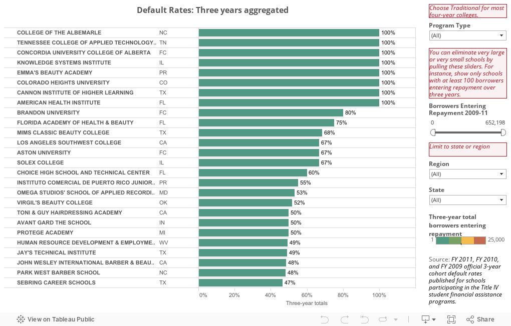
This is not the easiest data to work with. For one thing, the file layout descriptions don't match the file; Financial Aid uses a different ID than IPEDS, and the crosswalk tables that might help you figure out the IPEDS ID (to get a richer view of context) use a different format than this table does. In addition the "Region" doesn't roll up the states in any way I've seen before, and the "Program Type" also puts colleges in categories that don't always make sense. For most four-year institutions, try "Traditional" first in the selector box.
But here it is.
If you want to eliminate the small schools that skew things, you can use the "Borrowers Entering Repayment 2009--11" filter. You can just type the ranges in the boxes and hit enter, or use the sliders. You can also limit to states or region, in any combination.
A reminder that outputs are sometimes actually inputs. If you enroll high ability, wealthy students, and are very selective in admissions, your default rates are going to be lower than other institutions that take more chances on students who come from low-income or less-prepared backgrounds. It would be great if there were a way to recognize the institutions with lower default rates who took more risks.
What jumps out at you?
First, the source of the data is here. You should read it, especially the part about small numbers of students entering payment, or small percentages of students taking loans at a college skewing default rates. You should also know that the definition of a default is being at least 270 days behind on a payment.
This is not the easiest data to work with. For one thing, the file layout descriptions don't match the file; Financial Aid uses a different ID than IPEDS, and the crosswalk tables that might help you figure out the IPEDS ID (to get a richer view of context) use a different format than this table does. In addition the "Region" doesn't roll up the states in any way I've seen before, and the "Program Type" also puts colleges in categories that don't always make sense. For most four-year institutions, try "Traditional" first in the selector box.
But here it is.
If you want to eliminate the small schools that skew things, you can use the "Borrowers Entering Repayment 2009--11" filter. You can just type the ranges in the boxes and hit enter, or use the sliders. You can also limit to states or region, in any combination.
A reminder that outputs are sometimes actually inputs. If you enroll high ability, wealthy students, and are very selective in admissions, your default rates are going to be lower than other institutions that take more chances on students who come from low-income or less-prepared backgrounds. It would be great if there were a way to recognize the institutions with lower default rates who took more risks.
What jumps out at you?
Comments
Post a Comment