I've just finished writing an article for the Chronicle of Higher Education (which is why I haven't posted in a while) talking about our first-generation, low-income student challenge. This chart didn't make the final cut because the article has a lot of charts, and I tried to keep them simple. But I do think it's instructive.
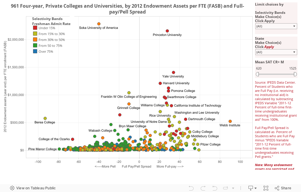
Each dot represents an institution; you can hover over the dot to see details. They're colored by freshman selectivity (red dots mean institutions with a freshman admission rate of under 15%, using 2012 IPEDS data, and green is admit rates between 50% and 75%, for instance.) They are arrayed on two scales: Endowment assets per FTE student enrollment (high to low, from top to bottom) and the Full-pay/Pell Spread. To calculate the Full-pay/Pell Spread, you simply subtract the percentage of undergraduates with Pell Grants from the percentage of all students who receive no institutional aid (also know as full-pay students.) Institutions on the right side of the zero have more full-pay, institutions on the left have more Pell students.
If you want to eliminate some of the noise, use the filters to limit the view. In fact, limiting by mean SAT scores, or by state allows you to see some interesting patterns in the data. Sometimes, what you see is really something else disguised in a more friendly name.
What do you see?
Comments
Post a Comment