College tuition is a hot topic these days, in case you've not noticed. But often, the stories focus on a national perspective: Tuition is up a gazillion percent in ten years, for instance, or average tuition increases last year were 4.9%. Sometimes, big states like California get attention because there are so many students affected by tuition increases (and because 9% of all college students in the US are in California Community Colleges.)
So I took data from the College Board, and looked at it four different ways, to show how the story changes depending on where you live. Each of these four views requires you to choose a type of institution (public four-year, public two-year, or private not-for-profit), and to choose whether you want to look at inflation adjusted tuition or nominal (non adjusted). I recommend inflation-adjusted (unless you're interested in nostalgia) because it gives you a better sense of how much tuition has increased. One view (at the bottom) also allows you to compare over any period of time, by changing the beginning or ending years.
Before beginning, just a caution: Different states have different numbers of private institutions, and varying levels of selectivity among them. I'm not sure the average tuition and fees at private universities in any state is especially meaningful, but I've included it here anyway. The data was free, so ignore it if you agree with me on this point.
And while the story of this post is tuition, there is a sub-context as well: The things that interest me about data visualization. The story you want to tell drives the way you choose to display your data. The corollary, of course, is that the display you choose limits the story you can tell. So choose wisely.
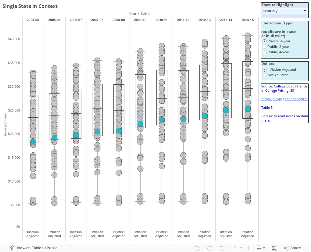
Here's the first. On this you must also choose a focus state, by using the control on the right. The state you select then changes color to show where it ranks among the states.
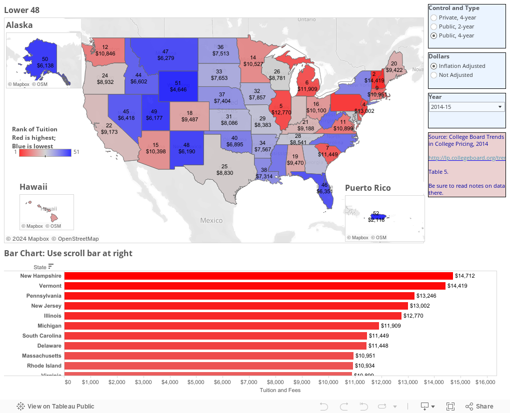
 Next is a view of all the states, with the rank of tuition represented by color. Red is high, blue is low. It gives you a good perspective, I think, on the geographic effect on tuition: Northeast and West Coasts are high, while the middle of the country is low. What you see in rank, though, you miss in spread; you can't tell how much separates #32 and #33, for instance, like you can on the first view. So the bar chart below should help you there.
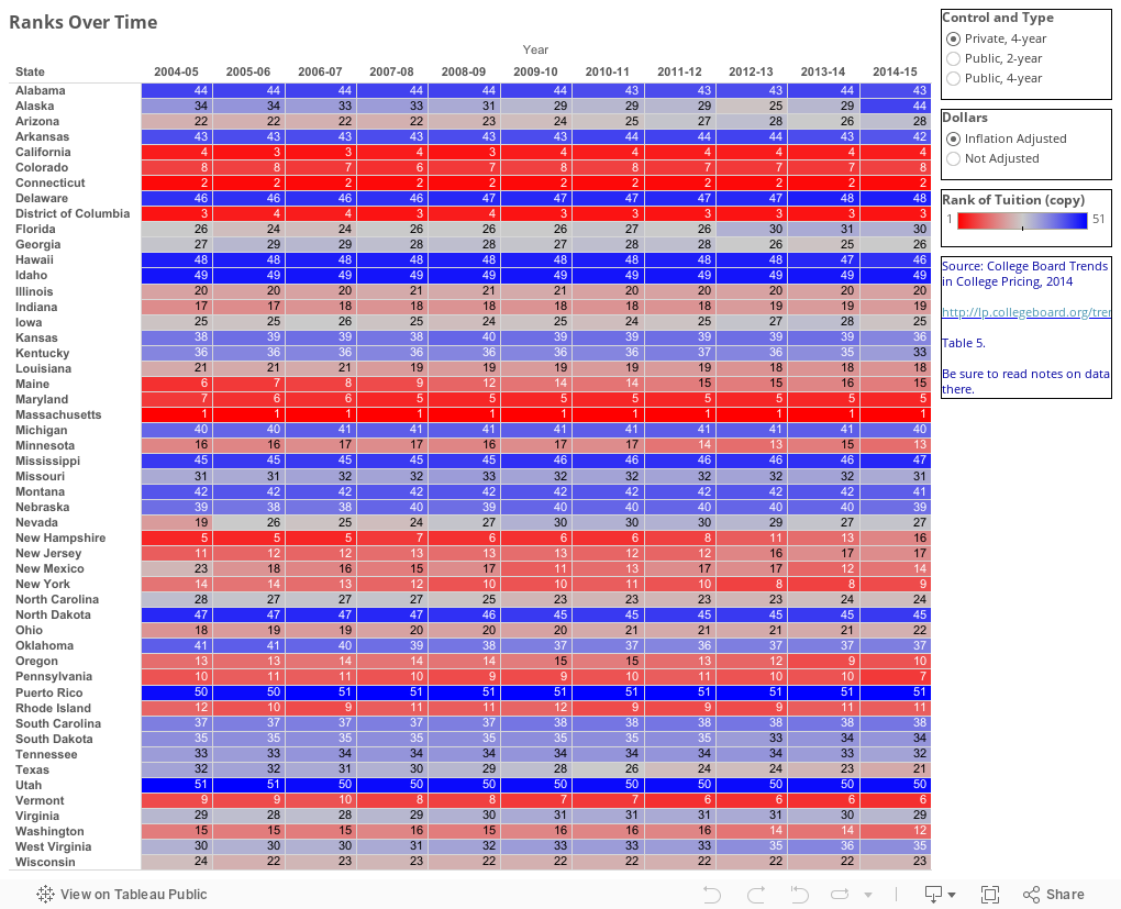
 Next is a heat map; it neither arrays the data on a map to allow the geography, nor tells the spread, but it does show you the entire data set over time, relative to rank: Has any state gone from blue to red, or vice versa (meaning its rank had changed?) Quite the contrary, of course. Most states stay pretty stable in their position relative to each other.
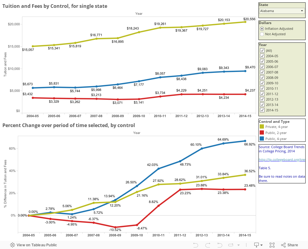
And finally, a good old line chart. See the trends for one state, both with regard to actual dollar amounts for the three different types of institutions, and the percent change over time. The spread between the three different types is most interesting, I think. Compare California to Vermont to Florida to Texas, for instance, to see how those states' philosophies vary. Note that you can change the time window by de-selecting any years to leave just the ones you want.
So I took data from the College Board, and looked at it four different ways, to show how the story changes depending on where you live. Each of these four views requires you to choose a type of institution (public four-year, public two-year, or private not-for-profit), and to choose whether you want to look at inflation adjusted tuition or nominal (non adjusted). I recommend inflation-adjusted (unless you're interested in nostalgia) because it gives you a better sense of how much tuition has increased. One view (at the bottom) also allows you to compare over any period of time, by changing the beginning or ending years.
Before beginning, just a caution: Different states have different numbers of private institutions, and varying levels of selectivity among them. I'm not sure the average tuition and fees at private universities in any state is especially meaningful, but I've included it here anyway. The data was free, so ignore it if you agree with me on this point.
And while the story of this post is tuition, there is a sub-context as well: The things that interest me about data visualization. The story you want to tell drives the way you choose to display your data. The corollary, of course, is that the display you choose limits the story you can tell. So choose wisely.
Here's the first. On this you must also choose a focus state, by using the control on the right. The state you select then changes color to show where it ranks among the states.
And finally, a good old line chart. See the trends for one state, both with regard to actual dollar amounts for the three different types of institutions, and the percent change over time. The spread between the three different types is most interesting, I think. Compare California to Vermont to Florida to Texas, for instance, to see how those states' philosophies vary. Note that you can change the time window by de-selecting any years to leave just the ones you want.
Comments
Post a Comment