Lots of US college students study abroad, and the IIE Open Doors Project has great data about where they go; if you're a member, they graciously make even more detailed data about what colleges and universities they attend.
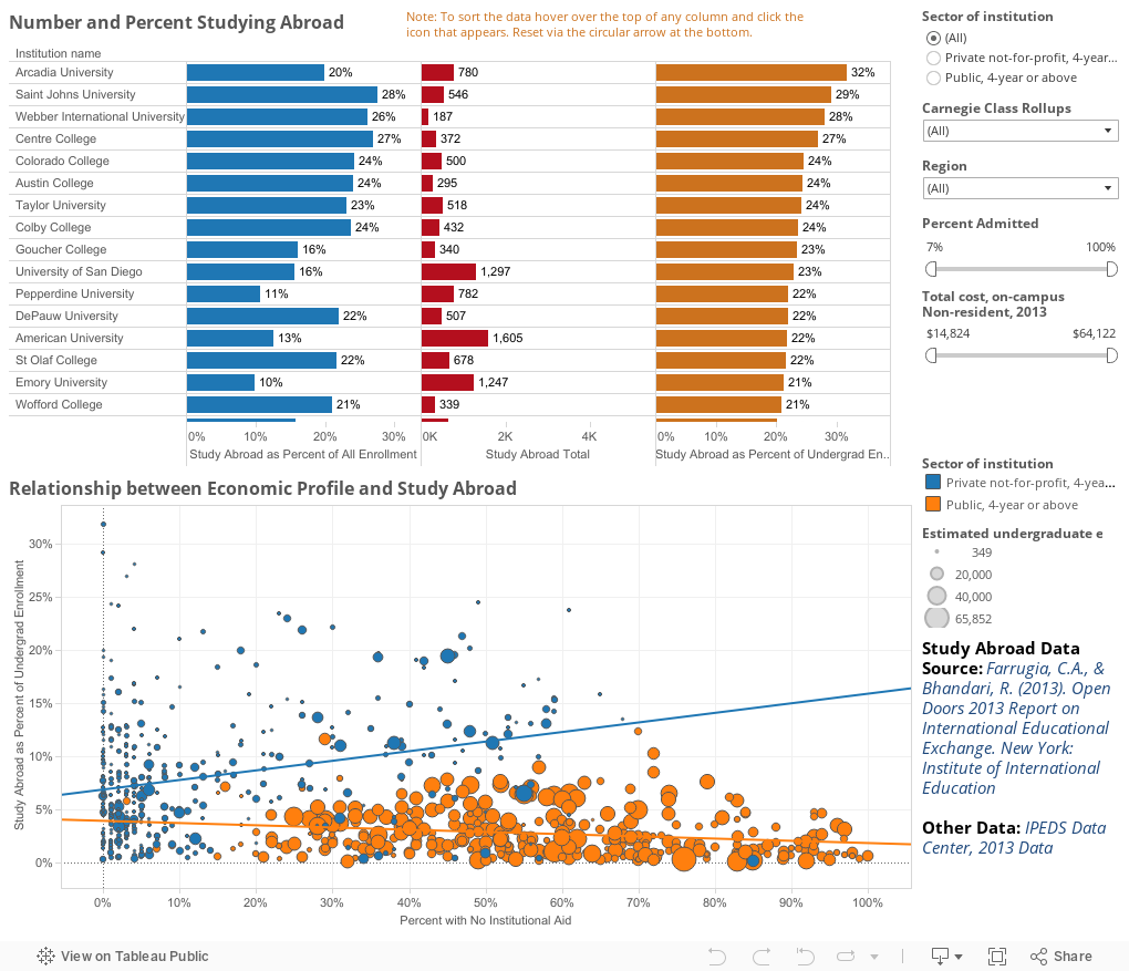
So I took that data and rolled it (from 2012) into my IPEDS data set (from 2013) to see what jumped out at me. On this visualization, you can sort the top chart several ways to see who comes to the top of the list: Alphabetically, by the number of students studying abroad, by the percent of all enrollment or the percent of undergraduate enrollment. Just hover over the top of that column until the small icon pops up, and click on it. It will sort ascending, descending, and alphabetically with subsequent clicks.
Note, I've taken a few institutions out because they are mostly graduate and thus have undergrad/study abroad percentages off the charts.
The bottom chart is more interesting, I think, for the pattern it shows: For public institutions, a higher percentage of freshman with no institutional aid (full pay) translates into a lower percentage of students studying abroad. For private institutions, it's just the opposite. Does that suggest anything to you?
Note: An update. I was asked how this can show an institution sending 15% of its students overseas while that institution claims 50% of its students do so. The IIE data is for a single year, and it does include graduate students, so it's not perfect. Thus, it's possible that 15% study overseas in one year, but over time, half the students at an institution do.
Comments
Post a Comment