This is a great example of how Data Visualization helps tell a story.
First, take a look at this table of data and tell me what you see. I know, right? Not much stands out of a table of black numbers on a white canvas.
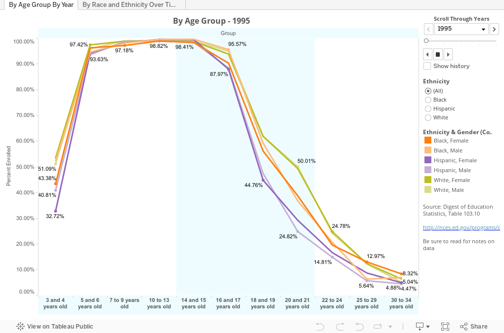
Now look below. It's pretty much the same data (I did not display SME), but it shows you a pattern you see instantly. This is the percent of people by age who are enrolled in any school, from pre-school to graduate programs. On the first view, you see the pattern by age group; each line is a gender/ethnic group (white females, Hispanic males, etc.) Right away, the story jumps out at you. In very early years, white students are enrolled at greater rates. From ages 6-15, things even out, then they split again. (Causality, coincidence, or co-variance with data you don't see?)
The view starts with 1995, but use the slider in the top right corner to scroll through the years. When you do, you'll see the consistency over time is another story element. We've made some, but not enough, progress in getting non-white kids to stay in school in greater numbers.
Another point: African-American and Hispanic women are more likely to be in school in their early 30's than other groups, especially recently.
The second tab shows females and males by age group over time. This time, use the slider to change the age category. What's the story here? Positive trends for almost all groups; but--sorry guys--women are always a couple steps ahead of you. As it is in life, so it is in education.
What else jumps out at you? I'd love to hear your thoughts.
First, take a look at this table of data and tell me what you see. I know, right? Not much stands out of a table of black numbers on a white canvas.
Now look below. It's pretty much the same data (I did not display SME), but it shows you a pattern you see instantly. This is the percent of people by age who are enrolled in any school, from pre-school to graduate programs. On the first view, you see the pattern by age group; each line is a gender/ethnic group (white females, Hispanic males, etc.) Right away, the story jumps out at you. In very early years, white students are enrolled at greater rates. From ages 6-15, things even out, then they split again. (Causality, coincidence, or co-variance with data you don't see?)
The view starts with 1995, but use the slider in the top right corner to scroll through the years. When you do, you'll see the consistency over time is another story element. We've made some, but not enough, progress in getting non-white kids to stay in school in greater numbers.
Another point: African-American and Hispanic women are more likely to be in school in their early 30's than other groups, especially recently.
The second tab shows females and males by age group over time. This time, use the slider to change the age category. What's the story here? Positive trends for almost all groups; but--sorry guys--women are always a couple steps ahead of you. As it is in life, so it is in education.
What else jumps out at you? I'd love to hear your thoughts.
Comments
Post a Comment