Note: The first version of this had a bug; I forgot to add the "Gender" filter to the final view, so everything was showing up at about 3 times the actual value. It's fixed now, with a thanks to Tableau Zen Master Allan Walker of Utah State University for catching it. While I was at it, I added a second view to show differences by gender.
The last time I wrote about the salaries of educators, I said I'd never do it again: There were too many people who didn't know the difference between nominal and constant dollars ("No one made $75,000 in 1980!") and those who didn't understand averages ("How could the average in that state be $60,000? I only make $53,000!").
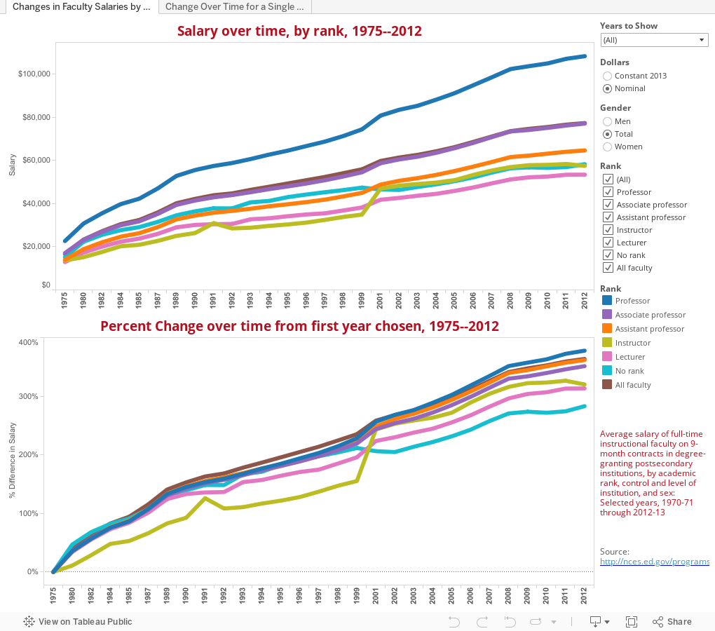
But this is interesting, I think in light of discussions about the rapid increase in tuition over time (in case you've been under a rock recently.) It shows the changes in average (there's that word again) faculty salaries by rank since 1975, in either nominal or constant (inflation adjusted) dollars.
Compare these changes to this and see what you think:
The last time I wrote about the salaries of educators, I said I'd never do it again: There were too many people who didn't know the difference between nominal and constant dollars ("No one made $75,000 in 1980!") and those who didn't understand averages ("How could the average in that state be $60,000? I only make $53,000!").
But this is interesting, I think in light of discussions about the rapid increase in tuition over time (in case you've been under a rock recently.) It shows the changes in average (there's that word again) faculty salaries by rank since 1975, in either nominal or constant (inflation adjusted) dollars.
Compare these changes to this and see what you think:
Comments
Post a Comment