
A DataViz Reboot: WICHE Projections of High School Graduates

A while ago, I used Tableau Software to visualize trends in High School Graduates provided by WICHE.  I think it was good, but with Tableau's new Story Points feature (in which you create pages of the story you want to tell) I think it's an even better story.  If you scroll through these points, you can get a sense of how America has become more diverse, and how those changes vary pretty dramatically by region.  That last point, especially, is often lost on people who talk about changing national demographics.

Just like all politics is local, almost all enrollment is too.

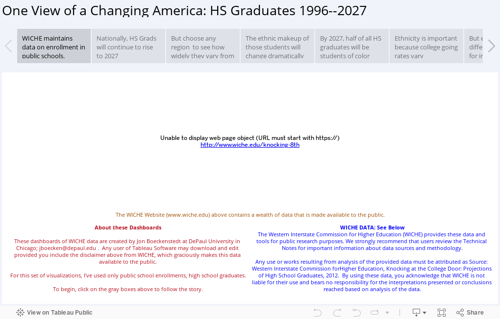
So, first, if you want, look at the old version, then take a look at the new visualization below.  What do you think?


Comments

Popular posts from this blog

Changes in AP Scores, 2022 to 2024

Used to be, with a little work, you could download very detailed data on AP results from the College Board website: For every state, and for every course, you could see performance by ethnicity.  And, if you wanted to dig really deep, you could break out details by private and public schools, and by grade level.  I used to publish the data every couple of years. Those days are gone.  The transparency The College Board touts as a value seems to have its limits, and I understand this to some extent: Racists loved to twist the data using single-factor analysis, and that's not good for a company who is trying to make business inroads with under-represented communities as they cloak their pursuit of revenue as an altruistic push toward access. They still publish data, but as I wrote about in my last post , it's far less detailed; what's more, what is easily accessible is fairly sterile, and what's more detailed seems to be structured in a way that suggests the company doesn...

The Highly Rejective Colleges

If you're not following Akil Bello on Twitter, you should be.  His timeline is filled with great insights about standardized testing, and he takes great effort to point out racism (both subtle and not-so-subtle) in higher education, all while throwing in references to the Knicks and his daughter Enid, making the experience interesting, compelling, and sometimes, fun. Recently, he created the term " highly rejective colleges " as a more apt description for what are otherwise called "highly selective colleges."  As I've said before, a college that admits 15% of applicants really has a rejections office, not an admissions office.  The term appears to have taken off on Twitter, and I hope it will stick. So I took a look at the highly rejectives (really, that's all I'm going to call them from now on) and found some interesting patterns in the data. Take a look:  The 1,132 four-year, private colleges and universities with admissions data in IPEDS are incl...

Changes in SAT Scores after Test-optional

One of the intended consequences of test-optional admission policies at some institutions prior to the COVID-19 pandemic was to raise test scores reported to US News and World Report.  It's rare that you would see a proponent of test-optional admission like me admit that, but to deny it would be foolish. Because I worked at DePaul, which was an early adopter of the approach (at least among large universities), I fielded a lot of calls from colleagues who were considering it, some of whom were explicit in their reasons for doing so.  One person I spoke to came right out at the start of the call: She was only calling, she said, because her provost wanted to know how much they could raise scores if they went test-optional. If I sensed or heard that motivation, I advised people against it.  In those days, the vast majority of students took standardized admission tests like the SAT or ACT, but the percentage of students applying without tests was still relatively small; the ne...