Most everyone who knows anything about our Financial Aid system thinks it needs some improvement. And almost everyone who actually goes through it, it seems, is astonished by the outcome: They expect me to pay how much for college? And that's just for one year?
For those of you who don't know, all federal financial aid begins with the FAFSA, or Free Application for Federal Student Aid. It's a form that collects information about income, assets, and family size in an attempt to estimate how much a family should be able to contribute to the cost of higher education. Should being the operative word. The figure it calculates--EFC, or Expected Family Contribution--is really a misnomer, sort of like the Peacekeeper Missile. It's really just an index number designed to estimate federal expenditures on financial aid programs. Many colleges find it so unreliable that they use another form, such as the College Board's Profile, or their own proprietary form to collect more information.
Many people believe the complexity of these forms causes many low-income students, especially those from immigrant families, to opt out of college. And a new bill has been introduced in Congress to simply the process, by possibly asking only two questions.
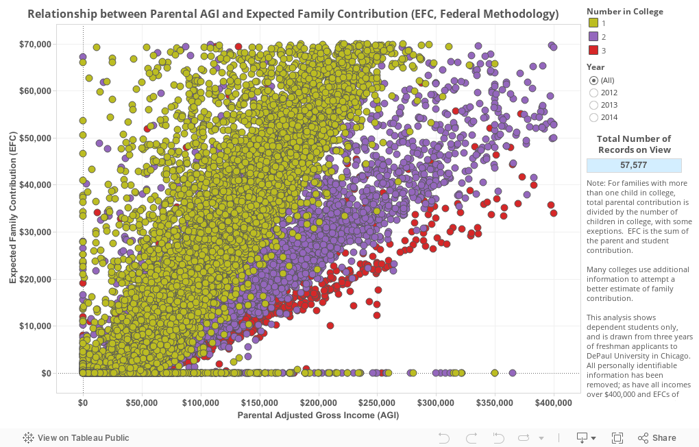
Debate is underway, and you can search it to read about it, but I began to wonder: What if we asked just one question: Parental Adjusted Gross Income. What is the current relationship between AGI and EFC?
I took about 57,000 records from three years of freshmen applicant to DePaul data, and plotted them (after I made them anonymous and created a fake ID number). Then I created a trend line to fit the data, and added confidence intervals to the lines. Note that only about half of the students who apply for admission fill out a FAFSA.
The dots are colored by the number of students in the family in college, which has a affects EFC at any income level. If you want a less cluttered view, select a single year.
What do you think? Could we simplify the process?
For those of you who don't know, all federal financial aid begins with the FAFSA, or Free Application for Federal Student Aid. It's a form that collects information about income, assets, and family size in an attempt to estimate how much a family should be able to contribute to the cost of higher education. Should being the operative word. The figure it calculates--EFC, or Expected Family Contribution--is really a misnomer, sort of like the Peacekeeper Missile. It's really just an index number designed to estimate federal expenditures on financial aid programs. Many colleges find it so unreliable that they use another form, such as the College Board's Profile, or their own proprietary form to collect more information.
Many people believe the complexity of these forms causes many low-income students, especially those from immigrant families, to opt out of college. And a new bill has been introduced in Congress to simply the process, by possibly asking only two questions.
Debate is underway, and you can search it to read about it, but I began to wonder: What if we asked just one question: Parental Adjusted Gross Income. What is the current relationship between AGI and EFC?
I took about 57,000 records from three years of freshmen applicant to DePaul data, and plotted them (after I made them anonymous and created a fake ID number). Then I created a trend line to fit the data, and added confidence intervals to the lines. Note that only about half of the students who apply for admission fill out a FAFSA.
The dots are colored by the number of students in the family in college, which has a affects EFC at any income level. If you want a less cluttered view, select a single year.
What do you think? Could we simplify the process?
Comments
Post a Comment