
COVID and AP Scores

Every year, The College Board releases summaries of the prior year's AP program.  While I've visualized these before (here and here), I've been unwilling to update the visualizations or do longitudinal analysis, for a couple of reasons:  First, the data are in multiple tables in multiple spreadsheets, and they are so heavily formatted for printing that scraping the data out of them is quite a burden.  Second, of course, is that the scores don't change a lot from one year to the next.

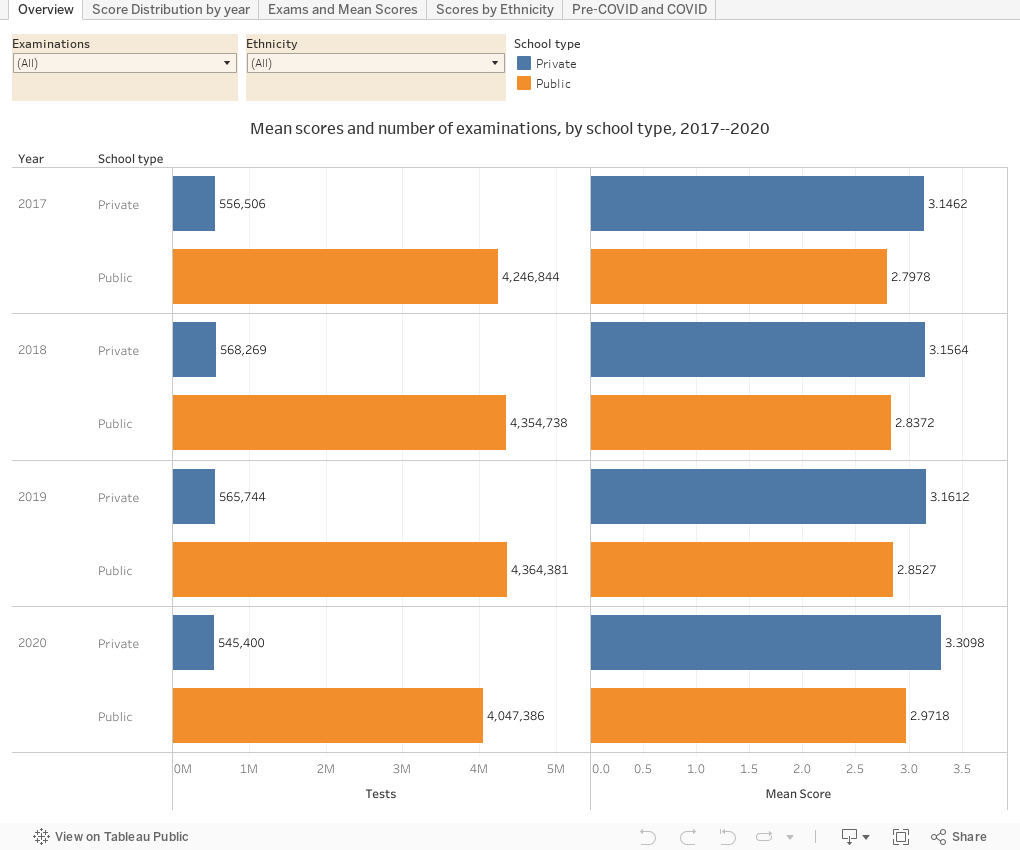
That is, until 2020, when COVID completely turned the world of higher education upside down.  I was interested in seeing how much scores changed from prior years.  As you can see, the changes are interesting, if not completely surprising.

By the way, if you enjoy Higher Ed Data Stories and use it in your work, you can support the web hosting and other costs associated with producing the content by Buying Me A Coffee, here.  If you're a high school teacher or counselor, just ignore and read on for free.

In the past I've been critical of the College Board, and I thought they should have cancelled the tests in 2020, notwithstanding the loss of opportunity it would have meant for thousands of students. And the test results seem to suggest the product in 2020 was not up to snuff.  And, to no one's surprise, the students we thought would be most affected by the pandemic were, in fact, apparently most affected by the pandemic.

A couple of notes about the data: The breakouts of public and private school students are estimates, based on subtracting the public school data from the overall data (the assumption being all schools are either public or private, but not accounting, of course, for home-schooled students, who are most likely in the latter category.)  I've also grouped a few subject exams together (Spanish Literature with Spanish Literature and Culture, and others where there was an apparent name change that may have included some content.)  I used the ethnicity labels College Board supplied, and I kept the awkward ALL CAPS labels on the exams, because well, if it's good enough for them, it's good enough for me.

And finally, let's remember a lot of things come with race/ethnicity, and school types that are not measured in this data: Income, parental attainment, opportunity, and student investment.  Don't jump to easy conclusions about what you see here. (And send a note to College Board and ask them to provide this data in more granular and detailed formats, so we can show that, too.)

These views are all very straightforward, and don't require a lot of explanation.  The last view, however, does break scores into two chunks: A weighted average of 2017--2019, and 2020, so you can see the comparisons of before and after (during COVID).

As always, let me know what you see here.


Comments

Popular posts from this blog

Changes in AP Scores, 2022 to 2024

Used to be, with a little work, you could download very detailed data on AP results from the College Board website: For every state, and for every course, you could see performance by ethnicity.  And, if you wanted to dig really deep, you could break out details by private and public schools, and by grade level.  I used to publish the data every couple of years. Those days are gone.  The transparency The College Board touts as a value seems to have its limits, and I understand this to some extent: Racists loved to twist the data using single-factor analysis, and that's not good for a company who is trying to make business inroads with under-represented communities as they cloak their pursuit of revenue as an altruistic push toward access. They still publish data, but as I wrote about in my last post , it's far less detailed; what's more, what is easily accessible is fairly sterile, and what's more detailed seems to be structured in a way that suggests the company doesn...

Educational Attainment and the Presidential Elections

I've been fascinated for a while by the connection between political leanings and education: The correlation is so strong that I once suggested that perhaps Republicans were so anti-education because, in general, places with a higher percentage of bachelor's degree recipients were more likely to vote for Democrats. The 2024 presidential election puzzled a lot of us in higher education, and perhaps these charts will show you why: We work and probably hang around mostly people with college degrees (or higher).  Our perception is limited. With the 2024 election data just out , I thought I'd take a look at the last three elections and see if the pattern I noticed in 2016 and 2020 held.  Spoiler: It did, mostly. Before you dive into this, a couple of tips: Alaska's data is always reported in a funky way, so just ignore it here.  It's a small state (in population, that is) and it's very red.  It doesn't change the overall trends even if I could figure out how to c...

Changes in SAT Scores after Test-optional

One of the intended consequences of test-optional admission policies at some institutions prior to the COVID-19 pandemic was to raise test scores reported to US News and World Report.  It's rare that you would see a proponent of test-optional admission like me admit that, but to deny it would be foolish. Because I worked at DePaul, which was an early adopter of the approach (at least among large universities), I fielded a lot of calls from colleagues who were considering it, some of whom were explicit in their reasons for doing so.  One person I spoke to came right out at the start of the call: She was only calling, she said, because her provost wanted to know how much they could raise scores if they went test-optional. If I sensed or heard that motivation, I advised people against it.  In those days, the vast majority of students took standardized admission tests like the SAT or ACT, but the percentage of students applying without tests was still relatively small; the ne...