Graduation rates are always a hot topic in higher education, but often for the wrong reason. To demonstrate, I offer my parents. Here is a portrait of Agnes and Mark, married May 4, 1946.

And, despite the Student Affairs perspective that graduation rates are a treatment effect, I maintain that they are actually a selection effect. As I've written about before, it's pretty easy to predict a college's six-year graduation rate if you know one data point: The mean SAT score of the incoming class. That's because the SAT rolls a lot of predictive factors into one index number. These include academic preparation, parental attainment, ethnicity, and wealth, on the student side, and selectivity, on the college side.
When a college doesn't have to--or chooses not to--take many risks in the admissions process, they tend to select those students who are more likely to graduate. That skews the incoming class wealthier (Asian and Caucasian populations have the highest income levels in America), higher ability (the SAT is a good proxy for some measure of academic achievement, and often measures academic opportunity), and second generation. And when you combine all those things--or you select so few poor students you can afford to fund them fully--guess what? Graduation rates go up.
If this doesn't make any sense, read the Blueberry Speech. Or ask yourself this question: If 100 MIT students enrolled at your local community college, what percentage would graduate?
But graduation rates are still interesting to look at, once you have that context. The visualization below contains three views, using the tabs across the top. You'll have to make a few clicks to get the information you need.
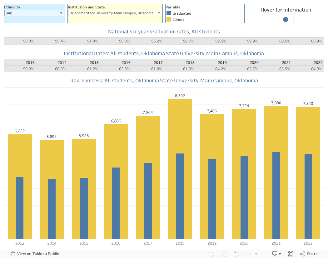
The first view (Single Group) starts with a randomly selected institution, Oklahoma State. Choose your institution of choice by clicking on the box and typing any part of the name, and selecting the institution.
On the yellow bars, you see the entering cohorts in yellow, and the number of graduating students on the blue bars. Note: The blue bars show graduates in the year shown (so, 4,755, which you can see by hovering over the bar) while the yellow bar shows the entering class from six years prior (7,406 in 2019, who entered in 2013).
The top row shows graduation rates at all institutions nationally, and the second row shows percentages for the selected institution. You can choose any single ethnicity at the top left, using the filter.
The second view (Single Institution) shows all ethnicities at a single institution. The randomly selected demonstration institution is Gustavus Adolphus College in Minnesota, but of course you can choose any institution in the data set. Highlight a single ethnic group using the highlight function (I know some people are frightened of interacting with these visualizations....you can't break anything).
Note: I start with a minimum of 10 students in each year's cohorts for the sake of clarity. Small schools in the Northeast, for instance, might enroll one Asian/Pacific Islander in their incoming class, each year, so the graduation rate could swing wildly from 0% to 100%. You can change this if you want to live dangerously, by pulling the slider downward.
The final view (Sectors) shows aggregates of institutional types. It starts with graduation rates for Hispanic/Latino students, but you can change it to any group you want.
Have fun learning about graduation rates. Just don't assume they are mostly driven by what happens at the institution once the admissions office has its say.
Comments
Post a Comment