This is a companion piece to my last blogpost about enrollment gaps for men and women in US postsecondary education, and it covers another angle of that discussion. In that post, I talked a little bit about the fact that the trend is a long one, and not a new phenomenon, and casually suggested a few reasons for it (TLDR: Higher education does better when the economy is worse, and there are more opportunities for young men without college degrees in the labor market when the economy heats up.) It's just a theory, of course, and might be completely wrong.
What really caught my eye in the WSJ article was this section:
The gender enrollment disparity among nonprofit colleges is widest at private four-year schools, where the proportion of women during the 2020-21 school year grew to an average of 61%, a record high, Clearinghouse data show. Some of the schools extend offers to a higher percentage of male applicants, trying to get a closer balance of men and women.
“Is there a thumb on the scale for boys? Absolutely,” said Jennifer Delahunty, a college enrollment consultant who previously led the admissions offices at Kenyon College in Gambier, Ohio, and Lewis & Clark College in Portland, Ore. “The question is, is that right or wrong?”
Ms. Delahunty said this kind of tacit affirmative action for boys has become “higher education’s dirty little secret,” practiced but not publicly acknowledged by many private universities where the gender balance has gone off-kilter.
“It’s unfortunate that we’re not giving this issue air and sun so that we can start to address it,” she said.
Neither is this a new idea. In fact, this piece in the New York Times written by Ms. Delahunty says the same thing.
But is it, you know, true?
You might be surprised. But, when you see the data and think about it, you'll probably say, "Well, duh." ("Duh" is what I say when I realize I should have realized something right away; your results may vary.)
Promo: If you like Higher Ed Data Stories and use it in your job, you can support the effort by buying me a coffee (or a beer, or web hosting, as the case may be) via a click here. Public and private high school counselors should always use this site guilt-free, for free, for ever.
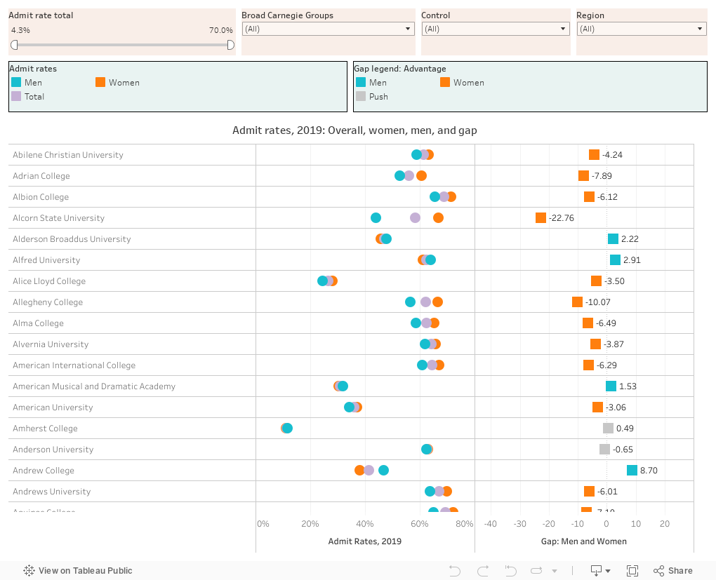
I've visualized data from 2019 admissions results in IPEDS, below. For the sake of clarity, I limited this group to colleges that a) accept both men and women, b) received at least 500 applications, c) enrolled at least 100 students, d) admitted 70% of applicants or less, and e) had a ratio of applications to seats of at least 5:1. That eliminates quite a few of the distracting outliers.
Are you ready to be surprised? OK. You're going to have to interact to do so.
First, scroll down in the default view. You'll see color-coded admit rates as circles for men (teal), women (orange) and the overall rate on the left. You'll see the gap between men and women on the right as a color-coded square. Orange on the right indicates women are admitted at higher rates than men; teal indicates men are admitted at a higher rate; gray indicates a push, that is, a difference of less than 1.5 percentage points. As you scroll down, I bet you'll see a lot more orange than teal. Hmmm.
Well, let's try public universities, by selecting "Public" in the "Control" box. Huh. Same thing.
OK, go back to all and change that selection to "Private, not-for-profit." Still more orange, no? Well, damn.
We'll find it. In the slider filter at top left, pull the right slider down to about 25%. Well, that's interesting, isn't it? There's more gray (mostly equal) but if there is an advantage, it seems to go to men. If there are highly rejectives with a higher admit rate for women, they seem to be the Cal Techs and the MITs and the Carnegie Mellons of the world, places with lots of science and tech and engineering.
OK, let's get crazy. Reset everything, via the control at the bottom right, using the arrow pointing to the left that touches the line. Then, choose private, not-for-profit, and pull that slider down to 30% or so, and choose New England and Mid-East in the region boxes.
More teal, right? Here's your duh moment. When the Wall Street Journal, and the New York Times, and the Washington post talk about "college" what they mean is private, highly rejective colleges in the northeastern part of the country.
That's it. Never forget it. They're the ones who have the warped perception of reality, not you. And yes, at those places, men often have an advantage in admissions, just like the wealthy, and the children of college-educated parents, and alumni and other connected people have advantages.
The question is, why do we still act surprised?
Comments
Post a Comment