In eighth grade, a teacher introduced my class to the Statistical Abstract of the United States, and it changed the way I looked at numbers and information. Of course, in those days, it was just a book, and very hard to interact with. But I still remember poring over it, absorbing interesting, if arcane, facts about the country and its regions. Ever since, I've been fascinated with reference books like it.
Then, sometime about 2005, I came across the Census Atlas of the United States, and my mind was blown even more. It contains page after page of maps, representing gobs of data, visualized in a way that tells stories, sometimes with a single picture. One map, especially, made an impression on me. It's in this chapter, page 14 of the chapter, page 40 of the book, showing Prevalent Asian Group, by county. If you can't download that large .pdf file, it's below:

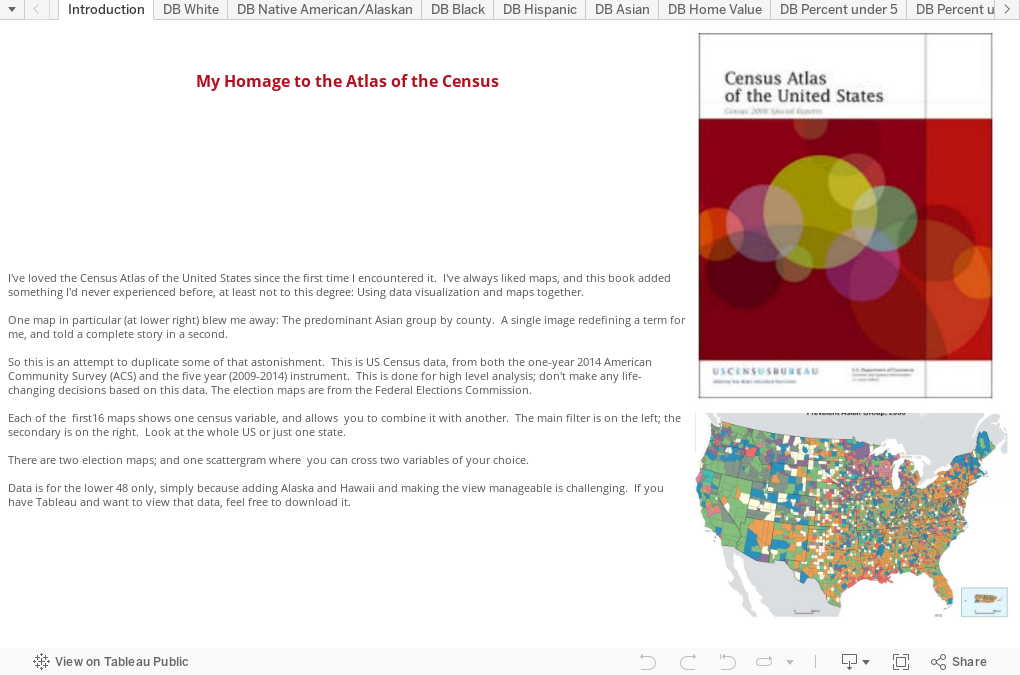
Then, sometime about 2005, I came across the Census Atlas of the United States, and my mind was blown even more. It contains page after page of maps, representing gobs of data, visualized in a way that tells stories, sometimes with a single picture. One map, especially, made an impression on me. It's in this chapter, page 14 of the chapter, page 40 of the book, showing Prevalent Asian Group, by county. If you can't download that large .pdf file, it's below:

In my job, and in higher education in general, we think about race and ethnicity a lot, of course, but here was something that exploded and challenged the status quo and made me think differently: "Asian," was not a monolithic term. Far from it.
That day, I bought a copy of the Atlas, and always pick it up when I see it. It's astonishing, I think, and I still discover something new every time I spend some time with it.
I've wanted to do my own mini-version for a long time, but the thing that makes it hard is getting at Census Bureau data. It's either very hard to extract, or rolled up in ways that don't inspire further analysis. But I did come across a file that was accessible and fairly easy to work with, with data on a lot of factors at the US county level. And I started working on it.
This includes 19 maps: The first 16 show US counties, colored by the variable indicated. In the heading is the US average. For instance, about 66.2% of the US population is "White alone." All maps are color coded with that center value as the center point. Check the legend.
You can look at the whole US or just a state; unfortunately, adding Alaska and Hawaii makes it hard and time consuming to get the maps to look good. If you have Tableau, you can download this and look at it yourself.
The maps have data filters on them too. So if you're looking at the view with percent of adults with a high school diploma, for instance, you can pull the slider up or down to show only those counties with very high or very low values. On each map, I've also added a somewhat-random second slider, so you can see combinations of variables. On the high school graduates one, for instance, you can also look at population density. See which counties have high/high, high/low, or low/low combinations. Play around.
Additionally, there are three other views: Two showing 2012 presidential election results, and one scatter-gram, where you can cross any two variables, and see the relationships between them.
If you work in my job, you might find interesting data that can help you understand how--and why--your distant markets are different than your local ones. Or maybe it's just fun to play with.
Either way, I hope you enjoy it. I'd love to hear what you discover.
Comments
Post a Comment