Note: A few people have pointed out that some data on this appears to be slightly askew, even though the story is mostly unchanged. So don't cite it.
Don't look at the viz yet. Wait until I tell you.
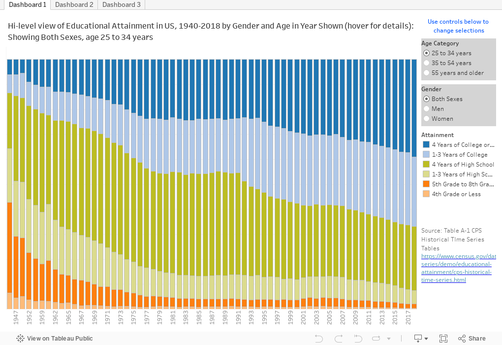
This is an update to a post I did about five years ago, showing the growth in educational attainment in the US over time. I thought then, and I still think, it's among the most jaw-dropping visualizations I've done, not, of course, for the visualization skills, but for the story it tells, and perhaps, the future it holds for us. This is from Table A-1 on this page of the Census Bureau.
First, before you dive into it, take a guess about the percentage of adults in the US, aged 35-54 with a bachelor's degree or higher. Got a guess? If you have a college degree, you probably said something like fifty or sixty percent, based on my sampling of twenty people or so. If you didn't, your guess is probably much lower, usually ten or fifteen percent. There's a lesson there, in itself.
The answer: 38%. You're probably surprised, either way.
Now, what was it in 1940? Got an guess in your head? The answer: Just under 5%. Yes. You read that right.
In fact, in 1940, the largest group of people in that age range had an education that ended in the 5th to 8th grade. When combined with the people who had less than a fifth grade education, you were looking at well over half the population.
OK, now you can play with the visualization. There are three views, using the tabs along the top.
Dashboard 1 shows the population in a column in stacked bars, colored by highest educational attainment. Look at what happened to the blues, representing a bachelor's degree or greater (dark blue) and some college (light blue). (Technically, the dark blue is "four years of college or more, but close enough.) Choose a gender or an age range if you wish to change the view.
Dashboard 2 shows you custom views: Choose the educational attainment using the control at right, and limit it to one gender if you wish; the lines are colored by age groups.
Dashboard 3 is just the opposite and is the more interesting of the last two, I think: Colored by gender, and filterable by age, once you select the attainment level.
The incredible post-war economic expansion in the US that lasted until the turn of the 21st century coincided with a substantial increase in educational attainment, especially for women. You can try to offer explanations about cause and effect if you wish. And you can extrapolate about our current disinvestment in education and what it might mean for the future. It could be a long, slow, spiral downward. And as you speculate, take a look at how counties with lower and higher levels of education voted in the 2016 presidential election.
Let me know what strikes you in the comments, below.
Don't look at the viz yet. Wait until I tell you.
This is an update to a post I did about five years ago, showing the growth in educational attainment in the US over time. I thought then, and I still think, it's among the most jaw-dropping visualizations I've done, not, of course, for the visualization skills, but for the story it tells, and perhaps, the future it holds for us. This is from Table A-1 on this page of the Census Bureau.
First, before you dive into it, take a guess about the percentage of adults in the US, aged 35-54 with a bachelor's degree or higher. Got a guess? If you have a college degree, you probably said something like fifty or sixty percent, based on my sampling of twenty people or so. If you didn't, your guess is probably much lower, usually ten or fifteen percent. There's a lesson there, in itself.
The answer: 38%. You're probably surprised, either way.
Now, what was it in 1940? Got an guess in your head? The answer: Just under 5%. Yes. You read that right.
In fact, in 1940, the largest group of people in that age range had an education that ended in the 5th to 8th grade. When combined with the people who had less than a fifth grade education, you were looking at well over half the population.
OK, now you can play with the visualization. There are three views, using the tabs along the top.
Dashboard 1 shows the population in a column in stacked bars, colored by highest educational attainment. Look at what happened to the blues, representing a bachelor's degree or greater (dark blue) and some college (light blue). (Technically, the dark blue is "four years of college or more, but close enough.) Choose a gender or an age range if you wish to change the view.
Dashboard 2 shows you custom views: Choose the educational attainment using the control at right, and limit it to one gender if you wish; the lines are colored by age groups.
Dashboard 3 is just the opposite and is the more interesting of the last two, I think: Colored by gender, and filterable by age, once you select the attainment level.
The incredible post-war economic expansion in the US that lasted until the turn of the 21st century coincided with a substantial increase in educational attainment, especially for women. You can try to offer explanations about cause and effect if you wish. And you can extrapolate about our current disinvestment in education and what it might mean for the future. It could be a long, slow, spiral downward. And as you speculate, take a look at how counties with lower and higher levels of education voted in the 2016 presidential election.
Let me know what strikes you in the comments, below.
Reminder: I appreciate support for webhosting and other costs associated with creating Higher Ed Data Stories. You can support these efforts here.
Comments
Post a Comment