Frankly, the data are a little boring when you first try to visualize them. When you're looking at the number of degrees awarded by discipline and by state, California, Texas, and New York win pretty much everything. That's no surprise, of course, as they're the largest states with the most college students.
So I broke it into regions, thinking there must be some differences in the degrees awarded in different parts of the country. Nope. The Middle Atlantic wins. That's where the people are.
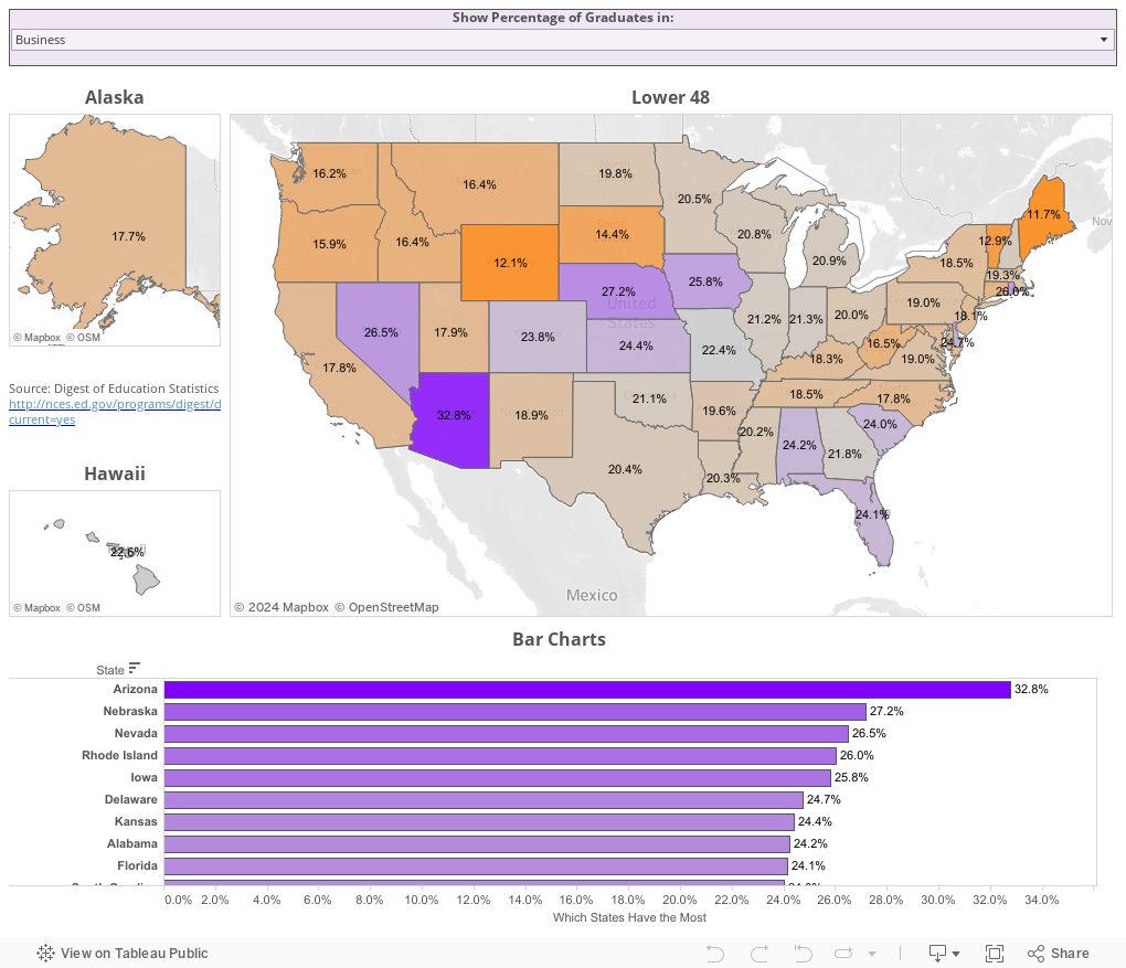
Finally, I looked at each state by the percentage of degrees in certain fields, and voila! Something interesting. Different states award different types of degrees in dramatically different proportions. Some of this can be answered easily: A high percentage of business and computer science degrees in Arizona is driven by the University of Phoenix, but others are not so obvious. Why is there such disparity when you look at humanities, engineering, or health professions?
To interact, just select the type of degree in the purple box at the top. It starts with business, but you can choose anything. The maps and the bar charts will update to show each state, and the percentage of bachelor's degrees in that state in the discipline selected.
Any explanations?
So I broke it into regions, thinking there must be some differences in the degrees awarded in different parts of the country. Nope. The Middle Atlantic wins. That's where the people are.
Finally, I looked at each state by the percentage of degrees in certain fields, and voila! Something interesting. Different states award different types of degrees in dramatically different proportions. Some of this can be answered easily: A high percentage of business and computer science degrees in Arizona is driven by the University of Phoenix, but others are not so obvious. Why is there such disparity when you look at humanities, engineering, or health professions?
To interact, just select the type of degree in the purple box at the top. It starts with business, but you can choose anything. The maps and the bar charts will update to show each state, and the percentage of bachelor's degrees in that state in the discipline selected.
Any explanations?
Comments
Post a Comment