
How many colleges are there anyway? Version 2022

I've always been fascinated by the idea of "colleges."  We think we know what we mean when we say it, but do we really?

When some people say "college" they might mean any four-year college that enrolls undergraduates.  Others might mean everything except for-profit colleges.  Do you include community colleges in your group?  Some people do, and others don't.

And of course, I'd be remiss if I didn't point out that when some major news outlets talk about "college" they are really talking about the 15 or  50 institutions their readers or listeners fascinate over.

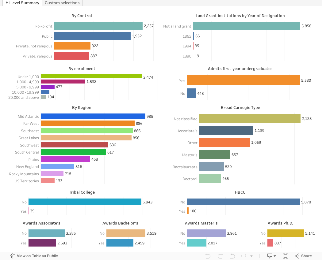
Well, now you can see the answer.  Sort of.  I started with IPEDS data, which includes all post-secondary institutions that receive Title IV aid.  There are many institutions in the US that don't and although they can report to IPEDS, they are not required to, and many don't.

But if we start with all the IPEDS institutions that enrolled at least one student in 2022, you get 5,978.  And that's where the fun begins.  

There are two quick views here.

The first view (using the tabs across the top) shows several common ways of breaking colleges into groups: By region, Carnegie type, and control, for instance.  It's not interactive, but you can see how your concept of colleges might be too small.

The second tab makes up in interactivity what the first tab missed.  Use any of the filters to filter to the number based on your definition: Some of the filters are discrete, some are numeric ranges.  Any combination is fine, and the pink bar will update automatically with the new count.  Be sure to read the instructions at the bottom about how to use the discrete filters.

Anything jump out at you here? Leave a comment below.

Comments

Popular posts from this blog

Educational Attainment and the Presidential Elections

I've been fascinated for a while by the connection between political leanings and education: The correlation is so strong that I once suggested that perhaps Republicans were so anti-education because, in general, places with a higher percentage of bachelor's degree recipients were more likely to vote for Democrats. The 2024 presidential election puzzled a lot of us in higher education, and perhaps these charts will show you why: We work and probably hang around mostly people with college degrees (or higher).  Our perception is limited. With the 2024 election data just out , I thought I'd take a look at the last three elections and see if the pattern I noticed in 2016 and 2020 held.  Spoiler: It did, mostly. Before you dive into this, a couple of tips: Alaska's data is always reported in a funky way, so just ignore it here.  It's a small state (in population, that is) and it's very red.  It doesn't change the overall trends even if I could figure out how to c...

First-year student (freshman) migration, 2022

A new approach to freshman migration, which is always a popular post on Higher Ed Data Stories. If you're a regular reader, you can go right to the visualization and start interacting with it.  And I can't stress enough: You need to use the controls and click away to get the most from these visualizations. If you're new, this post focuses on one of the most interesting data elements in IPEDS: The geographic origins of first-year (freshman) students over time.  My data set includes institutions in the 50 states and DC.  It includes four-year public and four-year, private not-for-profits that participate in Title IV programs; and it includes traditional institutions using the Carnegie classification (Doctoral, Masters, Baccalaureate, and Special Focus Schools in business, engineering, and art/design. Data from other institutions is noisy and often unreliable, or (in the case of colleges in Puerto Rico, American Samoa, and other territories, often shows close to 100% of enro...

Education Levels in the US, by State and Attainment

Attainment has always been an interesting topic for me, every since I first got stunned into disbelief when I looked at the data over time.  Even looking at shorter periods can lead to some revelations that many don't make sense at first. Here is the latest data from NCES, published in the Digest of Education Statistics . Please note that this is for informational purposes only, and I've not even attempted to visualize the standard errors in this data, which vary from state-to-state.  There are four views year, all looking at educational attainment by state in 2012 and 2022.   The first shows data on a map: Choose the year, and choose the level of attainment.  Note that the top three categories can be confusing: BA means a Bachelor's degree only; Grad degree means at least a Master's (or higher, of course); and BA or more presumably combines those two.  Again, standard errors might mean the numbers don't always add up perfectly. The second shows the data o...