I've been creating this data visualization, or some form of it, for several years now. I think it's most useful for higher education enrollment professionals who have to explain to people at their university why their yield rate is falling. The short answer is that applications and admits are increasing faster than student populations: If a student today applies to an average of seven colleges, compared to four colleges twenty years ago, yield rate almost has to go down. I'm sure AI will fix this, and all our problems, very soon.
But I've spoken to others who use this other ways: To work with students to talk about chances for admission; to show parents how things have changed in the past twenty years; or to help journalists understand the lay of the land. Whatever you use this for, I hope it's instructive, and I hope you feel free to share it widely.
And if you work in a college or university and save yourself some time by using this, or if you work with clients on a for-fee basis, I appreciate your support of the software and webhosting costs of Higher Ed Data Stories. You can buy me a coffee here to show your support (if you're a high school counselor, just ignore this request; you should always consider your use of the site cost-free and guilt-free).
There are four views of the data, using the tabs across the top.
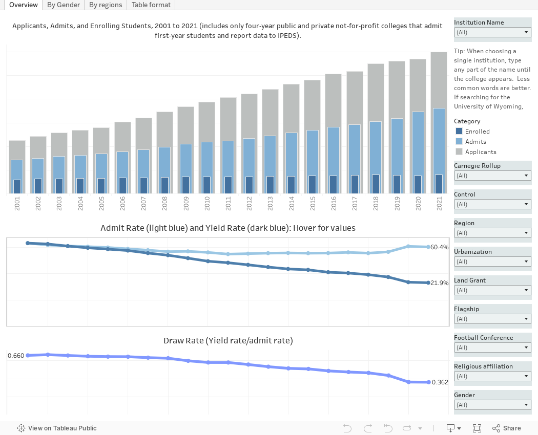
Overview shows applications, admits, and enrolling students on the bar charts; and admit rate, yield rate, and draw rates on the lines at the bottom. Draw rate (yield rate/admit rate) is a better indicator of market power, for a lot of reasons I've discussed elsewhere; in short, you can manipulate admit rate, but draw rate is generally much harder to do. (Generally does not always mean "always.") You can look up the data of a single institution, or select subsets of the university of colleges shown, which is about 1,500 four-year, public and private not-for-profit institutions that admit first year students and report admissions data (if your institution is open admission, that data is not reported to IPEDS which is where I got the data.)
By Gender shows admit rates for men and women, along with the totals. If the admit rate is over 50%, differences are less pronounced, so the x-axis only goes that high. Choose a year to show changes.
By Regions breaks out several values (choose one at top left) for public and private colleges and universities by region. Again, choose a year, and limit the data using the filters at right.
And the last view, Table Format, shows the data looking like a spreadsheet for those of you who don't like charts (you know who you are.) The filters work the same, and as the note indicates, you should limit the number of years you select to ensure the table is legible.
Let me know if you spot anything of interest. Ask your IR office if your data seems wrong.
Thanks for reading.
Comments
Post a Comment