You know I love this data set of freshman migration patterns over time. It shows every college in two year increments, and contains the state-by-state makeup of the freshman class. I like it for a couple of reasons: First, it's interesting in its own right to see where colleges attract students from. I think students can use it too, to see how geographically diverse the colleges they're looking at really are.
But beyond that, there are so many questions you can pose this data and come away with some insight. Previously, I've visualized this data several times, most recently here, with a focus on helping high school and independent counselors add a layer of information to student choice sets. This time, I think it might be of interest to enrollment management people and perhaps state policy makers. Or anyone who finds this interesting.
If you find Higher Ed Data Stories helpful in your work and you're not a high school counselor, you can support the cost of building and hosting this site by buying me a coffee, here.
The data are easy. Getting it all on one chart can be hard, as you'll see. And I kid you not, as I was typing just now, I thought of a new dashboard to add. So I'm going to add an eighth view to this.
OK, done. Here are the views:
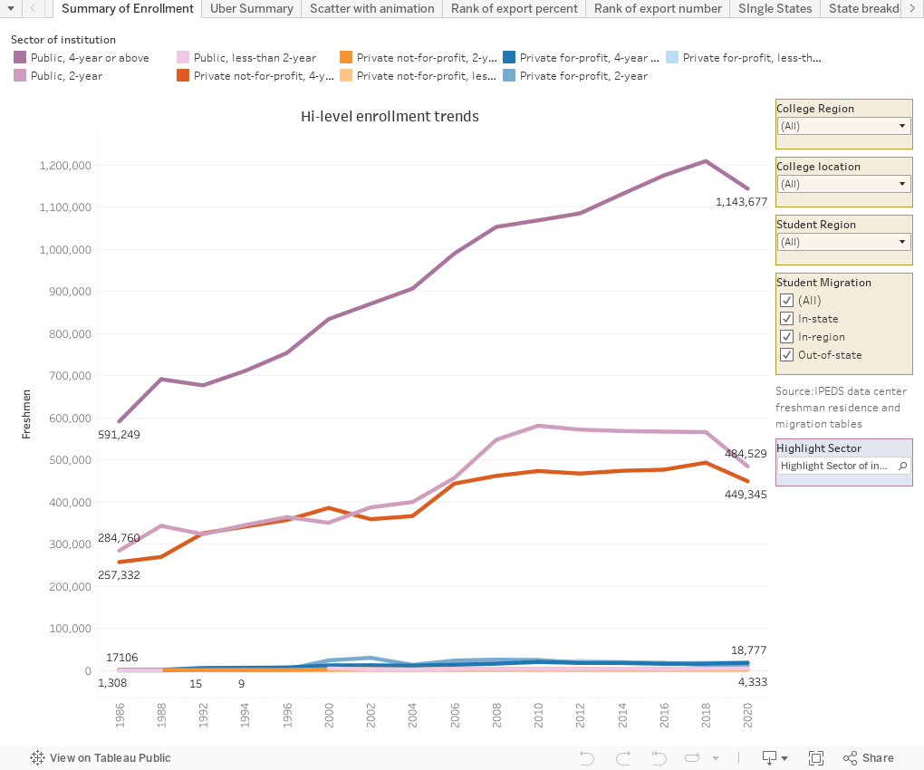
Summary of enrollment shows the highest level view of freshman enrollment over time (with the understanding that the data in this set is for freshmen who enrolled within twelve months of high school graduation.) Use the filters at right to view only types of student migration, or college or student regions, to see how those patterns differ. Use the Highlight Selector to emphasize one sector.
Uber Summary contains a lot of information. At left are overall patterns (the view starts with the US). Choose a state using the filter if you wish; at far left are destinations by type. You can see that in most years about 2/3 of all students enroll at a public institution in-state (the yellow bars). Hover for more detail. The columns break that data out even more. You can see, for instance, that in 2018, 48.49% of all students nationally who enrolled out-of-state but in region enrolled in a four-year private college. The interest comes when you look at different states.
Scatter with animation shows each state plotted by its rank among the states in two dimensions: How many students (number) it exports, and what percentage of all students from that state the number represents. Click through the arrows to animate over time, and I think you'll be surprised by how stable things appear to be. By way of example, in 1996, Minnesota ranked 18th in number of exports, and 15th in percentage of exports.
Rank of export percent looks like a red hot mess, until you use the Highlight box at the top. See how your chosen state fares over time on the percentage of freshmen it sends out-of-state.
Rank of export number is the same chart, but ranking raw numbers.
Single state allows you to see a state over time, with the total number of freshmen from that state (in gray) along with the number who stayed and the number who left.
State breakdown shows destinations of students by control, and Carnegie types. After you choose a state of interest using the filter, and select the year, you can click on any bar and use that as a filter as well.
For-profits and non-residents shows how for-profit institutions have fared over time. As you've seen from the previous charts, not a lot of freshmen who go to college within 12 months of graduation attend for-profits, so this is almost inconsequential. However, what was surprising to me was the number of students these colleges attracted from out-of-state: An all-time record in 2020, despite COVID.
If you work in EM, you can use this to see how receptive that new market you're eyeing really is to colleges like yours. If you work in higher ed policy in your state, you might find this compelling as you talk to people in your state house. And if you work in a university but not in admissions, you might find that you don't make big changes overnight, and maybe those new markets aren't as attractive as you think they might be.
As always, leave me a not below with the things you find interesting.
Comments
Post a Comment