(Note: I discovered that in IPEDS, Penn State Main Campus now reports with "The Pennsylvania State University" as one system. So when you'd look at things over time, Penn State would have data until 2018, and then The Penn....etc would show up in 2020. I found out Penn State main campus still reports its own data on the website, so I went there, and edited the IPEDS data by hand. So if you noticed that error, it should be corrected now, but I'm not sure what I'll do in years going forward.)
Freshman migration to and from the states is always a favorite visualization of mine, both because I find it a compelling and interesting topic, and because I had a few breakthroughs with calculated variables the first time I tried to do it.
If you're a loyal reader, you know what this shows: The number of freshman and their movement between the states. And if you're a loyal viewer and you use this for your work in your business, please consider supporting the costs of this blog by buying me a beer or coffee, by clicking here. (If you're a high school counselor or work for another non-profit, please ignore this.)
There are eight views using the tabs across the top:
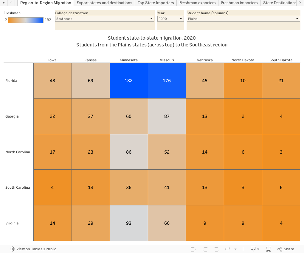
Region-to-region: Make three selections to get a high level view, using the controls: The year, the region students are leaving, and the region they're heading to. You'll see all the combinations of states and the number of students on that path. As with all the views, hover over a point for an explanation. Also, at lower right is a reset button if you get stuck.
Export states and destinations: Pick a year. The bar chart shows the states and the percentage of freshmen from that state who go to another state for college. Click on the bar of any state, and the table at the bottom updates to show you where they went. I you want to look at a paticular type of college, the filters in the middle of the view help with that.
Top State Importers: This starts off by showing every state, descending by the total number of students it imports (New York is the top importer, followed by California, for instance). The charts shows you where those students come from. If you only want to look at one state and a different year, just click.
Freshman exporters: This puts all the states in one view, to show both the percentage of students who leave, and the number who do. Click on the right arrows to animate (apparently there is too much data to run it as an automatic automation.)
Freshman importers: Same idea, in reverse.
State destinations: To which states do students go when the leave a particular state? This gives you the full view. Pick any year.
The final two views show specific colleges:
Percent by home state over time: Choose a college and whatever states are of interest to you. The view starts with Macalester College in Minnesota, and shows California, Illinois, and Minnesota. Choose any college and any state(s). (FYI, not all colleges report data in all years, even though IPEDS says it's required in even number years. And there are mistakes in the data; every time I do this I need to move Harvard's 221 students from Arkansas to California in 2012. I seem to recall Northwestern was kind of funky one year, too.)
Compare two colleges: Choose any two colleges in any two years to see the make up of their freshman classes to compare. You can do two colleges in the same year (as shown); one college in any two years, or mix them up and get crazy. You can't break this.
A reminder: I am glad people are enthusiastic about my visualizations, but I don't do requests. If you'd like to see a different view, IPEDS has all the data for you. My schedule doesn't permit responding to requests for custom views.
As always, let me know what you see or find interesting here.
Comments
Post a Comment