
A look at the states: Ethnicity and Age

 As is often the case, this started with some work I was doing anyway regarding a question someone asked me about different states and public universities and how the composition of the student body mirrored or varied from the population in general.  That will probably come about later, but for now, a look at just the population.

With a few exceptions, most of the enrollment at your institution is driven by geography; the majority of your enrollment will come from within 500 miles of  your campus. (The exception might be states like Texas, where I once looked at data for a private university and told them that--from a geodemographic standpoint, their top three markets were Texas, Texas, and Texas.)

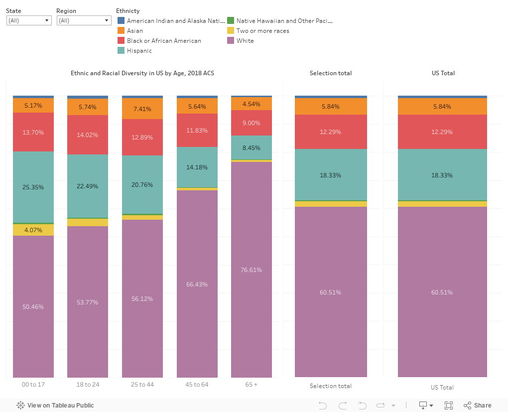
In addition, though, age is a confounding factor.  In the US, as you look at older populations, you get more white people; as you look at younger populations, you see more diversity.  Thus, it's not just the makeup of the state; it's the makeup of the people in the state who are mostly likely to go to college we might want to look at.  So, here we go.

This is pretty easy: It starts with the makeup of the entire US population; the five bars on the left show breakouts by age.  The sixth bar shows the overall composition of the selection you've made, and the seventh shows the entire US as a comparison.  It does not change.

Choose a state, or choose a region to change the six bars on the left.  Some suggestions to see how regions vary, and how they vary over time: West Virginia, California, Minnesota, and Florida.)  Once I get a reasonable set of flagships and land grants in all the states, I may do some comparisons.

A note about the data: This is from the Census Bureau's table creator, using 2018 American Community Survey data. It' notoriously hard to use, and the data are extraordinarily hard to visualize given the formats of the output.  But some spot checks suggest this is correct.  The extraction process requires you to export Hispanic and non-Hispanic populations separately in order to keep your sanity.  For the Hispanic populations, I rolled all the races into just the "Hispanic" category to follow the convention of higher education reporting.  As we know, race and ethnicity in America are complicated; the link above can get you what you want.  Have at it.

As always, let me know what you see here that looks interesting, compelling (or wrong).


Comments

Popular posts from this blog

Educational Attainment and the Presidential Elections

I've been fascinated for a while by the connection between political leanings and education: The correlation is so strong that I once suggested that perhaps Republicans were so anti-education because, in general, places with a higher percentage of bachelor's degree recipients were more likely to vote for Democrats. The 2024 presidential election puzzled a lot of us in higher education, and perhaps these charts will show you why: We work and probably hang around mostly people with college degrees (or higher).  Our perception is limited. With the 2024 election data just out , I thought I'd take a look at the last three elections and see if the pattern I noticed in 2016 and 2020 held.  Spoiler: It did, mostly. Before you dive into this, a couple of tips: Alaska's data is always reported in a funky way, so just ignore it here.  It's a small state (in population, that is) and it's very red.  It doesn't change the overall trends even if I could figure out how to c...

Changes in AP Scores, 2022 to 2024

Used to be, with a little work, you could download very detailed data on AP results from the College Board website: For every state, and for every course, you could see performance by ethnicity.  And, if you wanted to dig really deep, you could break out details by private and public schools, and by grade level.  I used to publish the data every couple of years. Those days are gone.  The transparency The College Board touts as a value seems to have its limits, and I understand this to some extent: Racists loved to twist the data using single-factor analysis, and that's not good for a company who is trying to make business inroads with under-represented communities as they cloak their pursuit of revenue as an altruistic push toward access. They still publish data, but as I wrote about in my last post , it's far less detailed; what's more, what is easily accessible is fairly sterile, and what's more detailed seems to be structured in a way that suggests the company doesn...

The Highly Rejective Colleges

If you're not following Akil Bello on Twitter, you should be.  His timeline is filled with great insights about standardized testing, and he takes great effort to point out racism (both subtle and not-so-subtle) in higher education, all while throwing in references to the Knicks and his daughter Enid, making the experience interesting, compelling, and sometimes, fun. Recently, he created the term " highly rejective colleges " as a more apt description for what are otherwise called "highly selective colleges."  As I've said before, a college that admits 15% of applicants really has a rejections office, not an admissions office.  The term appears to have taken off on Twitter, and I hope it will stick. So I took a look at the highly rejectives (really, that's all I'm going to call them from now on) and found some interesting patterns in the data. Take a look:  The 1,132 four-year, private colleges and universities with admissions data in IPEDS are incl...