
The Highly Rejective Colleges

If you're not following Akil Bello on Twitter, you should be.  His timeline is filled with great insights about standardized testing, and he takes great effort to point out racism (both subtle and not-so-subtle) in higher education, all while throwing in references to the Knicks and his daughter Enid, making the experience interesting, compelling, and sometimes, fun.

Recently, he created the term "highly rejective colleges" as a more apt description for what are otherwise called "highly selective colleges."  As I've said before, a college that admits 15% of applicants really has a rejections office, not an admissions office.  The term appears to have taken off on Twitter, and I hope it will stick.

So I took a look at the highly rejectives (really, that's all I'm going to call them from now on) and found some interesting patterns in the data.

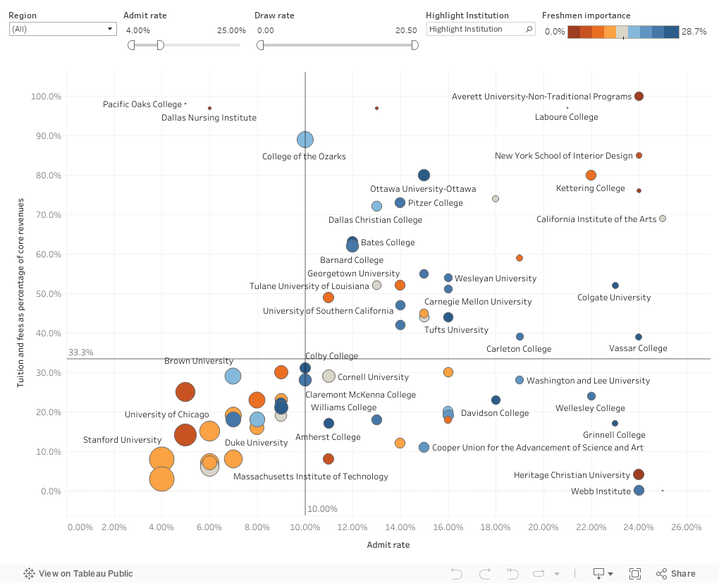
Take a look:  The 1,132 four-year, private colleges and universities with admissions data in IPEDS are included here, but this initial view is filtered down to just 70, all with an admit rate at or below 25%.  To make it interesting, I plotted admit rate (x-axis) against the percentage of core revenues from tuition and fees.  Then, I sized the bubbles by the draw rate, and colored by what I call "freshman importance."

A few words about those points:

Admit rate means the percentage of freshman applicants offered admission.  (If you want to narrow or broaden this, use the filter at the top).

Percentage of core revenue from tuition and fees is just that.  In IPEDS, it's defined as "revenues from all tuition and fees assessed against students (net of refunds and discounts and allowances) for educational purposes." Core Revenues do not include hospital revenues, but do include research dollars.  Essentially, it tells you where a college gets the revenue it needs to operate.

Draw rate is yield rate/admit rate.  It's a measure of market power.  Stanford's is 20; the national average is about 0.4.  It's a better indicator than selectivity.

And freshman importance is the size of the freshman class divided by total headcount enrollment.  You'd think this might be close to about 25% at most liberal arts colleges, but at major research universities, it's much lower. 

Look especially at the lower left of this chart.  These are all the names you know:  They all have admit rates below 10%; all get less than a third of core revenues from tuition and fees, are large (that is, large draw rates), and are more likely to be orange (where freshman are of lesser importance to the overall enterprise.)  If you want to find an institution, type part of its name in the Highlight Box.  Hover over a dot for details.

Think about the implications of those variables, and think about how much the April admissions press releases mean to the reputation of these institutions, and then ask yourself if this makes sense.

(I bet you'll think not.)  As always, let me know if you have questions or spot anything especially interesting.

Reminder: I appreciate support for webhosting and other costs associated with creating Higher Ed Data Stories.  You can support these efforts here.


Comments

Popular posts from this blog

Educational Attainment and the Presidential Elections

I've been fascinated for a while by the connection between political leanings and education: The correlation is so strong that I once suggested that perhaps Republicans were so anti-education because, in general, places with a higher percentage of bachelor's degree recipients were more likely to vote for Democrats. The 2024 presidential election puzzled a lot of us in higher education, and perhaps these charts will show you why: We work and probably hang around mostly people with college degrees (or higher).  Our perception is limited. With the 2024 election data just out , I thought I'd take a look at the last three elections and see if the pattern I noticed in 2016 and 2020 held.  Spoiler: It did, mostly. Before you dive into this, a couple of tips: Alaska's data is always reported in a funky way, so just ignore it here.  It's a small state (in population, that is) and it's very red.  It doesn't change the overall trends even if I could figure out how to c...

First-year student (freshman) migration, 2022

A new approach to freshman migration, which is always a popular post on Higher Ed Data Stories. If you're a regular reader, you can go right to the visualization and start interacting with it.  And I can't stress enough: You need to use the controls and click away to get the most from these visualizations. If you're new, this post focuses on one of the most interesting data elements in IPEDS: The geographic origins of first-year (freshman) students over time.  My data set includes institutions in the 50 states and DC.  It includes four-year public and four-year, private not-for-profits that participate in Title IV programs; and it includes traditional institutions using the Carnegie classification (Doctoral, Masters, Baccalaureate, and Special Focus Schools in business, engineering, and art/design. Data from other institutions is noisy and often unreliable, or (in the case of colleges in Puerto Rico, American Samoa, and other territories, often shows close to 100% of enro...

Education Levels in the US, by State and Attainment

Attainment has always been an interesting topic for me, every since I first got stunned into disbelief when I looked at the data over time.  Even looking at shorter periods can lead to some revelations that many don't make sense at first. Here is the latest data from NCES, published in the Digest of Education Statistics . Please note that this is for informational purposes only, and I've not even attempted to visualize the standard errors in this data, which vary from state-to-state.  There are four views year, all looking at educational attainment by state in 2012 and 2022.   The first shows data on a map: Choose the year, and choose the level of attainment.  Note that the top three categories can be confusing: BA means a Bachelor's degree only; Grad degree means at least a Master's (or higher, of course); and BA or more presumably combines those two.  Again, standard errors might mean the numbers don't always add up perfectly. The second shows the data o...