
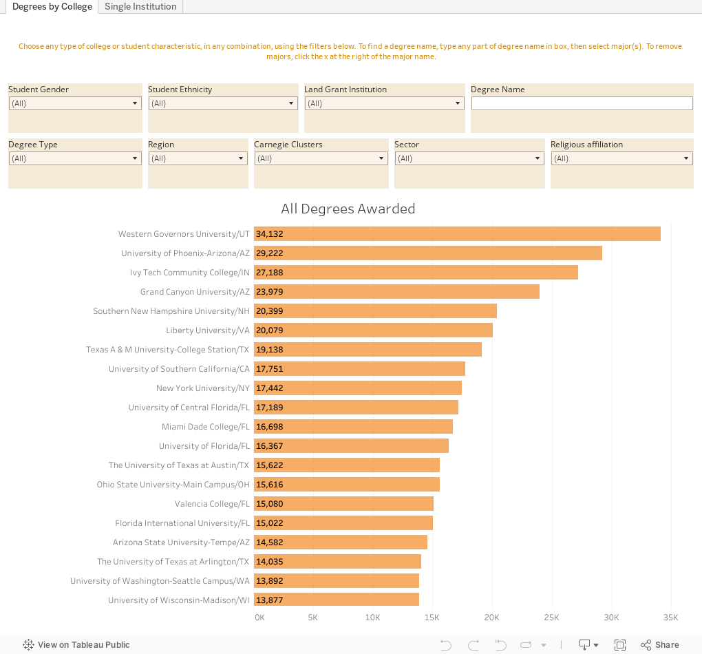
All Degrees Awarded by US Colleges and Universities, 2019

 The question often asked by high school and independent counselors is something like, "What college offers degrees in <insert major name>.  While this can't help you know what colleges offer a specific degree, it can tell you which colleges awarded those degrees in 2019.

It can also help you see the shape of degrees awarded in the US, and even dive deeper into a specific college to see what types of degrees 

It's pretty straight-forward, but there are also some features you need to be aware of.  If you know how to Tableau, go ahead and dive right in.

The first view using the tabs across the top shows all degrees awarded by US colleges in 2019.  From there, you can choose any specific combination of student and college characteristics: For instance, if you want to find which institutions award the most bachelor's degrees at public universities in the southwest, just click.  If you then want to find which of those colleges offer the most degrees in History, just start typing "history" in the box at upper right.

You'll see lots of options, including general history, military history, Asian history, and many others. Click the boxes to choose the ones you want.

If you make all those choices and select "General History" you'll see that UT-Austin leads the pack with 147.

To clear the degree name, click the X to the right of it in the filter.

The second view starts with the high-level overview.  Choose a single institution by typing any part of the name in the Institution Name box.  It works just like the major box on the first view.  Once you have that college selected, you can filter further by clicking on a bar in any of the other charts.  Give it a try; clear by clicking on white space.

As always, let me know what you find.

Comments

Popular posts from this blog

Educational Attainment and the Presidential Elections

I've been fascinated for a while by the connection between political leanings and education: The correlation is so strong that I once suggested that perhaps Republicans were so anti-education because, in general, places with a higher percentage of bachelor's degree recipients were more likely to vote for Democrats. The 2024 presidential election puzzled a lot of us in higher education, and perhaps these charts will show you why: We work and probably hang around mostly people with college degrees (or higher).  Our perception is limited. With the 2024 election data just out , I thought I'd take a look at the last three elections and see if the pattern I noticed in 2016 and 2020 held.  Spoiler: It did, mostly. Before you dive into this, a couple of tips: Alaska's data is always reported in a funky way, so just ignore it here.  It's a small state (in population, that is) and it's very red.  It doesn't change the overall trends even if I could figure out how to c...

First-year student (freshman) migration, 2022

A new approach to freshman migration, which is always a popular post on Higher Ed Data Stories. If you're a regular reader, you can go right to the visualization and start interacting with it.  And I can't stress enough: You need to use the controls and click away to get the most from these visualizations. If you're new, this post focuses on one of the most interesting data elements in IPEDS: The geographic origins of first-year (freshman) students over time.  My data set includes institutions in the 50 states and DC.  It includes four-year public and four-year, private not-for-profits that participate in Title IV programs; and it includes traditional institutions using the Carnegie classification (Doctoral, Masters, Baccalaureate, and Special Focus Schools in business, engineering, and art/design. Data from other institutions is noisy and often unreliable, or (in the case of colleges in Puerto Rico, American Samoa, and other territories, often shows close to 100% of enro...

Changes in Educational Attainment, 1940 to 2018

Note: A few people have pointed out that some data on this appears to be slightly askew, even though the story is mostly unchanged.  So don't cite it. Don't look at the viz yet.  Wait until I tell you. This is an update to a post I did about five years ago , showing the growth in educational attainment in the US over time. I thought then, and I still think, it's among the most jaw-dropping visualizations I've done, not, of course, for the visualization skills, but for the story it tells, and perhaps, the future it holds for us. This is from Table A-1 on this page of the Census Bureau. First, before you dive into it, take a guess about the percentage of adults in the US, aged 35-54 with a bachelor's degree or higher.  Got a guess?  If  you have a college degree, you probably said something like fifty or sixty percent, based on my sampling of twenty people or so.  If you didn't, your guess is probably much lower, usually ten or fifteen percent.  T...