
Yes, your yield rate is still falling, v 2019

 You know the drill.  For the past few years, I've updated this with new data as soon as IPEDS releases it.  Well, the Fall, 2019 admissions data is out, and I could have written this even before I visualized it.

Your yield rate is falling.  Probably.

It's falling because a) you tried to look like Harvard, so you thought generating more applications and lowering your admit rate would make you look more like them.  Because you thought that's why people liked Harvard.  Or, you felt bad about yourself, and you wanted to be able to brag to your colleagues.

So you spent a lot of money generating more applications.  And you dropped your admit rate. Probably. A bit.  But here's the thing: The number of students going to college in each year is a pretty consistent percentage of the high school graduates, give or take.  And if every graduate applies to one more college, well, they can still only attend one in the end.  Boom.  Your yield rate drops.

And so does your draw rate.  The draw rate is a function of your real market power: If you decrease your admit rate, but you do so by generating a lot of soft apps, your yield will fall (see above).  So draw rate is really the thing to look at it see if the market thinks more or less of you today than it did years ago: Measure your draw rate against your peer group.

The draw rate is falling, too.  Unless, of course, you're one of the brand name schools.  Then it's going up.  So all the money spent on trying to look more selective has been--to some extent--a fool's game.  By emphasizing selectivity as a measure of something valuable, you've made the truly selective institutions more attractive. (And, of course, not doing so while everyone else around you might have made it even worse, just to be clear; it's the rate race of competition that has led us here, not your individual decisions to try to keep up.)

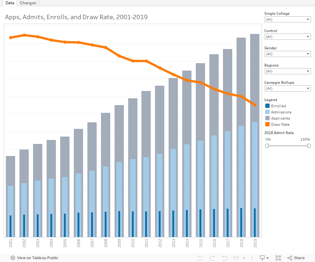
This shows two views: The first one shows apps, admits, and enrolls over time on the bars, along with draw rate (orange line).  Us the filters to look at data by college control, region, Carnegie type, or gender on the application (which is still binary in the federal data set).  Or, if you want, select an institution.

The second view shows changes over time.  You can make the same choices here, and you can choose to highlight one line for emphasis.

As always, let me know if this helps, or if you find anything of interest.

Reminder: I appreciate support for webhosting and other costs associated with creating Higher Ed Data Stories.  You can support these efforts here.


Comments

Popular posts from this blog

Educational Attainment and the Presidential Elections

I've been fascinated for a while by the connection between political leanings and education: The correlation is so strong that I once suggested that perhaps Republicans were so anti-education because, in general, places with a higher percentage of bachelor's degree recipients were more likely to vote for Democrats. The 2024 presidential election puzzled a lot of us in higher education, and perhaps these charts will show you why: We work and probably hang around mostly people with college degrees (or higher).  Our perception is limited. With the 2024 election data just out , I thought I'd take a look at the last three elections and see if the pattern I noticed in 2016 and 2020 held.  Spoiler: It did, mostly. Before you dive into this, a couple of tips: Alaska's data is always reported in a funky way, so just ignore it here.  It's a small state (in population, that is) and it's very red.  It doesn't change the overall trends even if I could figure out how to c...

Changes in AP Scores, 2022 to 2024

Used to be, with a little work, you could download very detailed data on AP results from the College Board website: For every state, and for every course, you could see performance by ethnicity.  And, if you wanted to dig really deep, you could break out details by private and public schools, and by grade level.  I used to publish the data every couple of years. Those days are gone.  The transparency The College Board touts as a value seems to have its limits, and I understand this to some extent: Racists loved to twist the data using single-factor analysis, and that's not good for a company who is trying to make business inroads with under-represented communities as they cloak their pursuit of revenue as an altruistic push toward access. They still publish data, but as I wrote about in my last post , it's far less detailed; what's more, what is easily accessible is fairly sterile, and what's more detailed seems to be structured in a way that suggests the company doesn...

The Highly Rejective Colleges

If you're not following Akil Bello on Twitter, you should be.  His timeline is filled with great insights about standardized testing, and he takes great effort to point out racism (both subtle and not-so-subtle) in higher education, all while throwing in references to the Knicks and his daughter Enid, making the experience interesting, compelling, and sometimes, fun. Recently, he created the term " highly rejective colleges " as a more apt description for what are otherwise called "highly selective colleges."  As I've said before, a college that admits 15% of applicants really has a rejections office, not an admissions office.  The term appears to have taken off on Twitter, and I hope it will stick. So I took a look at the highly rejectives (really, that's all I'm going to call them from now on) and found some interesting patterns in the data. Take a look:  The 1,132 four-year, private colleges and universities with admissions data in IPEDS are incl...