The US Department of Education has released the 2016 Cohort Default Rates, and it's always an interesting data set to play with, as it contains three years of data each time it's released.
This year's data is no exception, and I've taken the liberty of visualizing it to make it easy to get to the information, and to dive down deeper if you want. But first, you may want to take a look at the website and read about what, exactly, is being measured. Here's a detailed description of how these numbers are calculated, and you can take a look at the whole online publication here if you'd prefer.
It's also important to take a look at these as part input, part output. That is, going to a particular college does not cause a student to default; some colleges (especially some for-profit institutions) enroll students with considerably less academic preparation who are less likely to graduate in the first place, and thus may end up with no degree and no suitable job to pay the loans back.
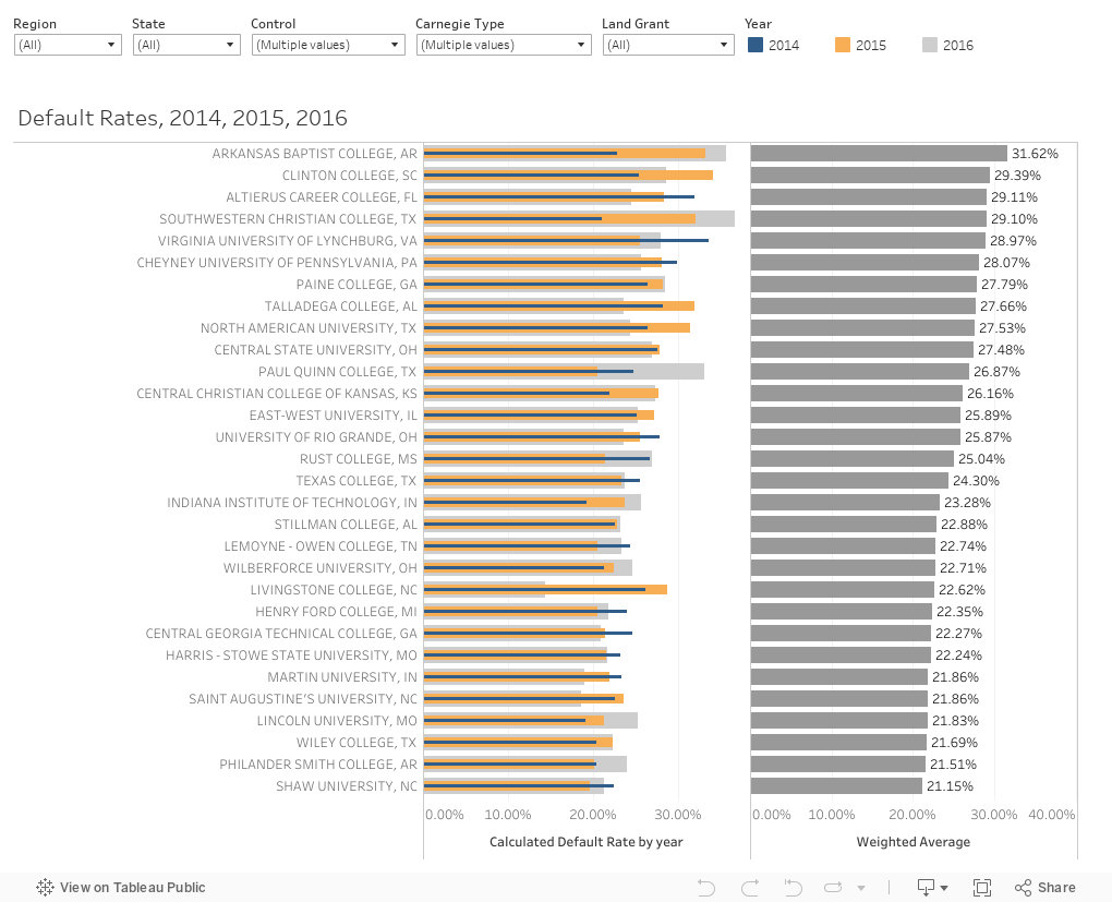
The view contains (on the left) the default rates for each institution for three years (color-coded, and as always, hover for details), and, on the right, the three year weighted average, which is used to sort institutions from highest to lowest. The view starts with just Doctoral, Master's and Baccalaureate institutions included, and just public and private, for-profit colleges and universities. You can easily change that with the click of a few filters to get just the views you want; for instance, you might choose to see only New England, or only Texas, or only community colleges.
Let me know what jumps out at you by leaving a comment, below.
This year's data is no exception, and I've taken the liberty of visualizing it to make it easy to get to the information, and to dive down deeper if you want. But first, you may want to take a look at the website and read about what, exactly, is being measured. Here's a detailed description of how these numbers are calculated, and you can take a look at the whole online publication here if you'd prefer.
It's also important to take a look at these as part input, part output. That is, going to a particular college does not cause a student to default; some colleges (especially some for-profit institutions) enroll students with considerably less academic preparation who are less likely to graduate in the first place, and thus may end up with no degree and no suitable job to pay the loans back.
The view contains (on the left) the default rates for each institution for three years (color-coded, and as always, hover for details), and, on the right, the three year weighted average, which is used to sort institutions from highest to lowest. The view starts with just Doctoral, Master's and Baccalaureate institutions included, and just public and private, for-profit colleges and universities. You can easily change that with the click of a few filters to get just the views you want; for instance, you might choose to see only New England, or only Texas, or only community colleges.
Let me know what jumps out at you by leaving a comment, below.
Comments
Post a Comment