As a young admissions officer in 1985, I went to my first professional conference, AACRAO, in Cincinnati. I don't remember much about it, but one session is still clear to me. I had chosen a session almost by accident, probably, because it was admissions focused in a conference that was mostly registrars. And fate stepped in.
There was a last minute substitution, and Fred Hargadon filled in for some person whose name is lost to history. At the time, I didn't think I'd stay in admissions long; my personality type is atypical for the profession, and I didn't find a lot to excite me. But in this session I found someone who could approach the profession, well, professionally; someone who could view admissions in a much larger context than I was used to seeing. Someone who was more intellectual and conceptual than friendly (although he was both).
I remember a lot of that session, but one thing has stuck with me through all this time. He said, "In all my years in this profession, I've learned only two things: First, that the block on which you were born determines where you'll end up in life more than any other factor; and second, if we had to choose the absolute worst time to put someone through the college admissions process, it would be age 17."
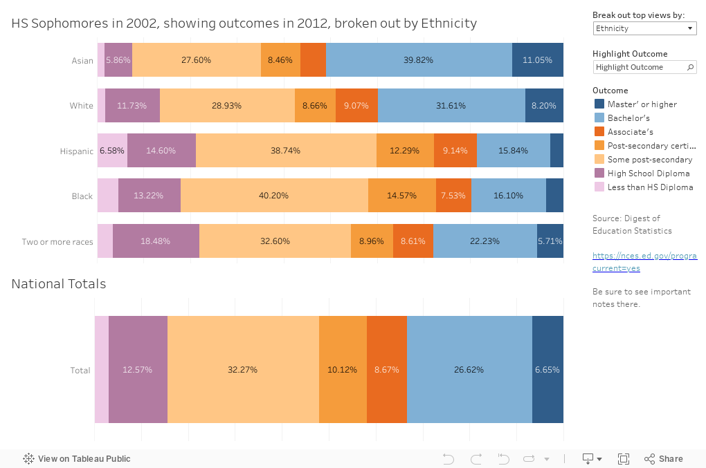
It was that first part that hit me. It still does. And here is some data that suggests things beyond your control still determine where you end up. It's from the NCES Digest of Education Statistics, and shows what happened to students who were sophomores in high school in 2002 ten years later.
This is a pretty easy visualization to work with: The bottom bar chart shows the outcomes of the total group. Then, using the filter at the top right, you can break out the top display by one of several values: Ethnicity (the default), gender, high school GPA, high school type, parental education, parental socioeconomic status, and the student's self-reported aspiration. You can then see what percentage of each group has attained degrees, some education, or nothing beyond high school. And of course, you can compare that breakout group to the total.
Use the "Highlight Outcome" function to make any particular level of education stand out.
Of course, the relationships between and among these variables are pretty clear, but the data are still telling: If you're white or Asian, if you're a female, if you were a good student in high school, if you went to a private high school, if your parents went to college, if you parents were wealthier, and if you aspired to a degree, guess what? You were more likely to get a degree.
And of course, while some of these things are a function of birth, others, like your high school GPA and your apsirations, may be heavily influenced by educated, wealthy parents.
Play around a little bit, and if you are able to find one thing on this that surprises you, let me know.
There was a last minute substitution, and Fred Hargadon filled in for some person whose name is lost to history. At the time, I didn't think I'd stay in admissions long; my personality type is atypical for the profession, and I didn't find a lot to excite me. But in this session I found someone who could approach the profession, well, professionally; someone who could view admissions in a much larger context than I was used to seeing. Someone who was more intellectual and conceptual than friendly (although he was both).
I remember a lot of that session, but one thing has stuck with me through all this time. He said, "In all my years in this profession, I've learned only two things: First, that the block on which you were born determines where you'll end up in life more than any other factor; and second, if we had to choose the absolute worst time to put someone through the college admissions process, it would be age 17."
It was that first part that hit me. It still does. And here is some data that suggests things beyond your control still determine where you end up. It's from the NCES Digest of Education Statistics, and shows what happened to students who were sophomores in high school in 2002 ten years later.
This is a pretty easy visualization to work with: The bottom bar chart shows the outcomes of the total group. Then, using the filter at the top right, you can break out the top display by one of several values: Ethnicity (the default), gender, high school GPA, high school type, parental education, parental socioeconomic status, and the student's self-reported aspiration. You can then see what percentage of each group has attained degrees, some education, or nothing beyond high school. And of course, you can compare that breakout group to the total.
Use the "Highlight Outcome" function to make any particular level of education stand out.
Of course, the relationships between and among these variables are pretty clear, but the data are still telling: If you're white or Asian, if you're a female, if you were a good student in high school, if you went to a private high school, if your parents went to college, if you parents were wealthier, and if you aspired to a degree, guess what? You were more likely to get a degree.
And of course, while some of these things are a function of birth, others, like your high school GPA and your apsirations, may be heavily influenced by educated, wealthy parents.
Play around a little bit, and if you are able to find one thing on this that surprises you, let me know.
Comments
Post a Comment