The College Board data on AP scores is now available for 2018, but it's hard to make sense of in a macro sense. The data are in 51 different workbooks, and, depending on how you want to slice and dice the data, as many as eight worksheets per workbook. What's more, is the data structure; they're designed to print on paper, for those who want to dive into one little piece of the big picture at a time.
So before going any farther, I'd like us all to challenge the College Board and ACT to put out their data in formats that make exploring data easier for everyone. Unless, of course, they really don't want to do that.
I downloaded all 51 workbooks and extracted the actual data using EasyMorph, then pulled it into Tableau for visualization and publication. There are four views here.
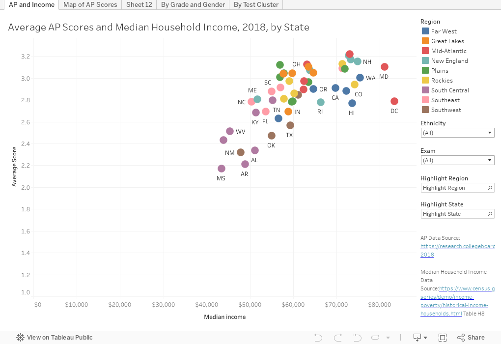
The first tab is a simple scattergram, which may be enough: The relationship between a state's median income and the average AP exam score. While blunt, it points out once again that we as a nation reward achievement in admissions (rather than merit) and that achievement is easier when you have more resources. Filter by ethnicity or specific exam, and use the highlighters to show a state or region.
Tab two is a map, with average scores color coded. Again, you see higher scores (orange and brown) in places where parental attainment and income are higher. Again, two filters for you to drill down.
Tab three shows differences for any group by grade level and gender. It might be surprising to find that 11th graders generally score higher than 12th graders, until you realize that accomplished, driven children of successful parents load up on AP courses early to help with college applications. But, given that girls have higher grades in high school than boys, you might also be surprised by the higher scores boys usually post in AP. By the way, the young women go on to earn higher grades in college too, so wonder about that for a while.
The fourth tab shows score distributions two ways: On the left, with scores of 4 and 5 to the right, assuming 4 is generally the cutoff for college credit; since some of the groups are small (like Italian, for instance), I also put a stacked 100% bar on the right. The Exam Groups filter at upper right clusters the tests by type (Science, Languages, etc.).
We all know that it is a good thing for students to work hard and challenge themselves in high school, but we also know--ceteris paribus--schools with more resources help prepare students for these exams better. As you look through these visualizations, I recommend you look at groups most underserved in our country, and ask whether the promise of AP has been delivered yet.
This data set is complicated as would need some explanation to manipulate, but I'll make the restructured version available to anyone in higher ed who wants it, via email to jon.boeckenstedt@depaul.edu
So before going any farther, I'd like us all to challenge the College Board and ACT to put out their data in formats that make exploring data easier for everyone. Unless, of course, they really don't want to do that.
I downloaded all 51 workbooks and extracted the actual data using EasyMorph, then pulled it into Tableau for visualization and publication. There are four views here.
The first tab is a simple scattergram, which may be enough: The relationship between a state's median income and the average AP exam score. While blunt, it points out once again that we as a nation reward achievement in admissions (rather than merit) and that achievement is easier when you have more resources. Filter by ethnicity or specific exam, and use the highlighters to show a state or region.
Tab two is a map, with average scores color coded. Again, you see higher scores (orange and brown) in places where parental attainment and income are higher. Again, two filters for you to drill down.
Tab three shows differences for any group by grade level and gender. It might be surprising to find that 11th graders generally score higher than 12th graders, until you realize that accomplished, driven children of successful parents load up on AP courses early to help with college applications. But, given that girls have higher grades in high school than boys, you might also be surprised by the higher scores boys usually post in AP. By the way, the young women go on to earn higher grades in college too, so wonder about that for a while.
The fourth tab shows score distributions two ways: On the left, with scores of 4 and 5 to the right, assuming 4 is generally the cutoff for college credit; since some of the groups are small (like Italian, for instance), I also put a stacked 100% bar on the right. The Exam Groups filter at upper right clusters the tests by type (Science, Languages, etc.).
We all know that it is a good thing for students to work hard and challenge themselves in high school, but we also know--ceteris paribus--schools with more resources help prepare students for these exams better. As you look through these visualizations, I recommend you look at groups most underserved in our country, and ask whether the promise of AP has been delivered yet.
This data set is complicated as would need some explanation to manipulate, but I'll make the restructured version available to anyone in higher ed who wants it, via email to jon.boeckenstedt@depaul.edu
Comments
Post a Comment