As I've written before, I think graduation rates are mostly an input, rather than an output. The quality of the freshman class (as measured by a single blunt variable, average test scores) predicts with pretty high certainty where your graduation rate will end up.
(Note: Remember, the reason test optional admissions practices work is that test scores and GPA are strongly correlated. If you didn't have a high school transcript, you could use test scores by themselves, but they would not be as good; sort of like using a screwdriver as a chisel. And the reason why mean test scores work in this instance is essentially the same reason your stock portfolio should have 25 stocks in it to reduce non-systematic risk.)
Further, choosing students with high standardized test scores means you're likely to have taken very few risks in the admissions process, as high scores signal wealth, more accumulated educational opportunity, and college-educated parents. That essentially guarantees high grad rates.
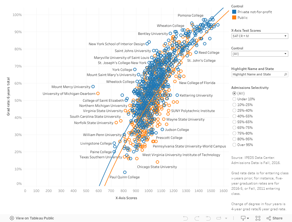
But you can see the data for yourself, below. How to interact:
Each dot is a college, colored by control: Blue for private, orange for public. Use the filter at right to choose either one, or both.
The six-year graduation rate is on the y-axis, and mean test scores of the Fall, 2016 freshman class are along the x-axis. Using the control at top right, you can choose SAT or ACT. Test-optional colleges are not allowed to report scores to IPEDS.
If you want to find a college among the 1,100 or so shown, type part of the name in the "Highlight" box. Then select from the options given. You should be able to find it.
Sound good? There is more.
Try using the "Selectivity" filter to look at groups of colleges by selectivity. Notice the shape of the regression lines, and how they're largely the same for each group.
Finally, if you click on an individual college, you'll find that two new charts pop up at bottom. One shows the ethnic breakdown of the undergraduate student body; one shows all the graduation rates IPEDS collects. If you click often enough, you'll see patterns here, too. Race signals a lot, including wealth and parental attainment, as those--again--turn into graduation rates.
A final note: I've added a variable called "Chance of Four-year Graduation" which is explained here. The premise is that everyone thinks they're going to graduate from the college they enter, so of those who do graduate, what percentage do it in four?
Tell me what you find interesting here.
(Note: Remember, the reason test optional admissions practices work is that test scores and GPA are strongly correlated. If you didn't have a high school transcript, you could use test scores by themselves, but they would not be as good; sort of like using a screwdriver as a chisel. And the reason why mean test scores work in this instance is essentially the same reason your stock portfolio should have 25 stocks in it to reduce non-systematic risk.)
Further, choosing students with high standardized test scores means you're likely to have taken very few risks in the admissions process, as high scores signal wealth, more accumulated educational opportunity, and college-educated parents. That essentially guarantees high grad rates.
But you can see the data for yourself, below. How to interact:
Each dot is a college, colored by control: Blue for private, orange for public. Use the filter at right to choose either one, or both.
The six-year graduation rate is on the y-axis, and mean test scores of the Fall, 2016 freshman class are along the x-axis. Using the control at top right, you can choose SAT or ACT. Test-optional colleges are not allowed to report scores to IPEDS.
If you want to find a college among the 1,100 or so shown, type part of the name in the "Highlight" box. Then select from the options given. You should be able to find it.
Sound good? There is more.
Try using the "Selectivity" filter to look at groups of colleges by selectivity. Notice the shape of the regression lines, and how they're largely the same for each group.
Finally, if you click on an individual college, you'll find that two new charts pop up at bottom. One shows the ethnic breakdown of the undergraduate student body; one shows all the graduation rates IPEDS collects. If you click often enough, you'll see patterns here, too. Race signals a lot, including wealth and parental attainment, as those--again--turn into graduation rates.
A final note: I've added a variable called "Chance of Four-year Graduation" which is explained here. The premise is that everyone thinks they're going to graduate from the college they enter, so of those who do graduate, what percentage do it in four?
Tell me what you find interesting here.
Comments
Post a Comment