How International is a college? And how do you measure it? There are certainly a lot of ways to think about it: Location in an international city like New York, Chicago, or Los Angeles, for instance. The extent to which the curriculum takes into account different perspectives and cultures, for another.
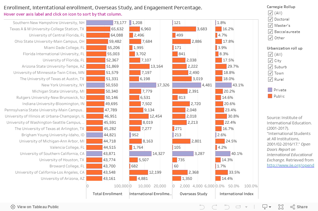
And, of course, there is some data, this time from the IIE Open Doors Project. I did a simple calculation, taking the number of international students enrolled, plus the number of enrolled students studying abroad, and divided the sum of those to come up with an international index of sorts.
No, it's not precise, and yes, I know the two groups are not discreet, but this--like all the data on this blog--is designed to throw a little light on a question, not to answer it definitively.
You'll find data on all the colleges that participate in the IIE survey, displayed in four columns: Total enrollment (on the left), International enrollment, Overseas study numbers, and the International Engagement Index, which is sort of the chance a randomly selected student will be either international or studied internationally in the last year.
The colleges are sorted by the first column, total enrollment. You may want to see who has the most international students, or the highest International Index. It's easy to sort these columns by hovering over the small icon near the axis label, as pictured below and indicated by the yellow arrow. There is one for each column; give it a try, and if you get stuck, use the reset button.

As always, feel free to leave a comment below.
Comments
Post a Comment