The College Board recently released data on its AP Exams. I've downloaded several workbooks already, and of the one I've dug into, I've only been able to get through two worksheets. The data presentation is clunky (please, agencies, provide un-pivoted data without merged cells and totals and all that stuff, if not by itself, then as a companion), but it reveals some interesting patterns.
Well, I think so.
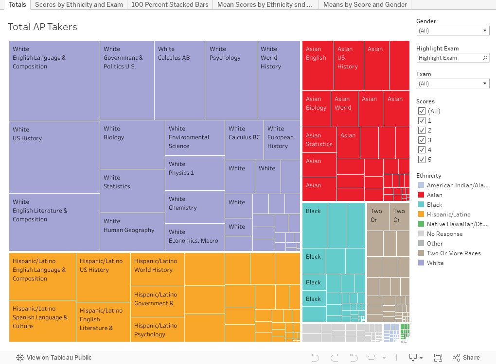
I've visualized it in five views: The source of the data is here, in case you want to download it yourself.
View 1, Totals (using the tabs across the top) is just totals: Use the controls to show males or females, or certain scores, or certain exams. I think it's very compelling, especially if you look at the high scores the College Board claim about AP opening access to selective institutions.
View 2, Scores by Ethnicity and Exam, shows score distributions of the four largest ethnic groups. Filter by a single exam if you'd like.
View 3, 100% Stacked Bars, shows the same data, presented by ethnicity. Again, filter to a test if you'd like.
View 4, Mean Scores by Ethnicity and Exam, arrays all tests, and breaks out mean scores (yes, I know you shouldn't take averages of string variables. So sue me). Use the highlighter if you'd like to make any of the groups stand out visually, and filter by gender if you'd like.
View 5, Mean Scores by Gender and Exam, shows the differences between males and females. Filter to a single ethnicity if you'd like.
Tell me what you see. Does this change your perspective on the College Board claims, or does it strengthen them? Does it help you make up your mind?
I'd love to hear.
Well, I think so.
I've visualized it in five views: The source of the data is here, in case you want to download it yourself.
View 1, Totals (using the tabs across the top) is just totals: Use the controls to show males or females, or certain scores, or certain exams. I think it's very compelling, especially if you look at the high scores the College Board claim about AP opening access to selective institutions.
View 2, Scores by Ethnicity and Exam, shows score distributions of the four largest ethnic groups. Filter by a single exam if you'd like.
View 3, 100% Stacked Bars, shows the same data, presented by ethnicity. Again, filter to a test if you'd like.
View 4, Mean Scores by Ethnicity and Exam, arrays all tests, and breaks out mean scores (yes, I know you shouldn't take averages of string variables. So sue me). Use the highlighter if you'd like to make any of the groups stand out visually, and filter by gender if you'd like.
View 5, Mean Scores by Gender and Exam, shows the differences between males and females. Filter to a single ethnicity if you'd like.
Tell me what you see. Does this change your perspective on the College Board claims, or does it strengthen them? Does it help you make up your mind?
I'd love to hear.
Reminder: I appreciate support for webhosting and other costs associated with creating Higher Ed Data Stories. You can support these efforts here.
Comments
Post a Comment