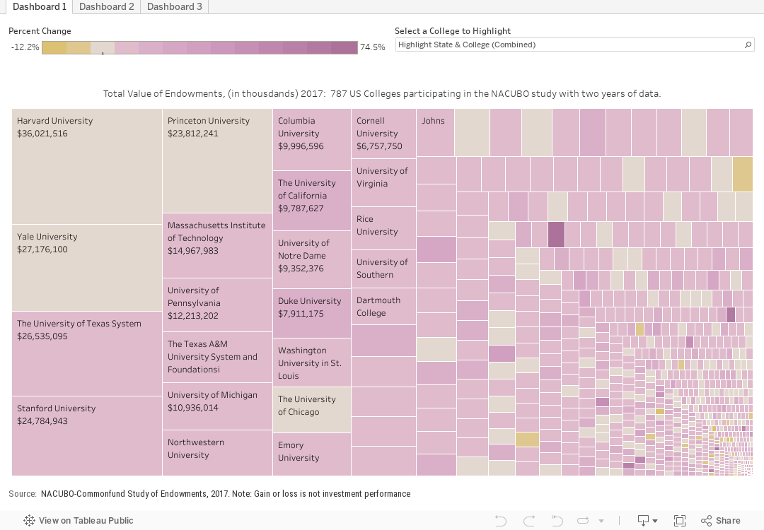
Each year NACUBO releases its study of endowment changes at about 800 colleges and universities in the US and Canada. For this post, I'm including only those institutions in the US, and only those who reported two years of data to the survey, or about 787 institutions.
Higher Education in the US, of course, is a classic story of the haves and have nots; a few institutions near the top of the endowment food chain have amassed enormous endowments, allowing them great freedom in the programs they offer and the students they enroll. In fact, the 21 most well endowed institutions control over half, or about $280B of the $560B held overall, leaving the other 766 to divvy up the remaining $280B among them; the top 93 own 75%.
What's more interesting, I think, is the astonishing endowment growth: Stanford added $2.4B to its endowment in one year. That amount is bigger than all but 38 of these institutions' total 2017 value. In other words, if the gain on Stanford's endowment was an endowment, it would be the 39th largest endowment in the nation. And in total value, it still trails Harvard by about $12B.
A couple of notes: Endowment growth is not the same as investment performance. Some of the growth or loss can be accounted for by additions and withdrawals as well. Second, endowments are not a big pot of money the college can spend as it wishes. Some percentage of the income from endowments is restricted to certain programs, and often carry additional expenses the college has to come up with on its own.
Still, I think this is interesting and compelling. Let me know what you think.
Comments
Post a Comment