Strategic planning at universities is always an important process, but it's even more crucial to do correctly these days. And lots of institutions might be missing a really critical element in scanning the external environment: The extent to which federal financial aid programs contribute to the essential revenue streams that run the enterprise.
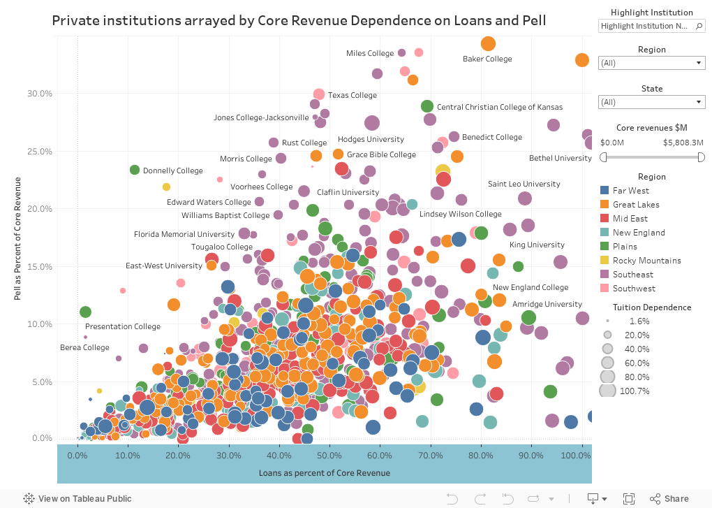
This is a fairly simple, if crowded, visualization, showing about 900 private colleges and universities who have good data in IPEDS. Each dot is a bubble, colored by region, representing a single institution. Its position along the horizontal axis shows student loans as percentage of core revenues, from left (low) to right (high). I've included subsidized undergraduate direct loans, unsubsidized undergraduate direct loans, Parent PLUS loans, graduate subsidized, and Graduate PLUS loans in the calculation. I did not include private loans.
Some of these numbers may seem high, but understand what this says and what it doesn't say: Loans go to pay other things (computers, gasoline, rent, books, food, etc.) so the colleges don't actually see all this money. But presumably, the funding does make attendance and the paying of tuition possible.
And the IPEDS definition of Core Revenues can be confusing, too, as there are many revenue sources you might not consider. This is what IPEDS puts into the category of Core Revenues:
And if you have investment losses, your core revenues drop. In other words, it can be misleading. And even if it doesn't, most places don't spend all of their investment returns, so while it shows up as a revenue, it is usually never touched.
This is a fairly simple, if crowded, visualization, showing about 900 private colleges and universities who have good data in IPEDS. Each dot is a bubble, colored by region, representing a single institution. Its position along the horizontal axis shows student loans as percentage of core revenues, from left (low) to right (high). I've included subsidized undergraduate direct loans, unsubsidized undergraduate direct loans, Parent PLUS loans, graduate subsidized, and Graduate PLUS loans in the calculation. I did not include private loans.
Some of these numbers may seem high, but understand what this says and what it doesn't say: Loans go to pay other things (computers, gasoline, rent, books, food, etc.) so the colleges don't actually see all this money. But presumably, the funding does make attendance and the paying of tuition possible.
And the IPEDS definition of Core Revenues can be confusing, too, as there are many revenue sources you might not consider. This is what IPEDS puts into the category of Core Revenues:
- Tuition and fees revenues (F2D01)
- Federal appropriations (F2D02)
- State appropriations (F2D03)
- Local appropriations (F2D04)
- Federal grants and contracts (F2D05)
- State grants and contracts (F2D06)
- Local grants and contracts (F2D07)
- Private gifts, grants, and contracts (F2D08)
- Contributions from affiliated entities (F2D09)
- Investment return (F2D10)
- Sales and services of educational activities (F2D11)
- Other revenues (F2D15)
And if you have investment losses, your core revenues drop. In other words, it can be misleading. And even if it doesn't, most places don't spend all of their investment returns, so while it shows up as a revenue, it is usually never touched.
Got it?
Second, on the y-axis, is Pell Grant revenue as a function of your Core Revenues. Same idea as above, but using Pell as the numerator over Core Revenues.
Add these two together, and you'll see what happens to your revenue stream if federal aid goes away.
The bubbles are sized by tuition dependence; the calculation is not standardized, so for the sake of simplicity, I looked just at tuition revenue as a percentage of tuition plus investment income.
If you want to show a single or a group of institutions in context, use the filter. Just type part of the name and select it. If you want to look at fewer institutions, choose a region, a state, or reduce the range of core revenues (for instance, type $100,000,000 in the left hand box of the filter, or use the slider, to eliminate very small institutions.)
As always, hover over a bubble for details.
You'll notice some interesting things, I hope. Mostly, I hope this doesn't frighten you. Depending on where you work, it can be a bit daunting.
Comments
Post a Comment