Recently, I received a message from Akil Bello who pointed out a data visualization he had seen. It was originally posted to Reddit, but later was edited to eliminate the red-green barrier that people with color-blindness face. The story was here, using a more suitable blue-red scheme.
There's nothing really wrong with visualizing test scores, of course. I do it all the time. But many of the comments on Reddit suggest that somehow the tests have real meaning, as a single variable devoid of any context. I don't think that's a good way to analyze data.
So I went to the NY City Department of Education to see what I can find. There is a lot of good stuff there, so I pulled some of it down and began taking a look at it. Here's what I found.
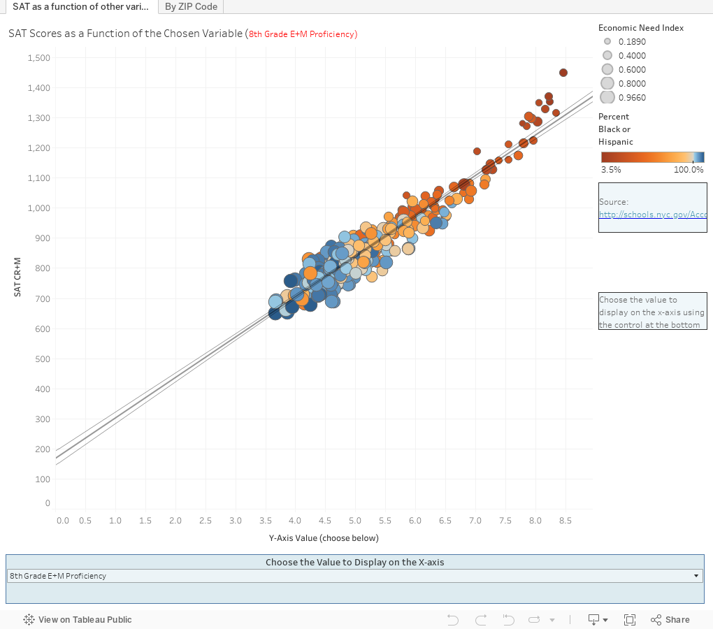
On the first chart, I wanted to see if the SAT could be described as an outcome of other variables, so I put the average SAT score on the y-axis, and began with a simple measure: Eighth grade math and English scores on the x-axis. Hover over the regression line, and you'll see an r-squared of about .90.
Scientists would use the term "winner, winner, chicken dinner" when getting results like this. It means, for all intents and purposes, that if you know a high school's mean 8th grade achievement scores, you can predict their SAT scores four years later with amazing accuracy. And--here's the interesting thing--the equation holds for virtually every single school. There are few outliers.
Ponder that.
But critics of the SAT also say that the scores are reflective of other things, too; an accumulation of social capital, for instance. So use the control at the bottom to change the value on the x-axis. Try economic need index, or percentage of students in temporary housing, or percentage of the student body that are White or Asian. The line may go up (positive correlation) or down (negative) but you'll always see the schools with the highest scores tend to have the characteristics you'd expect.
Jump to the second tab. This is more a response to the Reddit post: The top map shows the ZIP codes and a bubble, indicating the number of schools in that ZIP. The bottom map shows every school arrayed on two poverty scales: Economic Index and Percent in Temporary Housing. The color shows the mean SAT score in the school (Critical Reading plus Math, on a 1600-point scale.) Purple dots represent higher scores.
Use the ZIP highlighter, and you'll see the top map show only that bubble, and the bottom will show the schools in it.
Got the lesson? Good. Now, think about why the colleges with high median test scores a) have them, and b) tend to produce students with high GRE and MCAT and LSAT scores, and c) point to excellent outcomes for their students.
And let me know what you think.
There's nothing really wrong with visualizing test scores, of course. I do it all the time. But many of the comments on Reddit suggest that somehow the tests have real meaning, as a single variable devoid of any context. I don't think that's a good way to analyze data.
So I went to the NY City Department of Education to see what I can find. There is a lot of good stuff there, so I pulled some of it down and began taking a look at it. Here's what I found.
On the first chart, I wanted to see if the SAT could be described as an outcome of other variables, so I put the average SAT score on the y-axis, and began with a simple measure: Eighth grade math and English scores on the x-axis. Hover over the regression line, and you'll see an r-squared of about .90.
Scientists would use the term "winner, winner, chicken dinner" when getting results like this. It means, for all intents and purposes, that if you know a high school's mean 8th grade achievement scores, you can predict their SAT scores four years later with amazing accuracy. And--here's the interesting thing--the equation holds for virtually every single school. There are few outliers.
Ponder that.
But critics of the SAT also say that the scores are reflective of other things, too; an accumulation of social capital, for instance. So use the control at the bottom to change the value on the x-axis. Try economic need index, or percentage of students in temporary housing, or percentage of the student body that are White or Asian. The line may go up (positive correlation) or down (negative) but you'll always see the schools with the highest scores tend to have the characteristics you'd expect.
Jump to the second tab. This is more a response to the Reddit post: The top map shows the ZIP codes and a bubble, indicating the number of schools in that ZIP. The bottom map shows every school arrayed on two poverty scales: Economic Index and Percent in Temporary Housing. The color shows the mean SAT score in the school (Critical Reading plus Math, on a 1600-point scale.) Purple dots represent higher scores.
Use the ZIP highlighter, and you'll see the top map show only that bubble, and the bottom will show the schools in it.
Got the lesson? Good. Now, think about why the colleges with high median test scores a) have them, and b) tend to produce students with high GRE and MCAT and LSAT scores, and c) point to excellent outcomes for their students.
And let me know what you think.
Comments
Post a Comment