Note: You should view this on a tablet or desktop.
The Western Interstate Commission for Higher Education (WICHE) has just published the 9th version of "Knocking on the Door," a look at demographic projections of high school graduates in the US. And several organizations have already published interesting views of the data, like this one on the WICHE site and this one on Hechinger Report.
As I make my case for more self-service BI, these are great examples of what I call the 80/80 rule: Eighty percent of what an analyst will give you is not what you need as a practitioner; and 80% of your questions won't be answered when someone else does the analysis for you. So I took the data (and allow me to complain a little bit about putting data for 50 states and DC in 51 worksheets in an Excel workbook, WICHE) and spent a lot of time restructuring it for analysis. Then I started asking my questions, and came up with 6 views, in an attempt to provide practitioners maximum flexibility. On most of these, you can change start dates, end dates, states, regions, and ethnicity. Even after a couple of hours on this, I could have come up with 60 views, but my spare time is, of course, limited.
Overview:
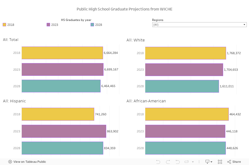
I started with two high level questions. The first is: What's going on at a macro level? And thus this. The gray bars show total numbers of public high school graduates between 2000-01 and 2031-32; the lines break out those numbers by ethnicity. So when your trustees ask about these numbers you can (but I wouldn't) say, "It looks like 2017 will be the low water point for at least eight years. It's good news going forward."
Because if I were you, and before I talk to your trustees, I'd want to know why lies underneath the macro trends, and thus my second question: How the changes look related to different ethnic groups: Take a look instead at the colored lines, showing break outs by ethnicity: As I've written before, ethnicity matters because ethnicity and income and parental attainment all go together. The two groups that attend college at the greatest rates are showing shrinking populations (White students) or modest changes in numbers (Asians, growing at less than 20,000 by 2024.)
But wait. Suppose you're in New York, or California, or Florida. In all probability, your enrollment demographics are shaped more by what happens 500 miles from campus than 3,000. And Illinois? We've pretty much seen the best we're going to see until after I retire. So interact, and use those filters to get the view you want.
Tidbit: The population of White graduates peaked almost ten years ago. And Hispanic populations will peak in 2024 after a long, steady, impressive increase since 2000.
View 1: National Overview
 Issues of Control:
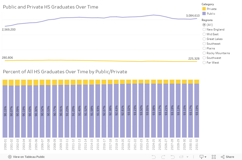
It never fails: When I do the data on public high school graduates, someone asks about private schools. WICHE has included that data this year, and it's, well, sort of boring. The numbers are falling almost everywhere, and as a percent of the whole, are not keeping pace. As you might expect, private school enrollments are a bigger thing in New England than elsewhere. (These data are not available by ethnicity.)
Tidbit: When a super-selective college brags that 60% of its students are from public schools, you can now understand that what they're really saying is private high school graduates are over-represented in their student body by a factor of five.
View 2: Public and Private
Digging down: The last four views (using the tabs across the top)
Now it gets a little more fun: Four ways to look at change over time. In my business, knowing what's coming is very important; we have about an 18-year window on our markets, and no one's going to allow you to claim you were surprised.
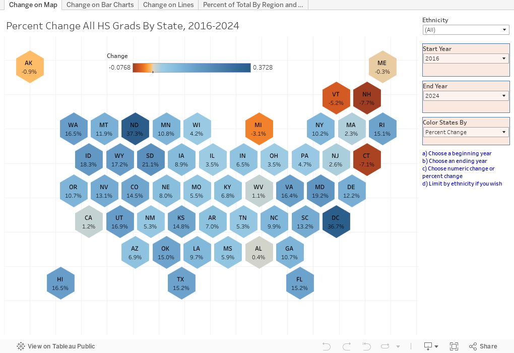
I've become a fan of Hex Maps, to allow visualization of data on a choropleth map. It's never been easy to color-code on traditional state maps because Rhode Island and Delaware are so small, and Alaska and Hawaii are so far out there.
This map view allows you to see change over time (any two years you choose) by state; to show it for all public high school graduates, or just certain ethnicities, and to show numeric change or percent change. I'm guessing you'll want to use this one a lot in strategic planning groups; it's my favorite.
Tidbit: Michigan. Notice how it stands out; that's a surprise to me.
Click to the next tab on the top, and you get the view for those who like bar charts. You can still specify change between any two years, but this data is broken out by ethnicity. You can specify region or single state.
Tidbit: I was expecting bigger drops in New England, but no matter which years I focus on, the drop is smaller than I expected. You?
The third tab is similar, but line charts over time. It shows all ethnicities, allows you to specify the years, and shows both numeric and percentage change from the first year chosen (be careful; these are not numbers, but rather changes).
Tidbit: Although Texas and California have seen dramatic increases in numbers of Hispanic graduates, it's Asian students in both states who will grow at the fastest rate between now and 2031.
Finally, the final view shows regions of the US, and the composition of the high school graduating class by ethnicity.
Tidbit: Pull the slider to show the changes over long periods. Note how fast some regions (Far West, Southwest) change, and how slowly others don't (Plains, Rockies.) Those last two regions will still be more White in 2032 than the whole US was in 2001. And notice the relative stability of African-American high school graduates over time, as a percentage of the total.
Views 3-6: Changes over time
 If you use Tableau, and you want to download this workbook in its entirety, I can share it with you; I'll also be happy to send you the data in a much more accessible database format suitable for your own analysis.
I'd love to hear what you see on these visualizations or on your own analysis. Leave a comment below.
The Western Interstate Commission for Higher Education (WICHE) has just published the 9th version of "Knocking on the Door," a look at demographic projections of high school graduates in the US. And several organizations have already published interesting views of the data, like this one on the WICHE site and this one on Hechinger Report.
As I make my case for more self-service BI, these are great examples of what I call the 80/80 rule: Eighty percent of what an analyst will give you is not what you need as a practitioner; and 80% of your questions won't be answered when someone else does the analysis for you. So I took the data (and allow me to complain a little bit about putting data for 50 states and DC in 51 worksheets in an Excel workbook, WICHE) and spent a lot of time restructuring it for analysis. Then I started asking my questions, and came up with 6 views, in an attempt to provide practitioners maximum flexibility. On most of these, you can change start dates, end dates, states, regions, and ethnicity. Even after a couple of hours on this, I could have come up with 60 views, but my spare time is, of course, limited.
Overview:
I started with two high level questions. The first is: What's going on at a macro level? And thus this. The gray bars show total numbers of public high school graduates between 2000-01 and 2031-32; the lines break out those numbers by ethnicity. So when your trustees ask about these numbers you can (but I wouldn't) say, "It looks like 2017 will be the low water point for at least eight years. It's good news going forward."
Because if I were you, and before I talk to your trustees, I'd want to know why lies underneath the macro trends, and thus my second question: How the changes look related to different ethnic groups: Take a look instead at the colored lines, showing break outs by ethnicity: As I've written before, ethnicity matters because ethnicity and income and parental attainment all go together. The two groups that attend college at the greatest rates are showing shrinking populations (White students) or modest changes in numbers (Asians, growing at less than 20,000 by 2024.)
But wait. Suppose you're in New York, or California, or Florida. In all probability, your enrollment demographics are shaped more by what happens 500 miles from campus than 3,000. And Illinois? We've pretty much seen the best we're going to see until after I retire. So interact, and use those filters to get the view you want.
Tidbit: The population of White graduates peaked almost ten years ago. And Hispanic populations will peak in 2024 after a long, steady, impressive increase since 2000.
View 1: National Overview
It never fails: When I do the data on public high school graduates, someone asks about private schools. WICHE has included that data this year, and it's, well, sort of boring. The numbers are falling almost everywhere, and as a percent of the whole, are not keeping pace. As you might expect, private school enrollments are a bigger thing in New England than elsewhere. (These data are not available by ethnicity.)
Tidbit: When a super-selective college brags that 60% of its students are from public schools, you can now understand that what they're really saying is private high school graduates are over-represented in their student body by a factor of five.
View 2: Public and Private
Digging down: The last four views (using the tabs across the top)
Now it gets a little more fun: Four ways to look at change over time. In my business, knowing what's coming is very important; we have about an 18-year window on our markets, and no one's going to allow you to claim you were surprised.
I've become a fan of Hex Maps, to allow visualization of data on a choropleth map. It's never been easy to color-code on traditional state maps because Rhode Island and Delaware are so small, and Alaska and Hawaii are so far out there.
This map view allows you to see change over time (any two years you choose) by state; to show it for all public high school graduates, or just certain ethnicities, and to show numeric change or percent change. I'm guessing you'll want to use this one a lot in strategic planning groups; it's my favorite.
Tidbit: Michigan. Notice how it stands out; that's a surprise to me.
Click to the next tab on the top, and you get the view for those who like bar charts. You can still specify change between any two years, but this data is broken out by ethnicity. You can specify region or single state.
Tidbit: I was expecting bigger drops in New England, but no matter which years I focus on, the drop is smaller than I expected. You?
The third tab is similar, but line charts over time. It shows all ethnicities, allows you to specify the years, and shows both numeric and percentage change from the first year chosen (be careful; these are not numbers, but rather changes).
Tidbit: Although Texas and California have seen dramatic increases in numbers of Hispanic graduates, it's Asian students in both states who will grow at the fastest rate between now and 2031.
Finally, the final view shows regions of the US, and the composition of the high school graduating class by ethnicity.
Tidbit: Pull the slider to show the changes over long periods. Note how fast some regions (Far West, Southwest) change, and how slowly others don't (Plains, Rockies.) Those last two regions will still be more White in 2032 than the whole US was in 2001. And notice the relative stability of African-American high school graduates over time, as a percentage of the total.
Views 3-6: Changes over time
I'd love to hear what you see on these visualizations or on your own analysis. Leave a comment below.
Comments
Post a Comment