A note in response to some questions from IPEDS geeks and others: My data selection was from 2014 IPEDS data. I used Title IV participating, US only, all sectors except administrative units. That resulted in 7,018 institutions. My visualization shows 6,876 because there were 142 institutions with absolutely no data reported. I should have defined in my original post.
Also, the selectivity bands are not defined: Cut points are at less than 15%,, 25%, 40%, 60%, and 75%. All others are "Not selective/Open."
College. University. We think we know what these terms mean, and yet, any discussion of colleges in the US invariably leads to someone saying, "It depends on what you mean by college."
For instance, there are about 6,900 post-secondary institutions in the US, but only 2,654 offer a bachelor's degree; they enroll 10.5 million of the 17.6 million undergraduates.
Of all the institutions in the US, only 293 enroll at least 15,000 undergraduates, but this small fraction of colleges enrolls almost 40% of the undergraduates. Conversely, there are over 4,300 options that enroll 1,000 students or fewer, but collectively they enroll only about one million students. Our nation's public community colleges enroll over 6 million students on just over 1,000 campuses.
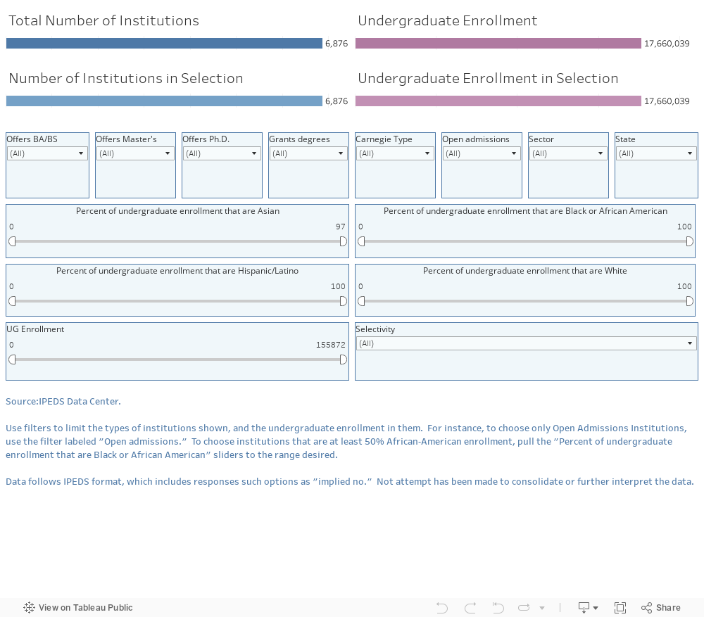
This visualization should give you plenty of options to see the shape of the higher education industry in the US: Filter and select to your heart's content, and as always, reset using the controls at the very bottom.
What surprised you?
Also, the selectivity bands are not defined: Cut points are at less than 15%,, 25%, 40%, 60%, and 75%. All others are "Not selective/Open."
College. University. We think we know what these terms mean, and yet, any discussion of colleges in the US invariably leads to someone saying, "It depends on what you mean by college."
For instance, there are about 6,900 post-secondary institutions in the US, but only 2,654 offer a bachelor's degree; they enroll 10.5 million of the 17.6 million undergraduates.
Of all the institutions in the US, only 293 enroll at least 15,000 undergraduates, but this small fraction of colleges enrolls almost 40% of the undergraduates. Conversely, there are over 4,300 options that enroll 1,000 students or fewer, but collectively they enroll only about one million students. Our nation's public community colleges enroll over 6 million students on just over 1,000 campuses.
This visualization should give you plenty of options to see the shape of the higher education industry in the US: Filter and select to your heart's content, and as always, reset using the controls at the very bottom.
What surprised you?
Comments
Post a Comment