Note: Please be sure to hover over a bar on the first chart, below, to see how to interact.
When I was a kid, I was fascinated by license plates on cars. And whenever I found myself in a college parking lot, it was like a buffet, with lots of plates from distant states. Thus, my fascination with freshman migration and out-of-state enrollment was born.
IPEDS has finally released 2014 Fall enrollment data, and that means the bi-annual availability of the freshman migration data. I like visualizing this for two reasons: First, I can think of dozens of ways to show it, all of them interesting to me, and maybe to you, too. Second, the data is so multi-faceted that it requires viewers to interact, something I've preached about for years: Don't let me decide which data is interesting; decide for yourself how you want to view it.
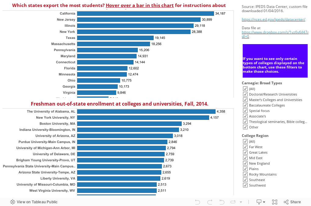
There are two ways I've presented it here. On the first, you start by looking at the states that exported the most freshmen in 2014. If you want to look at the colleges those students attended, just click on the state bar in the top view; the destination colleges below update. If you only want to look at liberal arts colleges, or colleges in the Southeast, you can do that using the filters. Remember, there is a reset button at the bottom of the visualization. You can't break it.
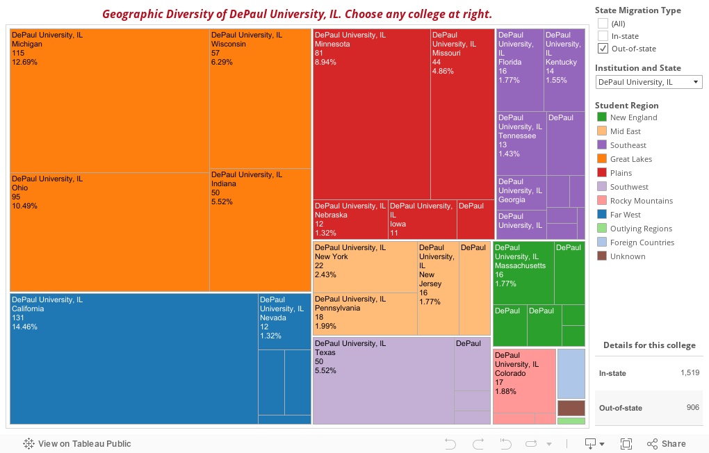
The second view shows individual colleges; I've started with my own. You can see where the 2014 class came from. First select All students or just Out-of-state students, depending on your interest. The tree map updates to show both regions (in color) and states (each square). Hover for details.
What do you see? And do you like this as much as I do?
(As always, data presented is believed to be accurate, but there are occasional problems with IPEDS, including incorrect and missing data).
When I was a kid, I was fascinated by license plates on cars. And whenever I found myself in a college parking lot, it was like a buffet, with lots of plates from distant states. Thus, my fascination with freshman migration and out-of-state enrollment was born.
IPEDS has finally released 2014 Fall enrollment data, and that means the bi-annual availability of the freshman migration data. I like visualizing this for two reasons: First, I can think of dozens of ways to show it, all of them interesting to me, and maybe to you, too. Second, the data is so multi-faceted that it requires viewers to interact, something I've preached about for years: Don't let me decide which data is interesting; decide for yourself how you want to view it.
There are two ways I've presented it here. On the first, you start by looking at the states that exported the most freshmen in 2014. If you want to look at the colleges those students attended, just click on the state bar in the top view; the destination colleges below update. If you only want to look at liberal arts colleges, or colleges in the Southeast, you can do that using the filters. Remember, there is a reset button at the bottom of the visualization. You can't break it.
The second view shows individual colleges; I've started with my own. You can see where the 2014 class came from. First select All students or just Out-of-state students, depending on your interest. The tree map updates to show both regions (in color) and states (each square). Hover for details.
What do you see? And do you like this as much as I do?
(As always, data presented is believed to be accurate, but there are occasional problems with IPEDS, including incorrect and missing data).
Comments
Post a Comment