Many people in higher education are fascinated with prestige, whether we like to admit it or not. The question, "Where did you go to college?" can carry a lot of weight in job interviews or even casual conversation as people get acquainted.
The National Science Foundation annually publishes data telling us the colleges that produce the most alumni who go on to earn a doctorate from a US institution in a given year. It's not a great data set in itself, and some brave soul will take IPEDS degree data and merge it to show which of these institutions are the most efficient producer by discipline, but that's not what you'll find here.
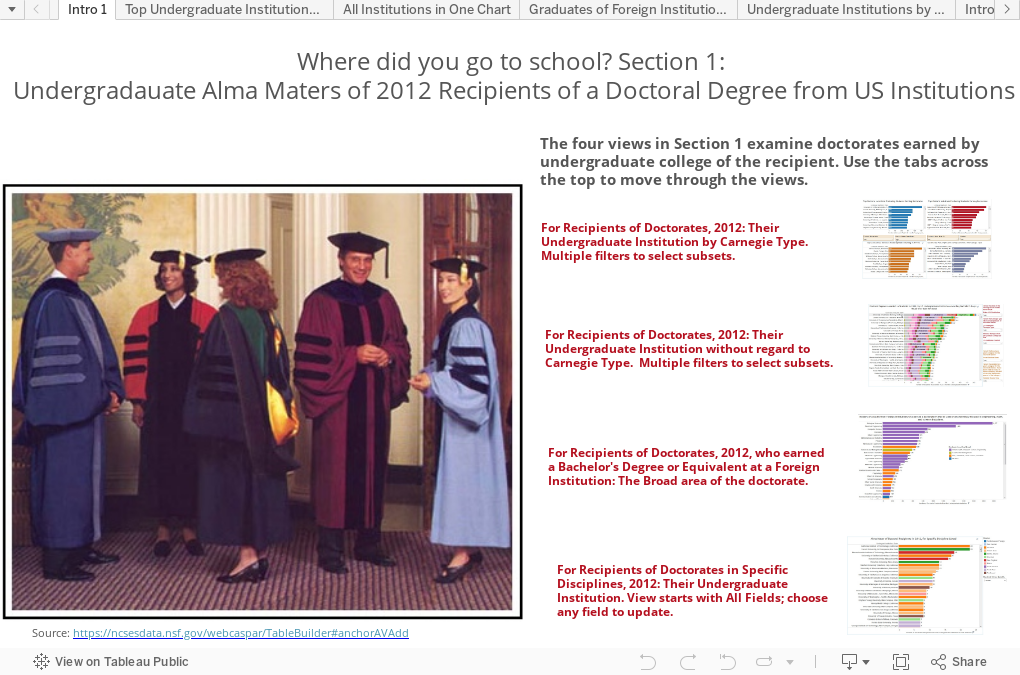
On this visualization, any time you see a college listed (UCLA, for instance), it shows how many bachelor's graduates of that institution earned a doctorate in 2012. It's not the university that awarded the doctorate; that could be anywhere in the US (The University of Texas, or Stanford, for instance.)
There is some interesting stuff here, even if you just stick to the first visualization, where you can choose a broad or specific field, and see which institution produces the most alumni who earn a doctorate. I've sorted them by Carnegie Type, so that Carleton, for instance, doesn't have its accomplishments diminished by the big research institutions.
One thing that jumped out is the surprisingly high percentage of doctorates in engineering earned by graduates of foreign colleges and universities.
What else do you see?
The National Science Foundation annually publishes data telling us the colleges that produce the most alumni who go on to earn a doctorate from a US institution in a given year. It's not a great data set in itself, and some brave soul will take IPEDS degree data and merge it to show which of these institutions are the most efficient producer by discipline, but that's not what you'll find here.
On this visualization, any time you see a college listed (UCLA, for instance), it shows how many bachelor's graduates of that institution earned a doctorate in 2012. It's not the university that awarded the doctorate; that could be anywhere in the US (The University of Texas, or Stanford, for instance.)
There is some interesting stuff here, even if you just stick to the first visualization, where you can choose a broad or specific field, and see which institution produces the most alumni who earn a doctorate. I've sorted them by Carnegie Type, so that Carleton, for instance, doesn't have its accomplishments diminished by the big research institutions.
One thing that jumped out is the surprisingly high percentage of doctorates in engineering earned by graduates of foreign colleges and universities.
What else do you see?
Comments
Post a Comment